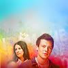
results!
- Eliminated!

nikkidot
with -3 votes
Sorry to see you go. Hope you stay around! (:
- People's/Mod's Choice!


dallowayward | elli
I love the concept and the coloring! Nice work ^^
People's Choice Banner: Here.
Mod's Choice Banner: Here.
- Voting Tally!
Voting Results - See your icon number right here.
1. -3 || +0 = - 3
2. -1 || + 2 = + 1
3. - 3 || + 2 = - 1
4. - 1 || + 0 = - 1
5. - 1 || + 0 = -1
6. - 1 || + 0 = -1
Negative Votes (-)
#01 - The texture is over powering Emma
#01 - the texture doesn't go well together with the picture used. Also, the yellow makes the character look too flat.
#01 - The yellow coloring overpowers the icon. It's also a bit too dark.
#02 - I don't think the lilac compliments the icon. It makes the characters look flat.
#03 - I like the use of color but their faces are just too saturated, it looks bad. They are starting to look like wax figures, unfortunately!
#03 - Rachel is kind of lost in the icon, and is a little fuzzy.
#03 - the texture/text background makes it a bit blurry, and the images could have been sharper.
#04 - The coloring is unattractive because her face is so pale and white. Overall it looks sort of unfinished and basic, like it's missing something.
#05 - the zoomed in aspect is nice but the border around it makes it blurry and hard to see, the glare-ish effect also makes the compostion hard to focus on
#06 - The coloring seems too dark, and a bit bland.
Positive Votes (+)
#02 - love the color and the crop and just everything about this icon. great job!
#02 - Nice use of color, and the crop is simple but well done. The halftone type texture is also well done, and is a nice touch.
#03 - Gorgeous coloring. The blending and texture use is also awesome.
#03 - perfect use of texture, colors! I love this one.
#05 - Nice texture use and use of space!
The next challenge will be posted in a minute!