Icon Making Tutorial
In answer to stffup's question here.
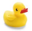
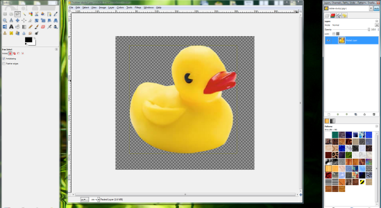
How to get from this:
To this:

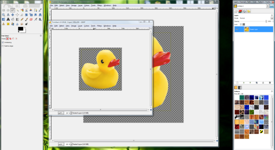
Start with the image you'd like to use, and select the lasso tool.
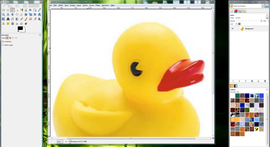
Then use the tool to outline the image.
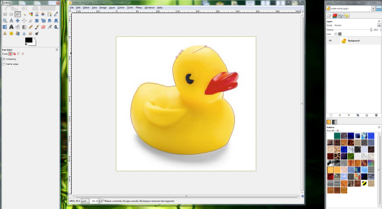
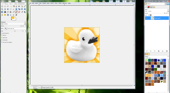
Cut and paste the image to remove it from its original background. It will be a floating layer, so right-click the floating layer and select "New Layer"
Right click the background that the image was originally on to remove it. This will back the background checkered. This shows that the background is blank.
If you save this image as a .png file now, then you will be able to keep this cleaned image for later use.
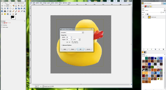
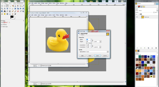
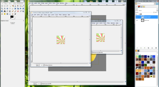
Create a new image, about 300x300 to start, depending on how large the image you're working with is.
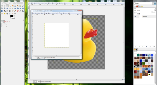
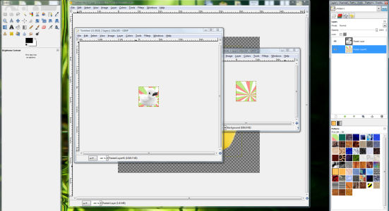
Copy and paste your cleaned image onto the new base. Again, it will be a floating layer, so you must right click the floating layer and select "New Layer"
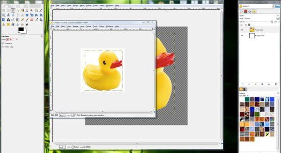
Remove the white background by right clicking and selecting the "Delete Layer" option
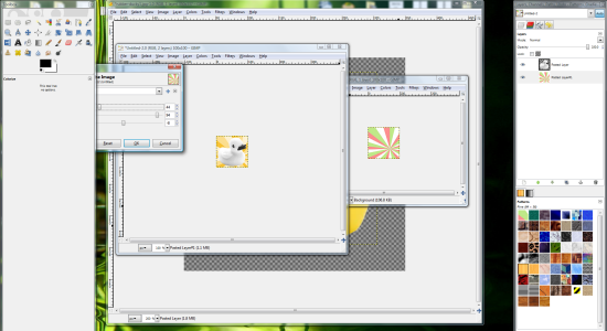
Now, resize the image to 100x100.
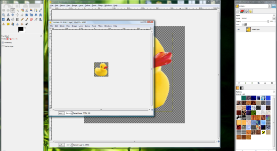
Sometimes if I'm adding text, then i won't do this until the icon is finished. Adding text is easier on larger images.
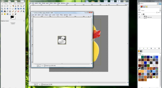
There, now you can desaturate the image. You don't have to follow this step, but that's the style stffup wanted to know. You may have to fiddle with the brightness and contrast depending on the image.
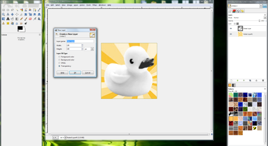
Select a background, like this one. Copy and paste onto the new icon. Once again, it will become a floating layer, so you have to right click it, and select "New Layer"
Drag the background underneath the image.
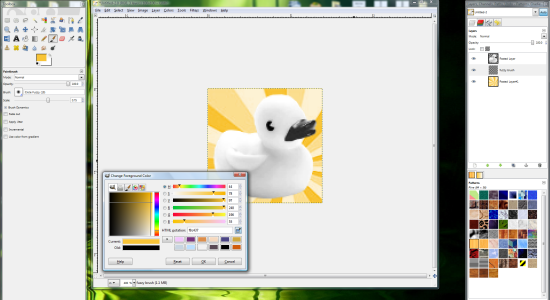
Now, if you want the color of your pattern changed, you'll have to play with it. For this I just used the "Colorize" tab under "Colors"
Now for the shadows. I like to use a fuzzy brush, totally default, rather then the drop shadow option in GIMP. It allows me to control the darkness and size better.
Create a new layer and drag it underneath the "duck" and above the background you chose.
Select the paintbrush tool, and pick any of the fuzzy brushes. The only difference is the size, and since I mess with the "scale" slider I don't really care.
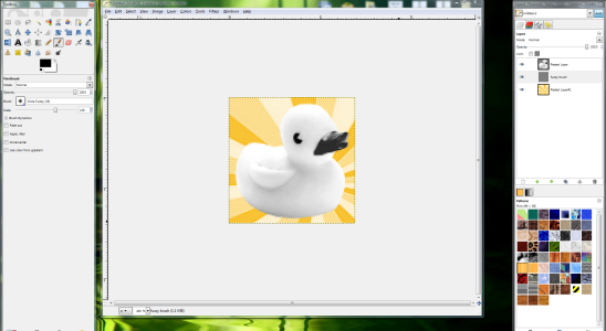
Usually the shadows don't look good black, so I chose the darker yellow in the background. Make sure to put the new layer you made on "Multiply" before you start drawing in. This makes sure that the shadows are darker. If they aren't quite the right shade, try fiddling with the Hue and Saturation until it's right.
Draw on the new "Multiply" layer around the image you chose. After that you can play with the color, and the opacity.
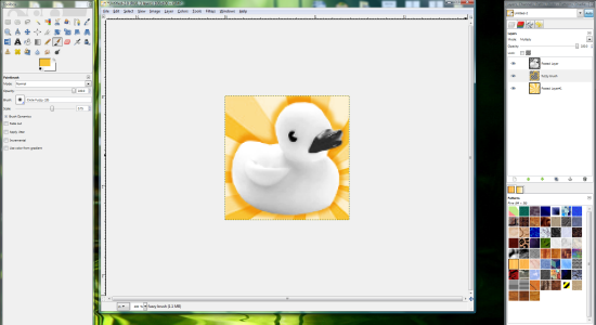
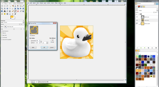
You can also give it a blur if it looks too hard.
Then you can flatten your icon and save! .png is usually best for icons.
I hope that's helpful! Enjoy messing with this <3