oo8
TUTORIAL oo2
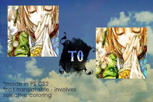
Sup~? Hehehe, posted a tutorial because I was bored and uhm, I'm waiting for the scanlated chapter of Bleach 316. Hehehehe. It's been a long time since I written a tutorial. I don't even know if I'm doing this right or whatever. Gah, I dunno :( Enough with the rambling, so here it is...TUTORIAL oo2:
STEP 1:
Get a cool base with a nice crop and whatnots. Here's mine.
STEP 2:
Let's prep the base up! What I did was I duplicated the base, then I set it to Screen with an opacity of 62%. Again, I duplicated the base and set it to Soft Light, 100%. So it's base, then screen layer, then soflight layer. YEY.

You can always play with the opacity of the Screen layer. It really depends on your picture, really.
STEP 3:
COLOR FILL LAYERS TIME!!! Uh-huh. It's quite essential really. Hehehe~ For the first color, fill it with #ebd2d5 in Soft Light, 100%.

STEP 4:
Next color is #f9eada in Multiply, 80%

STEP 5:
For the last color, #b1eaf2 in Color Burn, 100%
STEP 6:
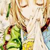
ADJUSMENT LAYERS TIME!!! Hehehehe, of course. Anyways, go to Image>Adjustments>Hue/Saturation (or just Ctrl+U). Then, up the Saturation to 17 or higher. Depends on the picture.
STEP 7:
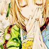
After that is the almighty Selective Color. Go to Image>Adjustments>Selective Color and put these numbers in:
Greens: 100, -71, 100, -57
Blacks: 100, 100, 0, 100
Nuetrals: 19, -20, 19, 30

STEP 8:
Duplicate your base, bring it to the top. Set it to Softlight, 40%

STEP 9:
Next to that, are CURVES! And when you think we are done with Adjustment layers. It's pretty tricky, so pay attention. Click anywhere and you'll get your self a dot :D Now you've seen that dot, go down where the numbers are located. Just, replace the numbers with the required ones. :DDD Then, make another dot and do the same. The values are:
1st dot: Input=198, Output=178
2nd dot: Input=68, Output=97

STEP 10:
That was the last...hehehe. Moving on, duplicate your base (again), bring it all the way to the top. Set it to Soft Light, 100%. I know, you're getting tired of this blending mode XD. AGAIN, duplicate your base, bring it to the top; set it to Color Burn, 30%. Whheee~
STEP 11:
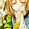
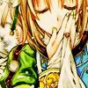
Err, it's getting long isn't it? Don't worry, we're almost done. On a new layer, fill it with black setting it to Soft Light with 40% opacity. Looks kinda dark and uhm, yucky, but do not worry~
STEP 12:
Last but not the least, duplicate your base. Drag it all the way to the top. Put it to Luminosity, 100%. Now, it looks soft and not yucky ^^. Not that soft enough, so...Gaussian Blur the layer! :DD Go to Filter>Blur>Gaussian Blur. The radius that I used is only .04, but you can also go higher. Oh yeah, the fill should be at 60% or lower and play with the opacity too (if you feel it). Just don't blur it that much, or you it would look bleh DX

STEP 13:
YAY! COLORING IS SO DONE DUDE! After that, you can add your textures, text and whatnots. Mine, I got this texture by ??? (pls tell me if it is yours). Rotated it, and set it to Screen

WE ARE FINALLY DONE! Congratzzzz~ That was long...=A=, but worth it??
OTHER RESULTS:


for the Bleach icon, I used the same settings as that of the the tutorial, but I tweaked the Luminosity layer's fill XD;. As for the Avatar icon, I lowered the opacity of the 5th step, duplicated the Hue/Saturation layer, and lowered the opacity of the Curves layer.
Hope you enjoyed the tutorial~ Lemme see yer results okay? And experiment so it would look fancy and neat! ^_____________^
BTW, if anybody wants a .PSD just drop a comment and I'll put it up for download~
&Like what you see??? Then, WATCH the community for future updates! :DD
Sup~? Hehehe, posted a tutorial because I was bored and uhm, I'm waiting for the scanlated chapter of Bleach 316. Hehehehe. It's been a long time since I written a tutorial. I don't even know if I'm doing this right or whatever. Gah, I dunno :( Enough with the rambling, so here it is...TUTORIAL oo2:

STEP 1:
Get a cool base with a nice crop and whatnots. Here's mine.
STEP 2:
Let's prep the base up! What I did was I duplicated the base, then I set it to Screen with an opacity of 62%. Again, I duplicated the base and set it to Soft Light, 100%. So it's base, then screen layer, then soflight layer. YEY.

You can always play with the opacity of the Screen layer. It really depends on your picture, really.
STEP 3:
COLOR FILL LAYERS TIME!!! Uh-huh. It's quite essential really. Hehehe~ For the first color, fill it with #ebd2d5 in Soft Light, 100%.

STEP 4:
Next color is #f9eada in Multiply, 80%

STEP 5:
For the last color, #b1eaf2 in Color Burn, 100%

STEP 6:
ADJUSMENT LAYERS TIME!!! Hehehehe, of course. Anyways, go to Image>Adjustments>Hue/Saturation (or just Ctrl+U). Then, up the Saturation to 17 or higher. Depends on the picture.

STEP 7:
After that is the almighty Selective Color. Go to Image>Adjustments>Selective Color and put these numbers in:
Greens: 100, -71, 100, -57
Blacks: 100, 100, 0, 100
Nuetrals: 19, -20, 19, 30

STEP 8:
Duplicate your base, bring it to the top. Set it to Softlight, 40%

STEP 9:
Next to that, are CURVES! And when you think we are done with Adjustment layers. It's pretty tricky, so pay attention. Click anywhere and you'll get your self a dot :D Now you've seen that dot, go down where the numbers are located. Just, replace the numbers with the required ones. :DDD Then, make another dot and do the same. The values are:
1st dot: Input=198, Output=178
2nd dot: Input=68, Output=97

STEP 10:
That was the last...hehehe. Moving on, duplicate your base (again), bring it all the way to the top. Set it to Soft Light, 100%. I know, you're getting tired of this blending mode XD. AGAIN, duplicate your base, bring it to the top; set it to Color Burn, 30%. Whheee~

STEP 11:
Err, it's getting long isn't it? Don't worry, we're almost done. On a new layer, fill it with black setting it to Soft Light with 40% opacity. Looks kinda dark and uhm, yucky, but do not worry~

STEP 12:
Last but not the least, duplicate your base. Drag it all the way to the top. Put it to Luminosity, 100%. Now, it looks soft and not yucky ^^. Not that soft enough, so...Gaussian Blur the layer! :DD Go to Filter>Blur>Gaussian Blur. The radius that I used is only .04, but you can also go higher. Oh yeah, the fill should be at 60% or lower and play with the opacity too (if you feel it). Just don't blur it that much, or you it would look bleh DX

STEP 13:
YAY! COLORING IS SO DONE DUDE! After that, you can add your textures, text and whatnots. Mine, I got this texture by ??? (pls tell me if it is yours). Rotated it, and set it to Screen

WE ARE FINALLY DONE! Congratzzzz~ That was long...=A=, but worth it??
OTHER RESULTS:


for the Bleach icon, I used the same settings as that of the the tutorial, but I tweaked the Luminosity layer's fill XD;. As for the Avatar icon, I lowered the opacity of the 5th step, duplicated the Hue/Saturation layer, and lowered the opacity of the Curves layer.
Hope you enjoyed the tutorial~ Lemme see yer results okay? And experiment so it would look fancy and neat! ^_____________^
BTW, if anybody wants a .PSD just drop a comment and I'll put it up for download~
&Like what you see??? Then, WATCH the community for future updates! :DD