Icon Tutorial #11
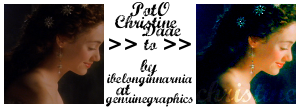
Requested by
princofwhales from this post, thanks!
Made in GIMP 2.
Fairly simple and translatable.
Uses color balance and floodfill layers.
Do NOT hotlink any of the images!
01) Open your image and crop it to your liking.
My image comes from one of my hundreds of screencaps, here, and here is the base.
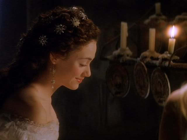
Want all my PotO screencaps? I'll upload and post them in a .zip soon!
02) Duplicate the base five (5) times. Set the first four (4) to screen, and the last one to soft light.
03) On the soft light layer, open Color Balance (Layer > Colors > Color Balance), and use the settings:
MIDTONES:
Red: 60
Green: 40
Blue: 45
Merge layers.
04) Then open Color Balance again, and use the settings:
MIDTONES:
Red: -90
SHADOWS:
Green: 20
Blue: -10
05) Open Hue-Saturation (Layer > Colors > Hue-Saturation), and use the settings:
MASTER:
Saturation: 35
06) Now open Color Balance again, and use the settings:
MIDTONES:
Red: -50
07) Use your blur tool and go over her skin. Then use your sharpening tool and go over her earring and hair gems.
08) Type your text (I wrote "christine" with font Marcelle Script font size 32), and set it to soft light. TADA! You're done.
NOTE: I'm not sure this is exactly right (this is what I got) but it's close, at least.
If there's any advice I can give, it's to EXPERIMENT with color balance and saturation.
DON'T REPEAT THIS TUTORIAL EXACTLY! IF YOU INTEND TO USE THIS TUTORIAL, PLEASE COMMENT!
I ALSO LOVE SEEING YOUR RESULTS, TOO! ;D
RESOURCES - REQUESTS - TUTORIAL INDEX
Questions? Ask away!
Feel free to JOIN or FRIEND the community!