Icon Tutorial #3
Alright, well today we'll be going from:

to
.
Made with GIMP, easily translatable.
Do NOT hotlink any of the images!
TUTORIAL #3- - -HARRY POTTER TRIOGo from
to
.
1. Open your image. Duplicate the base layer 3 times. Set
the second layer to soft light at 100% opacity, the third
layer to screen at 30% opacity, and the fourth to hard light
at 70% opacity.
Looks like this:

I'd say that looks pretty good!
Sometimes you can just stick with this, depending on the
icon, but I, personally, like to see some color.
2. Open a texture (as a layer).
I used this by
grrliz.
DON'T HOTLINK.
Set the texture to soft light 60% opacity.
Looks like this:

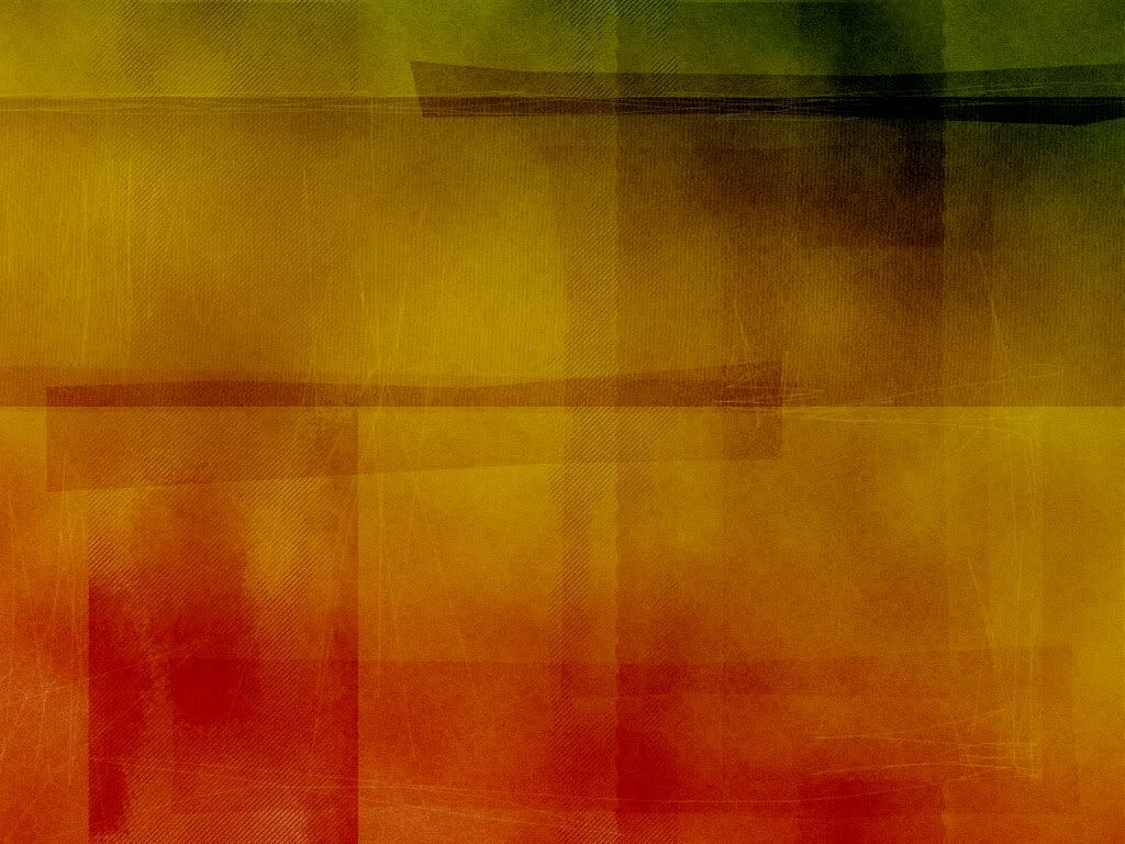
3. Now open some gradients! You can open whatever ones
you like best.
I used this and this by
crumblingwalls.
I set these to soft light 20% opacity.
Looks like this:

No it doesn't look much different, I know. But there is a
small difference. And you can mess with the opacity.
4. Make a new layer. Floodfill it with #A18563. Set it to
multiply 50% opacity.
Looks like this:

Ick, looks dark, right? Don't worry, that'll change.
5. And then open another gradient.
I used this by ???
PLEASE COMMENT SO I MAY CREDIT YOU
I set it to soft light 90% opacity.
Looks like this:

Now that looks better!
I like how this looks. You can stop here but I'll keep going.
6. Now time to open some color layers. Make two new
layers and floodfill them both with #FFDEBB. Set the first
to multiply 40% opacity, and the second one to soft light
40% opacity.
Looks like this:

7. Open a new layer and floodfill it with #9FDCDB. Set it to
burn at 50% opacity.
Looks like this:
TADA! You're done and you have a lovely icon.
to
.
Made with GIMP, easily translatable.
Do NOT hotlink any of the images!
TUTORIAL #3- - -HARRY POTTER TRIOGo from
to
.
1. Open your image. Duplicate the base layer 3 times. Set
the second layer to soft light at 100% opacity, the third
layer to screen at 30% opacity, and the fourth to hard light
at 70% opacity.
Looks like this:
I'd say that looks pretty good!
Sometimes you can just stick with this, depending on the
icon, but I, personally, like to see some color.
2. Open a texture (as a layer).
I used this by
grrliz.
DON'T HOTLINK.
Set the texture to soft light 60% opacity.
Looks like this:
3. Now open some gradients! You can open whatever ones
you like best.
I used this and this by
crumblingwalls.
I set these to soft light 20% opacity.
Looks like this:
No it doesn't look much different, I know. But there is a
small difference. And you can mess with the opacity.
4. Make a new layer. Floodfill it with #A18563. Set it to
multiply 50% opacity.
Looks like this:
Ick, looks dark, right? Don't worry, that'll change.
5. And then open another gradient.
I used this by ???
PLEASE COMMENT SO I MAY CREDIT YOU
I set it to soft light 90% opacity.
Looks like this:
Now that looks better!
I like how this looks. You can stop here but I'll keep going.
6. Now time to open some color layers. Make two new
layers and floodfill them both with #FFDEBB. Set the first
to multiply 40% opacity, and the second one to soft light
40% opacity.
Looks like this:
7. Open a new layer and floodfill it with #9FDCDB. Set it to
burn at 50% opacity.
Looks like this:
TADA! You're done and you have a lovely icon.