1.07 results.
Eliminated
azi_69_daniela
with -4 points

Voter's choice
red_fullmoon
Mod´s choice
lauradumb
POINTS:
1. -3
2. +2
3. -2/+1=-1.
4. +3
5. +1/-1=0.
6. -2/+1=-1.
7. -3.
8. -4. [eliminated]
LEAST FAVOURITE COMMENTS:
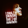
1. the text is awkward on the icon
the image is too sharp and the contrast is wrong
It's too dark & the font seems a little off.
3. the "smoky" effect takes away from the icon and with the red it's too distracting.
it's a bit too foggy
5. the images were cut out sloppily, you can distinctly tell where the cut lines are.
6. Texture and text are out of place.
7. I don't like the crop, it's plane.
8. Coloring doens't look good especially on his face
unattractive coloring and just very bland.
the pic is a bit out of focus.
the icon is oversaturated.
FAVORITE VOTE COMMENTS:
2. Nice, simple, good colouring.
excellent crop, good colouring and sharpening.
3. Very unique. I love the black & white with the textures.
4. lovely cropping & coloring
it's a very expressive icon, and the text suits it perfectly. very pretty :D
lovely composition, good text. <3
5. the 3 images worked really well together, and they did a nice job on the focus of the challenge
6. nice crop and good contrast with black & white and the text is a nice touch
Congratulations to everyone who participated! The next challenge will be up shortly and the skips post was updated.