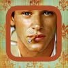
2.01 results
Eliminated
austenish
with -13 points

Voter's choice
irati86
Mod´s choice
oohshit

POINTS:
1.-3 = -3
2.-3/-5 = -8
3.-3/+5 = +2
4.-5/-5/+5 = -5
5.+5 = +5
6.0
7.-5/-5/-3 = -13
8.+5/+5 = +10
9.-3 = -3
LEAST FAVOURITE COMMENTS:
#01 - The icon composition is off, the b&w image on the side trows it off. It would of work better without it, maybe a nice settle texture instead. It could of also use a bit more sharpening, it looks a bit blurry.
#02 - the icon looks too orange
#02 - his face is really orange and not attractive
#03 - The crop is interesting, but I wish there had been more contrast in the icon.
#04 - Even though I like the way the imags were repeated, the coloring is way too light.
#04 - The coloring is to pale and yellowish.
#07 - the black looks sloppy and Gaspard looks like he's being attacked
#07 -- the odd black mask is not pretty, and the coloring of the picture is too dark and oversharpened
#07 - the black smudged around his face is awkward looking and not well done. it's strange
#09 -- poor crop and odd overly-airbrushed coloring
FAVORITE VOTE COMMENTS:
#03 - i like the crop, it is unique
#04 -- gorgeous coloring and composition
#05 - The repetition was uniquely done, + the exture used in the background went really well with the icon. The general composition of this icon was very good!
#08 - The coloring is gorgeous, very natural. And the cropping works well.
8 - nice colouring and cropping
Congratulations to everyone who participated! The next challenge will be up shortly and the skips post was updated.