Round 1: Challenge 6 Results.
Thank you for your votes. :)
ELIMINATED:
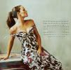
supc4ik (-7 votes)
PEOPLE'S CHOICE:
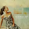
michelle_sarah (+3 votes)
MOD'S CHOICE:

michelle_sarah
Best I've seen this Round and that's say something considering how excellent the entries have been. You did the image justice and the way you used the textures as a part of the icon, not just complimenting it, work beautifully.
TALLIES: ( click here for your icon number)
1. - 1 + 4 = +3
2. - 2 + 3 = +1
3. - 7 + 0 = -7
4. - 6 + 1 = -5
5. - 2 + 1 = -1
I've put all the icon comments together this time so you don't have to search the positive and the favourites.
(-) = Lesser and (+) = Favourites.
ICON 01:
(+) love the idea of the texture behind + the text, it's amazing!
(+) Great use of textures! The icon is a little too dark though.
(+) beautiful coloring and great use of (stock?) textures
(+) love the texture in the background and the coloring
(-) GRAINY
ICON 02:
(+) Great work with the double image.
(+) Love the second picture
(+) original!
(-) the blending is a bit much
(-) the duplicate image covers up too much of her face
(+ additional comment: love the creativity in #2! :))
ICON 03:
(-) The tiny text looks out of place and the picture could have used more contrast.
(-) would have been better without the tiny text, it looks a bit out-of-place
(-) The coloring is nice, but the crop is rather unoriginal and the icon doesn't have anything special in it like the others does.
(-) the texture doesn't fit the icon
(-) there's this blurred spot on the tiny text that is really distracting; also, due to that particular crop the top seems a bit cut off (i.e. there either should have been something else in the background or at the top (like in #4), or just a bit more space (like in #1 or #5)
(-) BLURRY, COLORING TOO BASIC
(-) the tiny text doesn't add much to the icon, and other than that it seems kind of plain
ICON 04:
(+) GREAT COLORING, NICE TEXTURE AND USE OF TEXT
(-) The text looks cramped and the texture doesn't fit with the picture.
(-) the texture is too dark and doesn't match the coloring, plus the text looks a little bit too sharpened.
(-) The icon would be much better without the text.
(-) The text is poorly placed and a little bit to brightly
(-) the text is illegible and the blueish blob is a bit much
(-) bad cropping and the text looks misplaced
ICON 05:
(+) the crop and concept are fantastic!
(-) Too brightly and the dot light texture seems out of place
(-) the background seems a bit empty and doesn't go with the crop; the top texture with the tiny text doesn't fit with the rest of the icon
All banners will be posted after the results for next challenge.
ELIMINATED:

supc4ik (-7 votes)
PEOPLE'S CHOICE:

michelle_sarah (+3 votes)
MOD'S CHOICE:

michelle_sarah
Best I've seen this Round and that's say something considering how excellent the entries have been. You did the image justice and the way you used the textures as a part of the icon, not just complimenting it, work beautifully.
TALLIES: ( click here for your icon number)
1. - 1 + 4 = +3
2. - 2 + 3 = +1
3. - 7 + 0 = -7
4. - 6 + 1 = -5
5. - 2 + 1 = -1
I've put all the icon comments together this time so you don't have to search the positive and the favourites.
(-) = Lesser and (+) = Favourites.
ICON 01:
(+) love the idea of the texture behind + the text, it's amazing!
(+) Great use of textures! The icon is a little too dark though.
(+) beautiful coloring and great use of (stock?) textures
(+) love the texture in the background and the coloring
(-) GRAINY
ICON 02:
(+) Great work with the double image.
(+) Love the second picture
(+) original!
(-) the blending is a bit much
(-) the duplicate image covers up too much of her face
(+ additional comment: love the creativity in #2! :))
ICON 03:
(-) The tiny text looks out of place and the picture could have used more contrast.
(-) would have been better without the tiny text, it looks a bit out-of-place
(-) The coloring is nice, but the crop is rather unoriginal and the icon doesn't have anything special in it like the others does.
(-) the texture doesn't fit the icon
(-) there's this blurred spot on the tiny text that is really distracting; also, due to that particular crop the top seems a bit cut off (i.e. there either should have been something else in the background or at the top (like in #4), or just a bit more space (like in #1 or #5)
(-) BLURRY, COLORING TOO BASIC
(-) the tiny text doesn't add much to the icon, and other than that it seems kind of plain
ICON 04:
(+) GREAT COLORING, NICE TEXTURE AND USE OF TEXT
(-) The text looks cramped and the texture doesn't fit with the picture.
(-) the texture is too dark and doesn't match the coloring, plus the text looks a little bit too sharpened.
(-) The icon would be much better without the text.
(-) The text is poorly placed and a little bit to brightly
(-) the text is illegible and the blueish blob is a bit much
(-) bad cropping and the text looks misplaced
ICON 05:
(+) the crop and concept are fantastic!
(-) Too brightly and the dot light texture seems out of place
(-) the background seems a bit empty and doesn't go with the crop; the top texture with the tiny text doesn't fit with the rest of the icon
All banners will be posted after the results for next challenge.