Round 1: Challenge 1 Results.
Thanks everyone for your votes. :) Results under the cut.
ELIMINATED: (Please hang around and keep voting because you have a chance to come back in the comeback round)
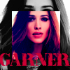
myalias_isjulia (-12)

winifred_ish (-11)

krystle_ab (-10)
PEOPLE'S CHOICE:

herm_weasley (+10)
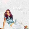
supc4ik (+10)
SCORES:
#1: -1+1=0
#2: 0+10 = 10
#3: 0+10 = 10
#4: -5+0=-5
#5: -1+5=4
#6: -11+0=-11
#7: -10+0=-10
#8: -4+2=-2
#9: -1+1=0
#10: -12+0=-12
#11: 0+1=1
#12: -4+3=-1
#13: -1+1=0
#14: -3+3=0
#15: -4+0=-4
REASONS: ( Click here for your icon number)
LESSER:
#1 - The icon is too dark and the black border is a bit overpowering
4 - reason the idea with a mirrored is original but the execution isn't very good - the coloured picture is too bright and looks ood - and the BW one is too flat. the white box with also doesn't lend anything to the icon.
#4 - the black and white part lacks contrast, the tiny text is unflattering
4 - the silver/grey brush distracts from the icon.
#4 - reason: belending the two images together would have worked better. and the brush seems so out of place with the rest of the icon.
04 - the Black and White part is under contrasted, and the icon as a whole is too busy.
#5 - the text is awkwardly placed (too close to her face)
#6 - the image is too much dark, and the background doesn't really match the colors
06 - the image does not have much contrast and the colors don't pop
#6 - The contrast between the sharp edges and blurred skin of her face is too harsh
#06 - Jennifer is a bit too dark, the texture in the background is distracting
#6 - good crop and texture)
#06 - The picture could have used more contrast, and the background texture is a little messy.
6 -grainy looks like it wasn't colored at all after being cropped
#6 - reason: the hard cut is plenty nice, but the background isnt all that flash. also, it doesnt seem as though he/she really did anything to jennifer, just shoved her on top of the background.
#06 - Bad texture use.
#6 - A good coloring is missing.
6 - the icon seems very washed out and the skin is blurred too much
#7 - too sharpened and the background doesn't go
#7 - the image looks a little bit crappy, and the blending is not really good
07 - The background texture is improperly and too colorful
#7 - oversharpened, the pink/yellow texture is unflattering
7 -backround texture doesn't work well/look good in icon
#7 - reason: the hard cut would have been much better without the white parts around the hair, they take away form the overall look of the icon. also the background is just so..BAM. it doesnt really go with the picture. the bg colours also dont really work, they seem too random and bright.
#07 - Distracting background color scheme.
7 - The cropping is good and the colorization too, but it was a huge mistake to use this gradient in the background. It cancel all the good things about the icon. Also, the selection arround Jen is too pixelated.
07 - Oversharpened, the glow seems out of place, and the background doesn't match the rest of the icon.
7 - the icons seems a bit too oversharpened
8 - reason the selective colours (maybe?) is looking odd on the icon also it is far too blurry. The small dots and text is badly placed and chosen and seems very awkward.
#08 - The crop could have been better and the text is too large for the icon.
8 - the speckles around her face distract from the icon. Changing the background colour may have helped.
#08 - more could have been done with the coloring, the blue/green coloring on top doesn't go with the rest of the icon and the font/text is uninteresting.
#9 - The shadow behind is too much blurred.
#10 - oversaturated
10 - reason the smaller duplicates doesn't work very well - the smaller especially is badly coloured and too coloured, also the text is too radiant.
#10 - the coloring is too much overpowering
10 - The coloring, especially on his face, is too purple and the text stands out too much
#10 - The icon is over contrasted/too dark
#10 - the text at the bottom is too overpowering, and the double image is awkward.
#10 - blurry, in the coloured pic she's an awkward shade of pink and purple which isn't flattering
#10 - The bright pink colour isn't flattering and the text doesn't fit well.
10 - the overlapping layer in colour distracts from the icon. Perhaps if it was just a softer shade it may have worked.
#10 - Way too pink coloring.
10 - Duplicating images is dangerous, and didn't work well at all on this icon. The duplicated photo is too big and makes impossible to see the original one. Also, the coloring is very odd, with too much red.
#10 - repeating effect is ineffective here, the coloring in the image is too harsh and red/purple. font and text used don't fit well.
#12 - the texture doesn't really match the icon, and the colors look weird with the b&w
#12 - It's too full
12 - the background is very busy and seems to detract from the picture
#12 - the icon is far too busy, jennifer is not the main focus.
13 - grainy,text doesn't work well with icon
#14 - she looks oversaturated and overcontrasted, I like the background texture though
#14 - poor colours, background lookes unfortunately
14 - Blurry and over contrasted to an extreme.
#15 - oversharpened
#15 - overcontrasted
#15 - too dark icon
15 - The yellow tones are too strong. It's too pixelated in some areas.
FAVOURITE:
#01 - nice use of coloring and textures, everything fits and works together very well.
2 - reason lovely with the red dot like effect - the picture seems sharp even if it is very small. the small text is well placed
#2 - simple but amazing, love the blending with the grey background
02 - great coloring and i love the lighttextur on jens face;)
#02 - the placement of Jennifer and the use of tinytext are very good, though the empty space at the top could've been used for some text^^
#2 - everything just looks perfect... the coloring, the texture, the tiny text... beautiful!
#2- very good cropping and composition, though the light purple texture/dot is a bit unflattering
2 - good choice of crop and text placement
#2 - reason: the simplicity really works. colouring is great, as is the texture and the brush just gives it a finishing touch.
#2 - The texture suits the picture and the font is well placed.
2 - Simple and amazing. It's a good coloring and smart use of tiny text
#3 - very creative! awesome font!
03 - sweet font and the arrangement is brilliant
#3 - Great use of text and blending with the two images. The red adds a nice splash of colour :D
#3 - amazing font and using of textures!
#03 - The big, chunky text really works, and the blend is good.
3-nice repeating image text looks good with icon
#3 - It's very original.
3 - There are amazing things in this icon: the balck and white contrast, the cropping and the use of color on the font. It's really sweet.
03 - The text and repeated images are wonderful. The composition is brilliant.
3 - good composition
#5 - beautiful coloring
#5 - great coloring
#5 - Nice subtle colouring and good use of text
#05 - Great crop, coloring and texture work.
#05 - lovely use of texture and coloring, font and text works well with the icon.
8 -nice crop,coloring and light
08 - love the colouring and the light texture, its beautiful.
#9 - the coloring is pretty, and the faded rep in the background looks nice
#11 - nice use of textures and cool colouring
12 - reason the background is positively adorable and text is very cute and astoundingly well placed. The white stroke seems to fit the icon very well also.
12 - stands out, the text has been placed perfectly
#12 - Fun texture use.
#13 - really nice composition
#14 - Good texture work.
#14 - reason: it a bit too contrasted, but still very nice. the background is great, as is the whole feel of the icon.
14 - nice crop and use of texture
ELIMINATED: (Please hang around and keep voting because you have a chance to come back in the comeback round)
myalias_isjulia (-12)
winifred_ish (-11)
krystle_ab (-10)
PEOPLE'S CHOICE:

herm_weasley (+10)

supc4ik (+10)
SCORES:
#1: -1+1=0
#2: 0+10 = 10
#3: 0+10 = 10
#4: -5+0=-5
#5: -1+5=4
#6: -11+0=-11
#7: -10+0=-10
#8: -4+2=-2
#9: -1+1=0
#10: -12+0=-12
#11: 0+1=1
#12: -4+3=-1
#13: -1+1=0
#14: -3+3=0
#15: -4+0=-4
REASONS: ( Click here for your icon number)
LESSER:
#1 - The icon is too dark and the black border is a bit overpowering
4 - reason the idea with a mirrored is original but the execution isn't very good - the coloured picture is too bright and looks ood - and the BW one is too flat. the white box with also doesn't lend anything to the icon.
#4 - the black and white part lacks contrast, the tiny text is unflattering
4 - the silver/grey brush distracts from the icon.
#4 - reason: belending the two images together would have worked better. and the brush seems so out of place with the rest of the icon.
04 - the Black and White part is under contrasted, and the icon as a whole is too busy.
#5 - the text is awkwardly placed (too close to her face)
#6 - the image is too much dark, and the background doesn't really match the colors
06 - the image does not have much contrast and the colors don't pop
#6 - The contrast between the sharp edges and blurred skin of her face is too harsh
#06 - Jennifer is a bit too dark, the texture in the background is distracting
#6 - good crop and texture)
#06 - The picture could have used more contrast, and the background texture is a little messy.
6 -grainy looks like it wasn't colored at all after being cropped
#6 - reason: the hard cut is plenty nice, but the background isnt all that flash. also, it doesnt seem as though he/she really did anything to jennifer, just shoved her on top of the background.
#06 - Bad texture use.
#6 - A good coloring is missing.
6 - the icon seems very washed out and the skin is blurred too much
#7 - too sharpened and the background doesn't go
#7 - the image looks a little bit crappy, and the blending is not really good
07 - The background texture is improperly and too colorful
#7 - oversharpened, the pink/yellow texture is unflattering
7 -backround texture doesn't work well/look good in icon
#7 - reason: the hard cut would have been much better without the white parts around the hair, they take away form the overall look of the icon. also the background is just so..BAM. it doesnt really go with the picture. the bg colours also dont really work, they seem too random and bright.
#07 - Distracting background color scheme.
7 - The cropping is good and the colorization too, but it was a huge mistake to use this gradient in the background. It cancel all the good things about the icon. Also, the selection arround Jen is too pixelated.
07 - Oversharpened, the glow seems out of place, and the background doesn't match the rest of the icon.
7 - the icons seems a bit too oversharpened
8 - reason the selective colours (maybe?) is looking odd on the icon also it is far too blurry. The small dots and text is badly placed and chosen and seems very awkward.
#08 - The crop could have been better and the text is too large for the icon.
8 - the speckles around her face distract from the icon. Changing the background colour may have helped.
#08 - more could have been done with the coloring, the blue/green coloring on top doesn't go with the rest of the icon and the font/text is uninteresting.
#9 - The shadow behind is too much blurred.
#10 - oversaturated
10 - reason the smaller duplicates doesn't work very well - the smaller especially is badly coloured and too coloured, also the text is too radiant.
#10 - the coloring is too much overpowering
10 - The coloring, especially on his face, is too purple and the text stands out too much
#10 - The icon is over contrasted/too dark
#10 - the text at the bottom is too overpowering, and the double image is awkward.
#10 - blurry, in the coloured pic she's an awkward shade of pink and purple which isn't flattering
#10 - The bright pink colour isn't flattering and the text doesn't fit well.
10 - the overlapping layer in colour distracts from the icon. Perhaps if it was just a softer shade it may have worked.
#10 - Way too pink coloring.
10 - Duplicating images is dangerous, and didn't work well at all on this icon. The duplicated photo is too big and makes impossible to see the original one. Also, the coloring is very odd, with too much red.
#10 - repeating effect is ineffective here, the coloring in the image is too harsh and red/purple. font and text used don't fit well.
#12 - the texture doesn't really match the icon, and the colors look weird with the b&w
#12 - It's too full
12 - the background is very busy and seems to detract from the picture
#12 - the icon is far too busy, jennifer is not the main focus.
13 - grainy,text doesn't work well with icon
#14 - she looks oversaturated and overcontrasted, I like the background texture though
#14 - poor colours, background lookes unfortunately
14 - Blurry and over contrasted to an extreme.
#15 - oversharpened
#15 - overcontrasted
#15 - too dark icon
15 - The yellow tones are too strong. It's too pixelated in some areas.
FAVOURITE:
#01 - nice use of coloring and textures, everything fits and works together very well.
2 - reason lovely with the red dot like effect - the picture seems sharp even if it is very small. the small text is well placed
#2 - simple but amazing, love the blending with the grey background
02 - great coloring and i love the lighttextur on jens face;)
#02 - the placement of Jennifer and the use of tinytext are very good, though the empty space at the top could've been used for some text^^
#2 - everything just looks perfect... the coloring, the texture, the tiny text... beautiful!
#2- very good cropping and composition, though the light purple texture/dot is a bit unflattering
2 - good choice of crop and text placement
#2 - reason: the simplicity really works. colouring is great, as is the texture and the brush just gives it a finishing touch.
#2 - The texture suits the picture and the font is well placed.
2 - Simple and amazing. It's a good coloring and smart use of tiny text
#3 - very creative! awesome font!
03 - sweet font and the arrangement is brilliant
#3 - Great use of text and blending with the two images. The red adds a nice splash of colour :D
#3 - amazing font and using of textures!
#03 - The big, chunky text really works, and the blend is good.
3-nice repeating image text looks good with icon
#3 - It's very original.
3 - There are amazing things in this icon: the balck and white contrast, the cropping and the use of color on the font. It's really sweet.
03 - The text and repeated images are wonderful. The composition is brilliant.
3 - good composition
#5 - beautiful coloring
#5 - great coloring
#5 - Nice subtle colouring and good use of text
#05 - Great crop, coloring and texture work.
#05 - lovely use of texture and coloring, font and text works well with the icon.
8 -nice crop,coloring and light
08 - love the colouring and the light texture, its beautiful.
#9 - the coloring is pretty, and the faded rep in the background looks nice
#11 - nice use of textures and cool colouring
12 - reason the background is positively adorable and text is very cute and astoundingly well placed. The white stroke seems to fit the icon very well also.
12 - stands out, the text has been placed perfectly
#12 - Fun texture use.
#13 - really nice composition
#14 - Good texture work.
#14 - reason: it a bit too contrasted, but still very nice. the background is great, as is the whole feel of the icon.
14 - nice crop and use of texture