Round 1: Challenge 7 results
So here are the results. It was a great week for iconing this challenge. I could see great things in all the icons submitted but unfortunately we have to eliminate 1 person. :\
Thank you for your votes and here are the results...
ELIMINATED:

irdamajere (-8 votes)
That was a really hard image to icon. It was a tiny little bit dark but you compiled it nicely! :)
PEOPLE'S CHOICE:

herm_weasley (+2 votes)
Tallies: ( click here for your icon numbers)
1. - 3 + 2 = -1
2. - 2 + 4 = +2
3. - 5 + 3 = -2
4. - 8 + 0 = -8
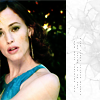
ICON 1
(+) amazing coloring!
(+) nice blending, would have been better with some contrast
(-) like the duplicate image, but it looks too separated... it doesn't flow/connect
(-) BLURRY, VERY UNORIGINAL COLORING
(-) Picture is blurry
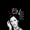
ICON 2
(+) great cropping and lovely use of text
(+) Great text work
(+) like how the J is red, and the tiny text looks really nice. the icon stood out :)
(+) The mix between white, black and red is great, the text font looks pixaleted, though.
(-) Its oversharpend
(-) The text is very pixely.
ICON 3
(+) Love the coloring and the swirl
(+) NICE COLOURING AND USE OF TEXTURES
(+) Lovely texture and coloring.
(-) the icon is oversaturated
(-) lovely coloring, but the white rectangular doesn't really fit the composition
(-) like the colouring,but the blurring is a bit much
(-) weird coloring and the white box looks misplaced
(-) The white block looks out of place
ICON 4
(-) no contrast
(-) the icon is too sharp especially on her skin
(-) she looks pale and background's too dark
(-) the icon is far too dark
(-) awkward crop, and the coloring is too dark
(-) the icon is not bad but needs a little more contrast
(-) TOO DARK, STRANGE CROPCAN ONLY SEE HALF OF LEFT EYE
(-) There's an odd texture across the picture, giving her face a sort of mottled appearance.
Thank you for your votes and here are the results...
ELIMINATED:

irdamajere (-8 votes)
That was a really hard image to icon. It was a tiny little bit dark but you compiled it nicely! :)
PEOPLE'S CHOICE:

herm_weasley (+2 votes)
Tallies: ( click here for your icon numbers)
1. - 3 + 2 = -1
2. - 2 + 4 = +2
3. - 5 + 3 = -2
4. - 8 + 0 = -8
ICON 1
(+) amazing coloring!
(+) nice blending, would have been better with some contrast
(-) like the duplicate image, but it looks too separated... it doesn't flow/connect
(-) BLURRY, VERY UNORIGINAL COLORING
(-) Picture is blurry
ICON 2
(+) great cropping and lovely use of text
(+) Great text work
(+) like how the J is red, and the tiny text looks really nice. the icon stood out :)
(+) The mix between white, black and red is great, the text font looks pixaleted, though.
(-) Its oversharpend
(-) The text is very pixely.
ICON 3
(+) Love the coloring and the swirl
(+) NICE COLOURING AND USE OF TEXTURES
(+) Lovely texture and coloring.
(-) the icon is oversaturated
(-) lovely coloring, but the white rectangular doesn't really fit the composition
(-) like the colouring,but the blurring is a bit much
(-) weird coloring and the white box looks misplaced
(-) The white block looks out of place
ICON 4
(-) no contrast
(-) the icon is too sharp especially on her skin
(-) she looks pale and background's too dark
(-) the icon is far too dark
(-) awkward crop, and the coloring is too dark
(-) the icon is not bad but needs a little more contrast
(-) TOO DARK, STRANGE CROPCAN ONLY SEE HALF OF LEFT EYE
(-) There's an odd texture across the picture, giving her face a sort of mottled appearance.