Icon progression post, part 1
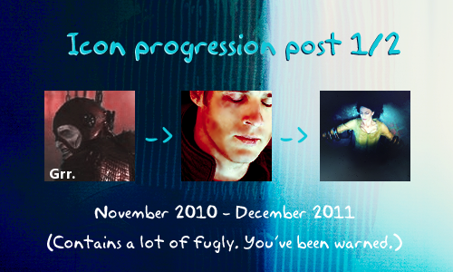
I've always wanted to make one of these! Warning: image heavy and rambly. This might get weirdly scrambled if you click the cut, so I'd advice to click the title!
Idk if anyone but me is interested in my full iconing career, but I didn't make one of these last year so I thought what the hell, let's just put the whole thing here. This is the first part of two and covers my (questionable) progress over my first 14 months of iconing.
All of the examples here are of Farscape because that is literally all I iconned o_O I'm a loyal guy!
If you've known me from waaaay back you might notice something weird about the order, but that's only because I had an incredibly nonlinear way to post my icons back then, so I'm going with the making month rather than the month something was posted.
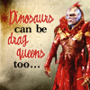
I started iconing in November 2010, because I wanted an icon of my OTP of the moment, but since it was so freaky and weird, I couldn't find many. So I created one myself, GET YOUR INSPIRATION FOLDERS READY FOR THIS BEAUTY:
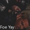
A work of art tbh, a fruit of the collaboration between a crappy starting iconer and Microsoft Paint.
Then I decided that it would be cool to have slightly better icons, so I found icon_tutorial, and realized that people don't usually make icons in Paint (ORLY :O) and started to use GIMP instead.
So let's see where that took me!!
If there's an icon post containing that icon, the icon links to it.
November 2010
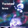
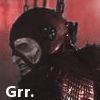
Pretty much all icons I made this month where for shipper/character squee purposes with really bad text on them to hammer in the shippiness.
Obviously I didn't do much to these icons yet cause I just didn't know anything about image editing, but HOLY PIXELLATION BATMAN!
December 2010



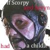

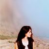
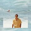

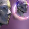
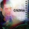
Omg, I made SO MANY icons cause I tried to follow every single tutorial ever written for icon_tutorial. OMGLOL at that 4th one. Also ouch the sharpening DDDD:
All of my slightly better icons like 2 and 8 were just results of direct step-by-step tutorial following, and ugh looks like I had absolutely no taste either cause I followed the ones that abused every single past trend too (see: 10). I would like 5 because of the coloring, if only the sharpening wasn't baaaaad. Also, this month I switched to Photoshop cause I noticed I was getting weird results following some of the PS tutorials with GIMP. Anyway I was a total brainless bad!icon machine, quantity over quality in the most gloriously craptastic way possible. One interesting thing to notice is that I already knew this early that I enjoyed making complex icons the most.
January 2011
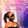
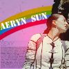
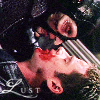
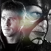
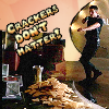
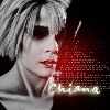
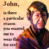
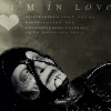
More hideous sharpening, sigh. I LOVED random colored light blobs on Screen o_O I was super proud of a lot of these but omfg how bad was my text??? I really liked tiny text brushes and abused standard text effects like outer glow and stroke. This month I started this 'great' strategy of producing a crapload of icons really fast: record a tutorial into an action -> run it on a billion different bases -> at least one of them must turn out fine! Except not, lol. Also, that last icon cracks me up way too much :DD
February 2011
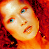
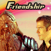
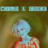
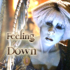
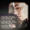
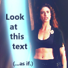
The same method of iconning so nothing new to add there, but let me tell you something super lulzy: I WROTE A 70-PAGED ICONING GUIDE THIS MONTH. I mean... look at these. Do you think someone at this stage should be writing a guide to someone else???? Lolololol. If it was in English, I'd share it just for the comedy value. Maybe one day I'll humour you with some snippets. THE 8TH ICON HERE WAS AN EXAMPLE OF HOW TO DO TEXT 'WELL': just use all the text effects. ^____^
March 2011
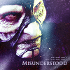
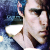

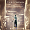
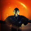
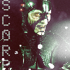
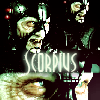
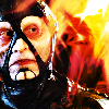
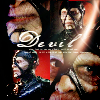
I participated in my first 20in20, which was the ever awesome farscape_20in20 ♥ Actually twice, as the first set (upper row) was made in very early March and the second set (lower row) in late March.
The sharpness still makes me cry as well as the tiny text, but hey at least I stopped the religious tutorial-following (and action recording) cause I figured that would be cheating in a 20in20. I was already a total texture addict as you can see. Also tried some blocking! Where I got this idea to combine all the Farscape guys with these super glowy, glittery textures, I have no idea o_O Also, NAMES AS TEXT ARGH, and could that Scorpius set be more overcontrasted?
April 2011
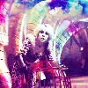
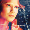
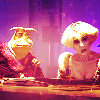
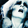
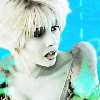
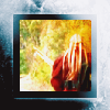
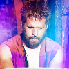
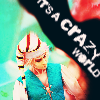

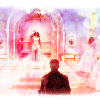
These are so fugly (again). Why are there so many months here without any progress? Most of these were from tutorials again. I did try to tweak them a bit now, usually by pasting even more textures on them and taking away all the most radioactive layers, but these still suck. I used to be SO PROUD of the first one, it was one of my own experiments, I thought the coloring/texture use was fantastic. Now I just look at it and go ’wtf’ o_O No challenge entries this month.
May 2011
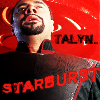
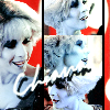
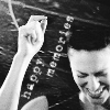
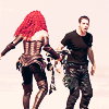
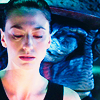
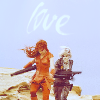
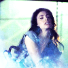
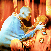
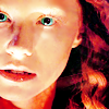
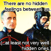
Mostly bad stuff again, but I did make some fairly decent (except the sharpness and overbrightness) icons at the end of May for farscape_20in20. I like the grunginess of the ’happy memories’ one and the composition of 2 (except for the part where I use name as text yet again, lol I’m starting to get the feeling this post will be used as a reference for everything you should NOT do when iconing :D really the only thing missing would be wrong aspect ratio). 4 and 5 are quite nice actually. LOL at that last icon though.
I don't think my technique improved much here, but my ~taste may have gotten a little better? At least most of these aren't crammed with ugly textures and tiny text.
June 2011


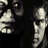
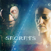
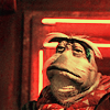

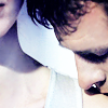
MAJOR PLOT TWIST!!! I read somewhere that people should never resize their images in Paint cause it makes them all pixelly. Which is exactly what I had done up to that point, cause I thought the resizing looked much more confusing in PS (WHY, I HAVE NO IDEA, IT'S EASY AS FUCK). Anyway now I started to resize them in PS and who knew, the quality did start getting much better! I still ruined it by oversharpening, but at least now I was oversharpening something smooth instead of something already pixelly and sharp, lol.
I like some of these, mostly 1, 5 and 8, but some are still hideous and swallowed by textures (3, 7). Hit and miss is what I'd call this stage, with a lot more misses than hits... But I gotta say I was getting quite good at masking, I always did it super carefully.
July 2011
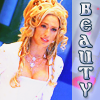
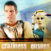


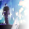
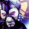
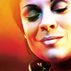
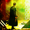


farscape_20in20 went on a hiatus ;_; without a challenge like that I think my motivation to try my best vanished and I didn't even post most of these at any point. Still hate the text use omg. My font choosing was literally random (like, see what song is playing -> pick the font name closest to its title! lol) cause I thought it would make my texts more 'interesting' :D um... don't try this at home.
Some of the textless ones work for me though! I like 10, and 4 and 8 are quite nice too. I went really bold with the colors here, with some experiments working better than others.
August 2011

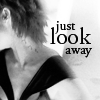


HI THERE, PROGRESS! Fucking finally! :D This is the first month where I can look at my icons without cringing.
farscape_20in20 is back, and the transition between my 8th round and 9th round sets for the comm is remarkable imo. I was starting to get a better grip on texture use maybe, and developed a love for b&w. I still like that blurred Chiana (10) a lot, and compare that new blending icon (9) with those fugly blends from the previous months!! MUCH better, right? Still sucky at text though (this seems to be my life story ;_;). Lots of other challenge entries too this month, the first three are a part of a set made for farscape_land and the last two come from my first ever icon battle (with thyla87). I still struggled with finding the right balance of brightness and contrast, and some of these have really weird lighting, but the overall look here is a billion times better than those of the previous month, idek know what happened here!
September 2011




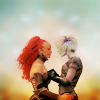
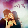
This is where I started getting a bit ambitious. I wanted to experiment with colors and textures and compositions. The results are far from perfect, but I quite like them. In fact I'd say September and December were my strongest icon months in 2011. I also made some icons (the last four here for example) for a big farscape_land icon battle where I did really, REALLY well, which somehow made me think I was better than I actually was, cause well... fandom-specific landcomms and icons, I choose not to comment any further :p Anyway I like where I was going here. 2 is great, and the majority of these would be awesome with just minor tweaking. Still bad at text ._.
October 2011


UGH. Not a good month for my icons I'm afraid. My set for farscape_20in20 (which the first row comes from) had these badly executed pastel/neon colors (the funny thing is I'm totally into pastels/neon rn too, I just hope I use them better now!). Some turned out fine, I like that thinking Rygel a lot as well as the coloring on 5, and I actually like 4 too despite or possibly because of the crazy coloring. Then again I tried to emulate a similar coloring for the rest of my category set too, and those turned out hideous. Also 6 is stylewise possibly my worst fs20in20 icon ever - bad text, RED LIGHT BLOB OF DOOM and a terribly placed one as well, just all around horrible look.
I also had an icon project with thyla87 with CRAPTASTIC results from my side at least (7-10 are from it), ugh ugh ugh I seem to have had a thing for those old-fashioned radioactive colorings where everything is low-luminosity and grayish but then the cyans and reds pop at you in the most eye-soring fashion possible. o_O Oh and let's not forget the crappiest challenge of them all, my farscape_land challenge entry which the last two come from. The last one, um, NO COMMENT xD
November 2011


I like these a bit better, but not by much :/ They still have that grayish/cyanish tint I abused the previous month. This set was all about orange and cyan. I like the compositions and crops here a lot. The texts are still bad when it comes to fonts but otherwise I kinda like them? I love the third one here and the last one has nice levels/blending. Also, HARVEY. ♥
Ooh and this was an interesting month iconingwise because I finished programming this little iconing tool that opens random textures for me and also randomizes all kinds of other things like layer settings, colors etc. At this stage I had enough sense not to follow these things without any thought though. The purpose was just to inspire me and help me try different tings. I still use it, the best thing I've ever programmed tbh!
This was a veeeery busy month at uni, so I didn't make any other icons than this one set.
December 2011
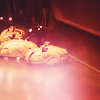
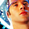
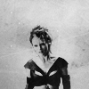
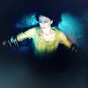
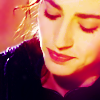

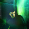
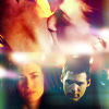
Mostly made icons for the Big Bang of farscape_land.
ANOTHER PLOT TWIST: THIS IS WHEN I REALIZED THERE ARE ACTIVE ICONING CIRCLES OUTSIDE FARSCAPE :OOO who knew?? and they looked aaaawesome so I decided that one day I'd be part of them. I don't even remember how I found out this shocking news, I had thought it would be completely unnecessary and pointless for anytone to icon anything but Farscape, so somehow I didn't think there was much to see outside our little circle, lol. Might be that sayuri_x linked to some IAM activity at wonderous_stuff or something but whatever it was, it somehow led me to lots of icon comms by really good makers, and well... at that point I was kinda shocked to see how awesome icons can be, and I realized that I was way, way worse at them than I had thought, haha. I had made icons pretty slowly and carefully before, but from this moment on I decided on a 'no fillers' policy and started to spend AGES on one icon, trying to get everything right (yet still being horribly hit and miss, go figure :D). This is also when I started reading much better quality tutorials too.
I do love almost all of these examples, especially 3, 4, 7, 8 and 9, but they're mostly the hits and there were many many more misses. Hate that super saturated John though (2), it’s both overly sharp and smudged and LQ-looking, and the saturation makes it look like he's wearing lipstick :P I only included it cause I liked it SO much at the time, lol. But in general this was a much much better month for my icons than anything preceding it, and it was probably all because I was so inspired by all the pretty I had been suddenly exposed to!
So, these were my first 14 months of icons and the first half of my progression post! Whenever someone tells me I've made 'really fast progress' or something like that, I just shake my head a little cause I remember all the crap in this post and how frelling SLOW my progress has been in all actuality. I mean everything before August 2011 sucks so much, I can't even. o_O
Stay tuned for the next part, which covers year 2012! I'm working on it so it will be posted in a couple of days I hope!
I mostly made this for myself so I could come back to it whenever I feel discouraged about something icon-related so I can feel great knowing that at least I've improved a lot from these days, but if any one has any thoughts to share on anything related, I'd love to hear it :)