tutorial: bones header
tutorial requested by kimcullen
it's not 100% the same coloring, but as close as I could recreate it :)
going from
and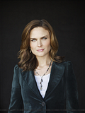
to
pictures from http://www.beyond-bickering.net/
Program: Photoshop CS2
Translatable: involves selective coloring
comment for the psd (my comments with the link will be screened, so make sure your e-mail notification is on)

comments are always appreciated

join/watch to keep track of updates
GETTING THE BASE READY
Open the two pictures we're gonna use and a 650x280 file in Photoshop
Start by pasting the pictures into the 650x280 file and resize/place them the way you want.
I ended up with this
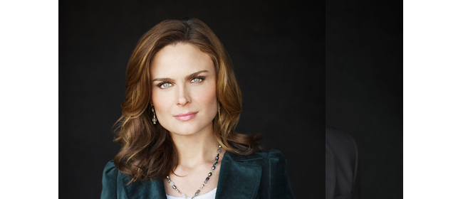
since I wanted booth and bones to be close together, I had to do something about the one picture overlapping the other one.
There are two ways you can fix that. you can either use the eraser and just erase the part that's overlapping (I recommend using a layer mask, so you can correct mistakes if you make some) OR you can select the picture that is on top and set it to lighten
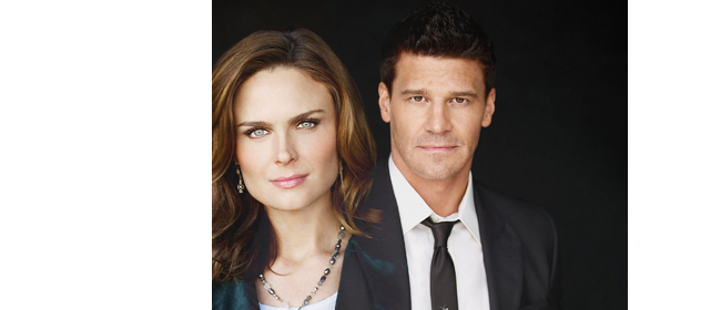
now you can see both pictures. since the picture with bones is set to lighten and the background is white it looks like its cut of on the left side. that's gonna change when we take care of the background.
since the pictures are supposed to blend into the background we have to change the color of it. to do this select the first layer and fill it with whichever color you want. I used #19191b, the same color as the background of the pictures.
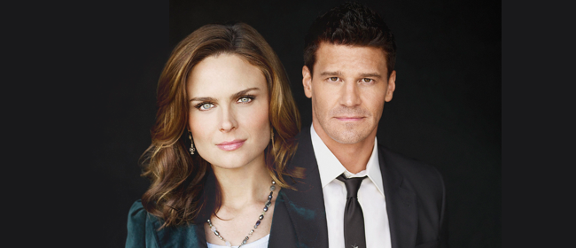
see, now the left image blends in nicely with the background but the right picture doesn't yet. to fix that we're gonna do the same thing we did to the other picture. We set it also to lighten.
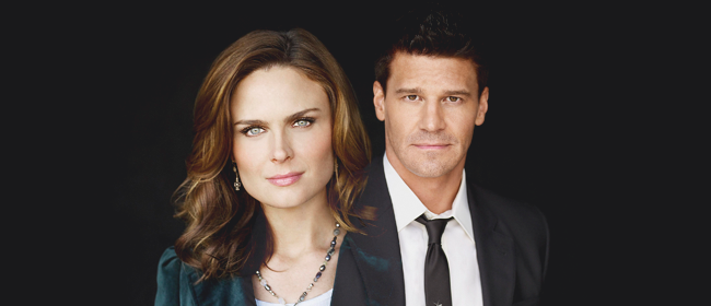
ok, so now that the base is ready, it's time for the COLORING
the first thing we're gonna do is lighten it up a little bit
for that go to Layer > New Adjustment Layer > Brightness/Contrast
Brightness: +64
Contrast: +23
Because it's way to bright this way, we're gonna change the opacity to 26% and set the adjustment layer to screen.
open a New Adjustment Layer > Color Balance, Opacity 100%
Midtones: -2 , +6 , -2
Highlights: -9 , 0 , 10
this will give it a little bit of a blue coloring
open a New Adjustment Layer > Hue/Saturation, Opacity 100%
Standard: 0, +12, 0
Reds: 0, +3, 0
Yellows: 0, -18, 0
Magenta: 0, +11, 0
my image looks like this now
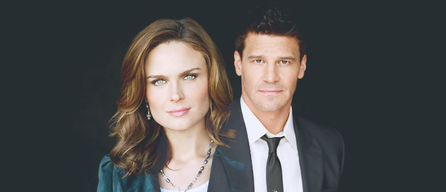
to bring out the reds just a little bit add a New Adjustment Layer > Solid Color, Opacity 100% with the color #8d8181. Set the solid color layer to soft light Depending on how much you want to higlight the red colors in your image choose a color thats more redish.
Add a New Adjustment Layer > Channel Mixer, Opacity 35% with following settings:
Reds: +99, 0, -9
Green: 0, +100, 0
Blue: +9, -2, +94
This will give it a little bit of a blueish color. Depending which color you would like to be dominant in the end change the settings. For example if you want to have a yellow-ish coloring in the end change the "blues".

Still looks a little boring colorwise. to make the colors pop a little more go to New Adjustment Layer > Selective Color, Opacity 53%
Reds: 0, 0, 0, +6
Yellows: 0, 0, 0, +55
Green: 0, 0, 0, +16
Cyan: 0, 0, 0, +49
Blue: 0, 0, 0, -22
Magenta: 0, 0, 0, 50
Blacks: 0, 0, -1, 0
To get more contrast set the Selective Color Layer to soft light
Add a New Adjustment Layer > Solid Color, Opacity 33% with the color #1f0e04. Set the solid color layer to exclusion.
Next add a New Adjustment Layer > Hue/Saturation, Opacity 40%
Standard: 0, +13, 0
Reds: 0, -5, 0
Cyan: 0, -8, 0
Blue: 0, +2, 0
Set the layer to soft light.
To give the image just a little bit of yellow-ish coloring add a New Adjustment Layer > Photofilter, Opacity 32%
Choose Warm Filter (85)
you should have this by now
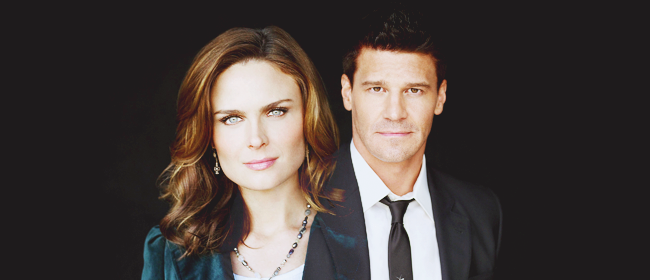
now you can either leave it like that, but I wanted the background to look a little bit "dusty". you can either get that effect by using a "smoke"-texture and set it to lighten or you can just create a new layer and use a soft brush. set the layer also to lighten and play around with the opacity till you like it. If you have to, erase the parts that bother you, for example if it is over their faces or something.
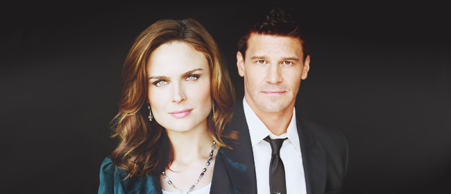
one thing I always do at the end is sharpening the image. you can either merge all layers together or press ctrl-alt-shift-e to create a copy of how the image looks.
Go to Filter > Sharpen > Sharpen. If the image is too sharp now, just go to Edit > Fade and choose whichever % works best for you image.

and you're done!!
not every image is the same, so just play around with the different settings, add new layers or delete some till it fits your image. just copying all layers onto another picture rarely works.
hope that was understandable. if anyone has any questions don't hesitate to ask :)
JOIN/WATCH
it's not 100% the same coloring, but as close as I could recreate it :)
going from

and

to

pictures from http://www.beyond-bickering.net/
Program: Photoshop CS2
Translatable: involves selective coloring
comment for the psd (my comments with the link will be screened, so make sure your e-mail notification is on)

comments are always appreciated

join/watch to keep track of updates
GETTING THE BASE READY
Open the two pictures we're gonna use and a 650x280 file in Photoshop
Start by pasting the pictures into the 650x280 file and resize/place them the way you want.
I ended up with this

since I wanted booth and bones to be close together, I had to do something about the one picture overlapping the other one.
There are two ways you can fix that. you can either use the eraser and just erase the part that's overlapping (I recommend using a layer mask, so you can correct mistakes if you make some) OR you can select the picture that is on top and set it to lighten

now you can see both pictures. since the picture with bones is set to lighten and the background is white it looks like its cut of on the left side. that's gonna change when we take care of the background.
since the pictures are supposed to blend into the background we have to change the color of it. to do this select the first layer and fill it with whichever color you want. I used #19191b, the same color as the background of the pictures.

see, now the left image blends in nicely with the background but the right picture doesn't yet. to fix that we're gonna do the same thing we did to the other picture. We set it also to lighten.

ok, so now that the base is ready, it's time for the COLORING
the first thing we're gonna do is lighten it up a little bit
for that go to Layer > New Adjustment Layer > Brightness/Contrast
Brightness: +64
Contrast: +23
Because it's way to bright this way, we're gonna change the opacity to 26% and set the adjustment layer to screen.
open a New Adjustment Layer > Color Balance, Opacity 100%
Midtones: -2 , +6 , -2
Highlights: -9 , 0 , 10
this will give it a little bit of a blue coloring
open a New Adjustment Layer > Hue/Saturation, Opacity 100%
Standard: 0, +12, 0
Reds: 0, +3, 0
Yellows: 0, -18, 0
Magenta: 0, +11, 0
my image looks like this now

to bring out the reds just a little bit add a New Adjustment Layer > Solid Color, Opacity 100% with the color #8d8181. Set the solid color layer to soft light Depending on how much you want to higlight the red colors in your image choose a color thats more redish.
Add a New Adjustment Layer > Channel Mixer, Opacity 35% with following settings:
Reds: +99, 0, -9
Green: 0, +100, 0
Blue: +9, -2, +94
This will give it a little bit of a blueish color. Depending which color you would like to be dominant in the end change the settings. For example if you want to have a yellow-ish coloring in the end change the "blues".

Still looks a little boring colorwise. to make the colors pop a little more go to New Adjustment Layer > Selective Color, Opacity 53%
Reds: 0, 0, 0, +6
Yellows: 0, 0, 0, +55
Green: 0, 0, 0, +16
Cyan: 0, 0, 0, +49
Blue: 0, 0, 0, -22
Magenta: 0, 0, 0, 50
Blacks: 0, 0, -1, 0
To get more contrast set the Selective Color Layer to soft light
Add a New Adjustment Layer > Solid Color, Opacity 33% with the color #1f0e04. Set the solid color layer to exclusion.
Next add a New Adjustment Layer > Hue/Saturation, Opacity 40%
Standard: 0, +13, 0
Reds: 0, -5, 0
Cyan: 0, -8, 0
Blue: 0, +2, 0
Set the layer to soft light.
To give the image just a little bit of yellow-ish coloring add a New Adjustment Layer > Photofilter, Opacity 32%
Choose Warm Filter (85)
you should have this by now

now you can either leave it like that, but I wanted the background to look a little bit "dusty". you can either get that effect by using a "smoke"-texture and set it to lighten or you can just create a new layer and use a soft brush. set the layer also to lighten and play around with the opacity till you like it. If you have to, erase the parts that bother you, for example if it is over their faces or something.

one thing I always do at the end is sharpening the image. you can either merge all layers together or press ctrl-alt-shift-e to create a copy of how the image looks.
Go to Filter > Sharpen > Sharpen. If the image is too sharp now, just go to Edit > Fade and choose whichever % works best for you image.

and you're done!!
not every image is the same, so just play around with the different settings, add new layers or delete some till it fits your image. just copying all layers onto another picture rarely works.
hope that was understandable. if anyone has any questions don't hesitate to ask :)
JOIN/WATCH