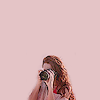
Tutorial 001 ; Gossip Girl ; Serena Van Der Woodsen
So, in my days of graphics making I've posted some PSD's but never a tutorial. Mostly because I never remember what exactly I did and because I have more important things to do than sit here and try to remember my values and whatnot. HOWEVER, I've recently been using a coloring that is super easy. Just a Curves layer, that's easy enough, and a little Color Balance. So here's me, on a Saturday, remembering those values. I hope you certainly enjoy. ( :
;
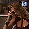
1. Pick your base. Keep in mind, that just like 99.9% of other tutorials, this will not work for everything. I can't tell you how many times I've had a base and had to manipulate the settings/values because the generic one, the one we're using, doesn't work for everything. Also, just about every TV shows lighting and whatnot is different. I would keel over from a heartattack if my coloring for The Vampire Diaries worked on my Gossip Girl caps.
2. Prepare it. Personally, I wait till' the end, because they do tend to look quite different once they're all spiffied up. The base I'm using at the moment is already sharpened. Two times, I do believe.
3. Looking at it, right off the bat, I think we can agree that it's too dark. We want Serena to be bright and blonde and alive. Normally, I use a curves layer, but for some crazy, unknown reason I want you to duplicate Miss Serena/or-whoever-you're-using and set that duplicate to screen.
Uh, yeah. I don't know about you, but I really dont' like how that looks. I'm not even sure how to describe it, but yeah- change it. Specifically set your base to screen 40%. I know, I know, what's the difference from the beginning base? Not much at the moment, but in the end? It'll help. Tons.
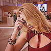
4. Serena is still too dark, too sandy haired. Let's fix that by Curving this puppy up. Take your little mouse there, head on up to Layer, squirm down to New Adjustment Layer and select Curves. We're leaving it at Normal, 100%. No settings need to be changed here.
Input: 11
Output: 23
Much better, right? Don't mean to repeat myself, but don't duplicate those numbers. Every single base is different and they all require different lighting. Just drag the curves along 'till it pleases your eye.
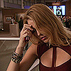
5. This is going to seem sort of . . . stupid? But I want to dim down the icon. I know! Two steps lightin' her up and now I want to dim her down. To me, it makes the end result look much better, less bright and IN YO FACE! So do please take this lovely texture by
navras_rheya. Set it to mulitply. Scary, right? Hot lava is trying to eat her. Turn it down to say . . . 30%. Adjust accordingly, so that your icon can avoid a nasty meeting with a volcano, but yet not be the sun.
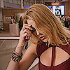
6. Hmm . . . Serena's lacking color, don't you think? So let's stick another texture, made by robsessed16, on her. Pink with a soft glow in the middle sounds (and looks) good. This helps TONS in the case of taking the greeness out of the icon and really bringing out the red of her dress and the yellow in her hair.
I say set it to Soft Light at about 50%, once again, depending on your icon.
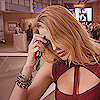
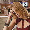
7. She's still lacking some color. I really, really dont' want Serena washed out with the background. I want her to sort of . . . pop, if you will. So, take this texture by
born_butterflyand set it to Soft Light. Scary results- again. So turn that down, a bunch, to about 30%. Your judgment really comes into play here. You don't want her radioactive or having some skin disease, but you want her to be vibrant, right? Judgment.
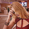
8. Next, take this texture, whose credit is unknown to me, and set it to Soft Light at about 20%. Reason? I really don't have one. I just really love this effect. It's subtle and soft and pretty.

9. Final step! Serena's still lacking some color so let's head on up to Layer, scroll down to New Adjustment Layer and select Color Balance.
Midtones: 2, -5, -5
Shadows: -5, -3, -3
Highlights: -5, 0, -5
Again, subtle. The difference might not seem huge to you, but I think it looks better than step 8.
This is just a guide for how I get the majority of my colorings. I, of course, mess around with them like freaking crazy because every screencap is different, which is something I didn't quite get when I started iconing. "OMG! WHY DOESN'T THIS STUPID COLORING WORK?!?" Ha. I was such a goob.
- PSD? No. No. No. I'm a big fan of those normally, but I seriously just spent a half hour typing this up and making sure my numbers were correct and what not so I think you can take three minutes to put it to use. It's technically, what 7 steps? Four of which you're just tacking on a texture and changing the settings. So, yes, no PSD. Please don't ask. That's irritating.
If you have any questions at all, lemme know! I'll answer to the best of my ability.
As always, comments are total and complete love.
( :
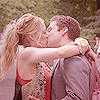
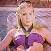
Other Examples;
;
1. Pick your base. Keep in mind, that just like 99.9% of other tutorials, this will not work for everything. I can't tell you how many times I've had a base and had to manipulate the settings/values because the generic one, the one we're using, doesn't work for everything. Also, just about every TV shows lighting and whatnot is different. I would keel over from a heartattack if my coloring for The Vampire Diaries worked on my Gossip Girl caps.
2. Prepare it. Personally, I wait till' the end, because they do tend to look quite different once they're all spiffied up. The base I'm using at the moment is already sharpened. Two times, I do believe.
3. Looking at it, right off the bat, I think we can agree that it's too dark. We want Serena to be bright and blonde and alive. Normally, I use a curves layer, but for some crazy, unknown reason I want you to duplicate Miss Serena/or-whoever-you're-using and set that duplicate to screen.
Uh, yeah. I don't know about you, but I really dont' like how that looks. I'm not even sure how to describe it, but yeah- change it. Specifically set your base to screen 40%. I know, I know, what's the difference from the beginning base? Not much at the moment, but in the end? It'll help. Tons.
4. Serena is still too dark, too sandy haired. Let's fix that by Curving this puppy up. Take your little mouse there, head on up to Layer, squirm down to New Adjustment Layer and select Curves. We're leaving it at Normal, 100%. No settings need to be changed here.
Input: 11
Output: 23
Much better, right? Don't mean to repeat myself, but don't duplicate those numbers. Every single base is different and they all require different lighting. Just drag the curves along 'till it pleases your eye.
5. This is going to seem sort of . . . stupid? But I want to dim down the icon. I know! Two steps lightin' her up and now I want to dim her down. To me, it makes the end result look much better, less bright and IN YO FACE! So do please take this lovely texture by
navras_rheya. Set it to mulitply. Scary, right? Hot lava is trying to eat her. Turn it down to say . . . 30%. Adjust accordingly, so that your icon can avoid a nasty meeting with a volcano, but yet not be the sun.
6. Hmm . . . Serena's lacking color, don't you think? So let's stick another texture, made by robsessed16, on her. Pink with a soft glow in the middle sounds (and looks) good. This helps TONS in the case of taking the greeness out of the icon and really bringing out the red of her dress and the yellow in her hair.
I say set it to Soft Light at about 50%, once again, depending on your icon.
7. She's still lacking some color. I really, really dont' want Serena washed out with the background. I want her to sort of . . . pop, if you will. So, take this texture by
born_butterflyand set it to Soft Light. Scary results- again. So turn that down, a bunch, to about 30%. Your judgment really comes into play here. You don't want her radioactive or having some skin disease, but you want her to be vibrant, right? Judgment.
8. Next, take this texture, whose credit is unknown to me, and set it to Soft Light at about 20%. Reason? I really don't have one. I just really love this effect. It's subtle and soft and pretty.
9. Final step! Serena's still lacking some color so let's head on up to Layer, scroll down to New Adjustment Layer and select Color Balance.
Midtones: 2, -5, -5
Shadows: -5, -3, -3
Highlights: -5, 0, -5
Again, subtle. The difference might not seem huge to you, but I think it looks better than step 8.
This is just a guide for how I get the majority of my colorings. I, of course, mess around with them like freaking crazy because every screencap is different, which is something I didn't quite get when I started iconing. "OMG! WHY DOESN'T THIS STUPID COLORING WORK?!?" Ha. I was such a goob.
- PSD? No. No. No. I'm a big fan of those normally, but I seriously just spent a half hour typing this up and making sure my numbers were correct and what not so I think you can take three minutes to put it to use. It's technically, what 7 steps? Four of which you're just tacking on a texture and changing the settings. So, yes, no PSD. Please don't ask. That's irritating.
If you have any questions at all, lemme know! I'll answer to the best of my ability.
As always, comments are total and complete love.
( :
Other Examples;