Tutorial 001
This is my first tutorial and I have never in my life tried to make one so... let's see how it goes :D
I was asked for a tutorial about this icon in Ask the Maker:

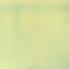
As the subject of my icon was green, I decided to use a greenish background too, so I picked this texture by trapunta:
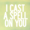
Then, I used some text in the texture. The font I used was Roadway, which I specially love for this kind of icons for its big and clear letters. I merged all the layers with text and applied the outer glow effect, setting its opacity to 30:
After this, I decided that it was the time to use this shiny image of Carbuncle, so I resized, sharpened and placed it in the center of the icon. As the background was kind of merged with the image, I used a Layer Mask to delete the background inside Carbuncle. Then, I duplicated the Carbuncle image and set it to Soft Light 50% to increase its contrast:

Every time I make an icon, I like first to apply some basic changes to the colour of the image. I do this by using a Selective Color layer and a Hue/Saturation layer to increase the colours. It's a good idea to play with the settings of these layers to see what parameters fit better the image. This is how our base image looks like:

As the colours were somehow faded, I increased their intensity by means of a Color Balance layer:

But the icon still lacked some contrast. For this purpose, I applied a black and white gradient map layer set to Soft Light 50%, a Curves layer in which I played with the RGB, a blank layer filled with #000000 and set to Overlay 30%, and finally, a black and white gradient set to Soft Light 70%:

At this point, I like to try different textures to give the "final touch" to the icon. In this case, I used this texture by she_rockstar, set it to Multiply 30% and used a Layer Mask to delete the texture inside Carbuncle:

This time was just the opposite. I added another Hue/Saturation layer at 70% to make Carbuncle's colours more intense and used a Layer Mask to delete the layer in the background:

Finally, I took this texture by mixedbag, resized it to 200x200 and set it to Soft Light 100% to make the icon a bit clearer:

And that's all! I hope you find the tutorial fun and useful and that my explanations were clear enough. Don't hesitate to ask me if there is something you don't understand ;)
I was asked for a tutorial about this icon in Ask the Maker:

As the subject of my icon was green, I decided to use a greenish background too, so I picked this texture by trapunta:

Then, I used some text in the texture. The font I used was Roadway, which I specially love for this kind of icons for its big and clear letters. I merged all the layers with text and applied the outer glow effect, setting its opacity to 30:

After this, I decided that it was the time to use this shiny image of Carbuncle, so I resized, sharpened and placed it in the center of the icon. As the background was kind of merged with the image, I used a Layer Mask to delete the background inside Carbuncle. Then, I duplicated the Carbuncle image and set it to Soft Light 50% to increase its contrast:

Every time I make an icon, I like first to apply some basic changes to the colour of the image. I do this by using a Selective Color layer and a Hue/Saturation layer to increase the colours. It's a good idea to play with the settings of these layers to see what parameters fit better the image. This is how our base image looks like:

As the colours were somehow faded, I increased their intensity by means of a Color Balance layer:

But the icon still lacked some contrast. For this purpose, I applied a black and white gradient map layer set to Soft Light 50%, a Curves layer in which I played with the RGB, a blank layer filled with #000000 and set to Overlay 30%, and finally, a black and white gradient set to Soft Light 70%:

At this point, I like to try different textures to give the "final touch" to the icon. In this case, I used this texture by she_rockstar, set it to Multiply 30% and used a Layer Mask to delete the texture inside Carbuncle:

This time was just the opposite. I added another Hue/Saturation layer at 70% to make Carbuncle's colours more intense and used a Layer Mask to delete the layer in the background:

Finally, I took this texture by mixedbag, resized it to 200x200 and set it to Soft Light 100% to make the icon a bit clearer:

And that's all! I hope you find the tutorial fun and useful and that my explanations were clear enough. Don't hesitate to ask me if there is something you don't understand ;)