42. Ask the Maker
A bunch of people requested a composition and texture guide at Ask The Maker, so... hopefully this covers it?

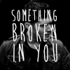
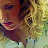
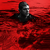
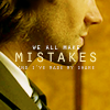
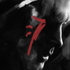
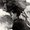
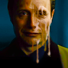
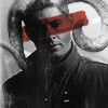
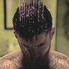
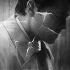
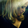
So for me composition isn't something I think too much about for the most part. The only time I really consider it is with regards to negative space. The closer I crop to a character the more I'm trying to focus on the emotions they are displaying, the further I crop the more I'm focusing on the emotions they are NOT displaying, such as a feeling of isolation.


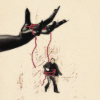
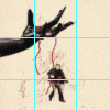
So I like to make it painfully obvious where you need to be looking in my icons, none of this 'natural movement of gaze' rubbish they teach you in art class. I find the best way to direct this gaze by framing the icon in negative space to uncomplicate the composition and draw the eye to where the subject of interest is.

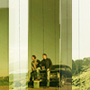


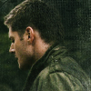
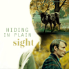
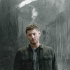
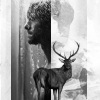
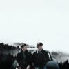
A photography favorite. This composition technique involves dividing the canvas into ninths as follows:
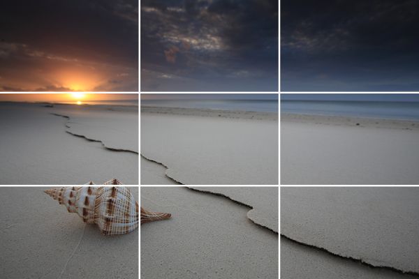
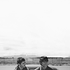
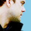
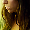
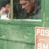
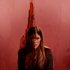
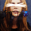
The idea is the subject should either fill 2/3 or 1/3 of the canvas or the subject should lie along one of the grid lines (I was taught different things between photography and art classes, so let's just go along with both). I find it's a nice tidy way to organise negative space. For example:


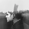
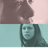
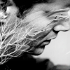
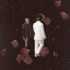
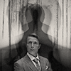
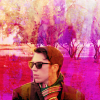
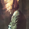
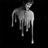
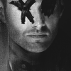
I'm not going to lie, I hate this composition, I do it more often than I'd like and for the most part unless it's used in blocking it can look awkward, but since I don't really pay much attention to composition until after I've made the icon sometimes it just happens. The premise is simple, split the icon in half using the subject or textures. It's a good way to keep a close crop and still have ample negative space. Once you're done though it's good to take a step away from the photoshop and come back and take a look at the icon, this composition goes wrong very fast (in fact it did with a couple of these example icons).


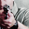
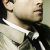
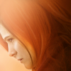
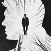
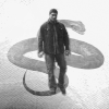
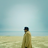
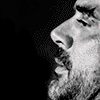
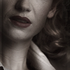
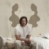
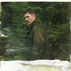
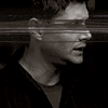
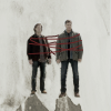
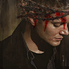
Lead room is a term that refers to negative space in front of a character/subject. It's the idea that having negative space in front of or in the direction of an object suggests movement and since the eye expects to see this space it is meant to be more visually pleasing. This isn't something I do very often as I favour center crops (and lets be real, my cropping skills aren't particularly refined) but it is always something to keep in mind when doing close-crops.

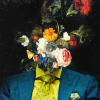
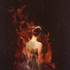
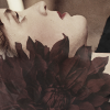
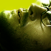
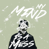
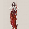
I love paint textures, they give this messy look that I'm drawn to. I use them primarily to 'finish off' an icon, where the icon feels like it's missing a little something. I do also use them a lot as decorative features or to distort the subject. I think if there is one texture type you want to use and learn to use well I'd say it should be paint textures. Plus I find they are a great way to get a softer grunge look than traditional grunge textures.


I brought myself a Wacom Bamboo about 5 years ago because cutting out background with a mouse was driving me nuts and I had just got my tax return. I use mine a lot, like A LOT, and if you have a spare $100 kicking around, I highly recommend getting a low-end one. It's great for idea for concepts that you can't execute with a texture or the texture doesn't quite fit and needs some hard-core editing.


There's no secret that I love using stock in my icons, to me there's something special about changing the screencap to be something uniquely yours.
Common stock textures I use:
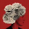
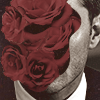
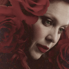
Flowers: for me these represent death, I always relate them more to the flowers left on a grave than those given by a lover
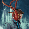
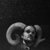
Animal features: represents a change or a loss of morals
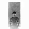
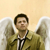
Wings: Represents power
Skull/skeleton: humanity, imperfections, death
Black smoke: evil
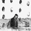
Landscape: isolation, escaping reality/obligations
Snakes: evil, bad intentions
Hands: control/influence

I find icons more interesting if they have a message, story, or emotion behind them. Even a simple crop and colour and say so much through composition, contrast and the colouring itself.
- Think about the characters you are using, are they happy, sad, confused, lost, etc? Is there an event or character trait/trope in their past that you want to emphasize?
- Think about you. We put hours into each of our icon, why not put a little more of you in instead of just your time? Do you relate to the character(s) in your icon for a particular reason? Is there an event in the character's life that you relate to? Is there simply something going on in your life you want to get off your chest? I make a lot of my icons dark and messy, because that's what's going on in my head and iconning is a good release.
- Think about symbolism through colours, texture use, obscuring parts of the image, negative space.
Things to remember:
- don't overcomplicate your composition. Make it obvious what the most part important part of the icon is regardless of how you've composed it, don't let all the elements in the icon fight for attention because it just makes it look like you had no overall plan for the icon. Even if you didn't have a plan, fake it until you make it, as they say.
- It's okay to try something out of your comfort zone, you'll never evolve your style unless you try new things, don't be afraid to fail!
- Making icons shouldn't be a chore. If you're not having fun, take a step back and try again later!
So for me composition isn't something I think too much about for the most part. The only time I really consider it is with regards to negative space. The closer I crop to a character the more I'm trying to focus on the emotions they are displaying, the further I crop the more I'm focusing on the emotions they are NOT displaying, such as a feeling of isolation.
So I like to make it painfully obvious where you need to be looking in my icons, none of this 'natural movement of gaze' rubbish they teach you in art class. I find the best way to direct this gaze by framing the icon in negative space to uncomplicate the composition and draw the eye to where the subject of interest is.
A photography favorite. This composition technique involves dividing the canvas into ninths as follows:
The idea is the subject should either fill 2/3 or 1/3 of the canvas or the subject should lie along one of the grid lines (I was taught different things between photography and art classes, so let's just go along with both). I find it's a nice tidy way to organise negative space. For example:
I'm not going to lie, I hate this composition, I do it more often than I'd like and for the most part unless it's used in blocking it can look awkward, but since I don't really pay much attention to composition until after I've made the icon sometimes it just happens. The premise is simple, split the icon in half using the subject or textures. It's a good way to keep a close crop and still have ample negative space. Once you're done though it's good to take a step away from the photoshop and come back and take a look at the icon, this composition goes wrong very fast (in fact it did with a couple of these example icons).
Lead room is a term that refers to negative space in front of a character/subject. It's the idea that having negative space in front of or in the direction of an object suggests movement and since the eye expects to see this space it is meant to be more visually pleasing. This isn't something I do very often as I favour center crops (and lets be real, my cropping skills aren't particularly refined) but it is always something to keep in mind when doing close-crops.
I love paint textures, they give this messy look that I'm drawn to. I use them primarily to 'finish off' an icon, where the icon feels like it's missing a little something. I do also use them a lot as decorative features or to distort the subject. I think if there is one texture type you want to use and learn to use well I'd say it should be paint textures. Plus I find they are a great way to get a softer grunge look than traditional grunge textures.
I brought myself a Wacom Bamboo about 5 years ago because cutting out background with a mouse was driving me nuts and I had just got my tax return. I use mine a lot, like A LOT, and if you have a spare $100 kicking around, I highly recommend getting a low-end one. It's great for idea for concepts that you can't execute with a texture or the texture doesn't quite fit and needs some hard-core editing.
There's no secret that I love using stock in my icons, to me there's something special about changing the screencap to be something uniquely yours.
Common stock textures I use:
Flowers: for me these represent death, I always relate them more to the flowers left on a grave than those given by a lover
Animal features: represents a change or a loss of morals
Wings: Represents power
Skull/skeleton: humanity, imperfections, death
Black smoke: evil
Landscape: isolation, escaping reality/obligations
Snakes: evil, bad intentions
Hands: control/influence
I find icons more interesting if they have a message, story, or emotion behind them. Even a simple crop and colour and say so much through composition, contrast and the colouring itself.
- Think about the characters you are using, are they happy, sad, confused, lost, etc? Is there an event or character trait/trope in their past that you want to emphasize?
- Think about you. We put hours into each of our icon, why not put a little more of you in instead of just your time? Do you relate to the character(s) in your icon for a particular reason? Is there an event in the character's life that you relate to? Is there simply something going on in your life you want to get off your chest? I make a lot of my icons dark and messy, because that's what's going on in my head and iconning is a good release.
- Think about symbolism through colours, texture use, obscuring parts of the image, negative space.
Things to remember:
- don't overcomplicate your composition. Make it obvious what the most part important part of the icon is regardless of how you've composed it, don't let all the elements in the icon fight for attention because it just makes it look like you had no overall plan for the icon. Even if you didn't have a plan, fake it until you make it, as they say.
- It's okay to try something out of your comfort zone, you'll never evolve your style unless you try new things, don't be afraid to fail!
- Making icons shouldn't be a chore. If you're not having fun, take a step back and try again later!