tutorial: love triangle
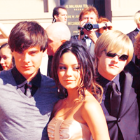
See the icon I'm using to post? Wanna learn how to make it?
From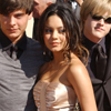
to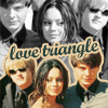
Made in PSCS2, involves selective coloring
requested by pinkishgirly
The original that I made has a bit softer coloring to it, but if you adjust the settings in the tutorial, you can get the same. And there are double steps in this, so beware. Any questions, please ask.
Step One
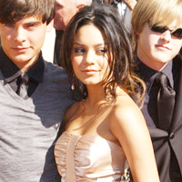
Take your picture and pull it into a 200x200 box. It's easier to work with when it's bigger. Pull it to where you want it (Don't CROP!) and duplicate it to SCREEN.
Step Two
If you went and checked out the previous tutorial on Sandy & the Girls, you know about the hue/sat & selecting coloring layers. Bring those over to this tutorial.
Hue/Saturation
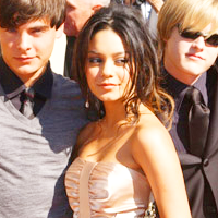
Go to Layer - New Adjustment Layer - Hue/Saturation. Up the Saturation to 23 and hit okay.
Selective Coloring
Go to Layer - New Adjustment Layer - Selective Coloring. You're going to be using all Colors except Magenta, White & Black.
Reds:
Cyan -100
Yellow +100
Yellows:
Cyan +52
Yellow -55
Greens:
Cyan +44
Yellow -71
Cyans:
Cyan +71
Magenta -67
Yellow -74
Blues:
Cyan +52
Magenta +27
Yellow +52
Neutrals:
Cyan -29
Magenta -26
Yellow -59
Black +33
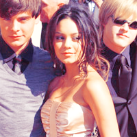
Step Three
Duplicate your base image and drag it up to the top. Set this to SOFT LIGHT.
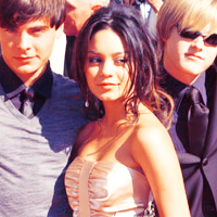
Copy & Merge everything again (Edit - Copy Merged - Paste). Now, DESATURATE (Image - Adjustments - Desaturate) the image. Duplicate it and set it to Color.
Step Four
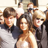
Leave that image alone for now. Go back to your base image again and duplicate it, bring it up to the top and resize the image down. Remember, it should be smaller than the desaturated layer we just did. And you're going to follow the same steps as above up until the desaturation.
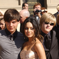
-
-
Step Five
Now that you've got the two bases done, here comes the tricky part. I'm going to be calling the bigger image A and the smaller image B. Bring base A back up to the top, then bring base B above it.
Pull base B down a bit to a place you like. You're going to do some cutting here, so make sure you have it where you want it.
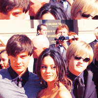
Using your polygonal lasso tool, start cutting away the excess image around Lucas, Vanessa & Zac. You should end up with something like this:
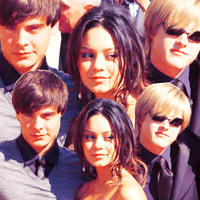
I realize that there are two colored images here. The background - base A - is supposed to be b&w/desaturated.
Flip it
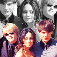
Step Six
The coloring is really up to you. I didn't want that blue anymore and instead of going with a variations layer, I chose a color layer instead. I went up to Layer - New Fill Layer - Color. But wait! When the popup screen pops-up, you see this little white box and a question next to it asking if you want to group the layer with the previous layer. Check the box, since you only want this color with the colored image and not the desaturated one.
I chose color #f3d59a and set it on MULITPLY @ 50% and I got this:
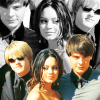
Pretty, isn't it?
Step Seven
Resize the icon now. Go to Image - Image size and key in 100, it will automatically resize it for you. Say OK.
Select the base B, which we just cut, on your layer palette. Now, there are two ways you can get the outline around the base B.
Option 1: Layer - Layer Style - Stroke
Option 2: See the tiny 'f' at the bottom of your layer palette. Click that and choose stroke.
Stroke Properties:
Color - #f3d59a
Opacity - 100%
Size - 2
Position - Outside
Blend Mode - Normal
You should get this: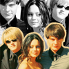
Step Eight
Now adding the text is pretty simple. You're going to use the same stroke options in Step Seven to outline it. I used Script Bold and keyed in 'Love Triangle' and just tilted it a bit.
Step Nine
Add in one more Hue/Saturation Layer with these settings:
Hue: -2
Sat: -20
and viola!

Original vs. Reproduction
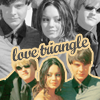
-
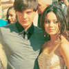
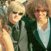
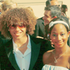
Other examples with the same type of coloring, but no double layers:
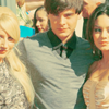
From

to

Made in PSCS2, involves selective coloring
requested by pinkishgirly
The original that I made has a bit softer coloring to it, but if you adjust the settings in the tutorial, you can get the same. And there are double steps in this, so beware. Any questions, please ask.
Step One
Take your picture and pull it into a 200x200 box. It's easier to work with when it's bigger. Pull it to where you want it (Don't CROP!) and duplicate it to SCREEN.

Step Two
If you went and checked out the previous tutorial on Sandy & the Girls, you know about the hue/sat & selecting coloring layers. Bring those over to this tutorial.
Hue/Saturation
Go to Layer - New Adjustment Layer - Hue/Saturation. Up the Saturation to 23 and hit okay.

Selective Coloring
Go to Layer - New Adjustment Layer - Selective Coloring. You're going to be using all Colors except Magenta, White & Black.
Reds:
Cyan -100
Yellow +100
Yellows:
Cyan +52
Yellow -55
Greens:
Cyan +44
Yellow -71
Cyans:
Cyan +71
Magenta -67
Yellow -74
Blues:
Cyan +52
Magenta +27
Yellow +52
Neutrals:
Cyan -29
Magenta -26
Yellow -59
Black +33

Step Three
Duplicate your base image and drag it up to the top. Set this to SOFT LIGHT.

Copy & Merge everything again (Edit - Copy Merged - Paste). Now, DESATURATE (Image - Adjustments - Desaturate) the image. Duplicate it and set it to Color.
Step Four
Leave that image alone for now. Go back to your base image again and duplicate it, bring it up to the top and resize the image down. Remember, it should be smaller than the desaturated layer we just did. And you're going to follow the same steps as above up until the desaturation.

-

-

Step Five
Now that you've got the two bases done, here comes the tricky part. I'm going to be calling the bigger image A and the smaller image B. Bring base A back up to the top, then bring base B above it.
Pull base B down a bit to a place you like. You're going to do some cutting here, so make sure you have it where you want it.

Using your polygonal lasso tool, start cutting away the excess image around Lucas, Vanessa & Zac. You should end up with something like this:

I realize that there are two colored images here. The background - base A - is supposed to be b&w/desaturated.
Flip it

Step Six
The coloring is really up to you. I didn't want that blue anymore and instead of going with a variations layer, I chose a color layer instead. I went up to Layer - New Fill Layer - Color. But wait! When the popup screen pops-up, you see this little white box and a question next to it asking if you want to group the layer with the previous layer. Check the box, since you only want this color with the colored image and not the desaturated one.
I chose color #f3d59a and set it on MULITPLY @ 50% and I got this:

Pretty, isn't it?
Step Seven
Resize the icon now. Go to Image - Image size and key in 100, it will automatically resize it for you. Say OK.
Select the base B, which we just cut, on your layer palette. Now, there are two ways you can get the outline around the base B.
Option 1: Layer - Layer Style - Stroke
Option 2: See the tiny 'f' at the bottom of your layer palette. Click that and choose stroke.
Stroke Properties:
Color - #f3d59a
Opacity - 100%
Size - 2
Position - Outside
Blend Mode - Normal
You should get this:

Step Eight
Now adding the text is pretty simple. You're going to use the same stroke options in Step Seven to outline it. I used Script Bold and keyed in 'Love Triangle' and just tilted it a bit.
Step Nine
Add in one more Hue/Saturation Layer with these settings:
Hue: -2
Sat: -20
and viola!

Original vs. Reproduction
-

Other examples with the same type of coloring, but no double layers: