PHOTOSHOP CS tutorial
Brightening from 
to
without "Duplicate, screen, duplicate, screen".. Using mostly gradient maps.
The table is kind of messy, but it was even harder to read without it, so.

Crop your base to 100x100. I don't like to sharpen screen caps, but you can if you want. That base is so dark. You can barely see Haley and Nathan.

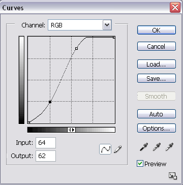
Now go to Layer >> New Adjustment Layer >> Curves. Or, on your layer palette.. find the "half black, half white" circle and click on it, then go to curves. I always use the latter. For this icon, I used the following settings:

New Adjustment Layer again. This time, I'm using a gradient map. I selected the default black to white and reversed it.
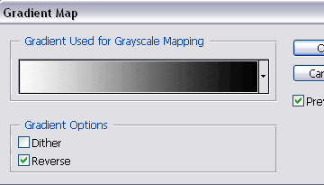
Set this layer to soft light.

New gradient map layer. Black to white, default.
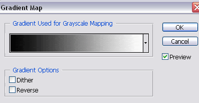
Set it to screen.

Gradient map layer. I used a dark-to-light tan gradient by crumblingwalls
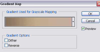
Set this to soft light.

Another gradient by crumblingwalls. This is a dark blue to light blue one.
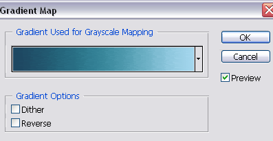
Set this to soft light at 50%.

Go back to the base, duplicate it, and drag it to the top. Set this to screen.

Create a new layer, fill it with a light blue (#D8EFFB) and set it to color burn at 40%

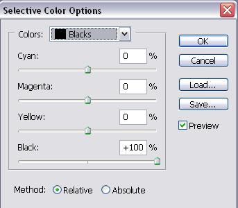
Create a new "Selective Color" adjustment layer. I used the settings below.
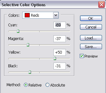
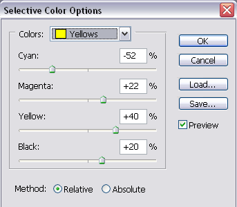
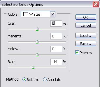

Create a new layer and have black as the foreground colour. With a soft, round (default) brush, I went over the bottom and sides of the icon. I then set this layer to soft light.

The red indicates where I brushed in black.

Now you can finish up your icon with.. whatever! I went on to make this.

to

without "Duplicate, screen, duplicate, screen".. Using mostly gradient maps.
The table is kind of messy, but it was even harder to read without it, so.

Crop your base to 100x100. I don't like to sharpen screen caps, but you can if you want. That base is so dark. You can barely see Haley and Nathan.

Now go to Layer >> New Adjustment Layer >> Curves. Or, on your layer palette.. find the "half black, half white" circle and click on it, then go to curves. I always use the latter. For this icon, I used the following settings:


New Adjustment Layer again. This time, I'm using a gradient map. I selected the default black to white and reversed it.

Set this layer to soft light.

New gradient map layer. Black to white, default.

Set it to screen.

Gradient map layer. I used a dark-to-light tan gradient by crumblingwalls

Set this to soft light.

Another gradient by crumblingwalls. This is a dark blue to light blue one.

Set this to soft light at 50%.

Go back to the base, duplicate it, and drag it to the top. Set this to screen.

Create a new layer, fill it with a light blue (#D8EFFB) and set it to color burn at 40%

Create a new "Selective Color" adjustment layer. I used the settings below.


Create a new layer and have black as the foreground colour. With a soft, round (default) brush, I went over the bottom and sides of the icon. I then set this layer to soft light.

The red indicates where I brushed in black.

Now you can finish up your icon with.. whatever! I went on to make this.