Sephiroth// Fallen tutorial. ♥
Okay, okay, I'll admit I said this icon was simple to make. So, that's why I have spent hours of trial and error to figure out exactly what I did. =/ So I do have a variation and I think that it looks quite close.
From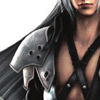
to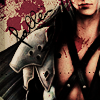
Made in PS CS3 and is mostly translatable. There is a bit of selective coloring but nothing that makes a huge difference.
Step one>> start with your image. I used this. I would suggest using an image that has a blank background. Crop to your liking and keep in mind there should be a bit of blank space to the left of your subject. I like to have odd angles in my crops, it makes me feel special.
Step two>> you can 'sharpen' the image if you want, I usually go for a 'sharpen edges' kind of thing. You do what makes you feel good. Anyways, duplicate your base and set that layer to 'screen'@70%.
Step three>> duplicate the base again and drag it to the top and set the layer to 'overlay'.
Step four>> duplicate the base three times and drag each one to the top. Set them all to 'soft light'.
Step five>> this is the selective coloring step. I'm pretty sure the only thing this step does is take out the yellow in Sephiroth's skin. But, hey who am I to judge if you like Sephroth's yellow skin? So, right the selective color-
Reds; -24, 100, 100, -65
Yellows; -100, -84, -100, -90
Magenta; 100, 100, 100, 100
Step six>> when I finished the coloring I decided it was time to add my texture. I used the 'quick selection tool' to select the white space by Sephiroth's shoulder on the top layer only then 'cut' it. Now I took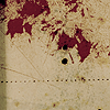
(from 77words "Rather Grungy" set) and set it to 'multiply'.
Step seven>> Now take the texture and drag it underneath the first layer. Play with the opacity if it's too overpowering.
Step eight>> Almost done, I swear! Now for text which I hate with a burning passion. I typed "fallen" with the font 'violation' at 18pt in black(#000000). I rotated it using the 'free transform'(ctrl+T) option. I put mine at -45.
Ta-da! You are finished! Now sit back and enjoy your work. The only problem I had with recreating the icon was the purpleish hue that it seemed to have. I thought I would fix that by upping the magentas. I was wrong. So if you have any ideas on how I did that, share them!
Hopefully I was not confusing! :D
From

to

Made in PS CS3 and is mostly translatable. There is a bit of selective coloring but nothing that makes a huge difference.
Step one>> start with your image. I used this. I would suggest using an image that has a blank background. Crop to your liking and keep in mind there should be a bit of blank space to the left of your subject. I like to have odd angles in my crops, it makes me feel special.
Step two>> you can 'sharpen' the image if you want, I usually go for a 'sharpen edges' kind of thing. You do what makes you feel good. Anyways, duplicate your base and set that layer to 'screen'@70%.
Step three>> duplicate the base again and drag it to the top and set the layer to 'overlay'.
Step four>> duplicate the base three times and drag each one to the top. Set them all to 'soft light'.
Step five>> this is the selective coloring step. I'm pretty sure the only thing this step does is take out the yellow in Sephiroth's skin. But, hey who am I to judge if you like Sephroth's yellow skin? So, right the selective color-
Reds; -24, 100, 100, -65
Yellows; -100, -84, -100, -90
Magenta; 100, 100, 100, 100
Step six>> when I finished the coloring I decided it was time to add my texture. I used the 'quick selection tool' to select the white space by Sephiroth's shoulder on the top layer only then 'cut' it. Now I took

(from 77words "Rather Grungy" set) and set it to 'multiply'.
Step seven>> Now take the texture and drag it underneath the first layer. Play with the opacity if it's too overpowering.
Step eight>> Almost done, I swear! Now for text which I hate with a burning passion. I typed "fallen" with the font 'violation' at 18pt in black(#000000). I rotated it using the 'free transform'(ctrl+T) option. I put mine at -45.
Ta-da! You are finished! Now sit back and enjoy your work. The only problem I had with recreating the icon was the purpleish hue that it seemed to have. I thought I would fix that by upping the magentas. I was wrong. So if you have any ideas on how I did that, share them!
Hopefully I was not confusing! :D