Round 15: Phase Two - Results
ROUND FIFTEEN: PHASE TWO - RESULTS
SAYING GOODBYE
Selphie - moonshadow_nal
Lightning - lefthandpenguin
Sorry to see you both go.
RESULTS
Zack: +7, -2 = +5
Scarlet: +1
Vanille: +2, -6 = -4
Selphie: -7
Lightning: +1, -8 = -7
Rikku: +5, -1 = +4
Auron: +17 Favorite Icon of the Phase!
Serah: +15, -1 = +14
[+] = positive vote; [-] = negative vote; [G] = General comment
: Zack
[+] The colors on this are gorgeous and still manage to fit with the theme without losing any depth.
[+] I love the way it looks. Everything is so crisp and vibrant!
[+] I love the way the coloring looks, the bright red orange really stands out in a cool way.
: Scarlet
no comments left
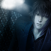
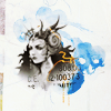
: Vanille
[+] I really, really like the simplicity of this, I just wish the theme was a little more evident in the icon.
[-] The area around his face is a bit dull in terms of lighting. Maybe use Curves or Levels to contrast the shades around that area.
[-] This icon just seems really plain and dull compared to the others.
[-] The icon's coloring is really flat and dark, it's hard to make out details like Noctis's hair and clothes. Maybe up the contrast so the viewer can make out exactly what's going on in the icon. The light texture is also either a little too big or bright, it draws the viewer's eye away from Noctis. Lower the opacity next time? Also, the required color scheme of this phase isn't as obvious in this icon as it is in the others.
[-] The cropping is too center that it throws the icon off. If it was offset either horizontally or vertically, the overall icon would be more appealing.
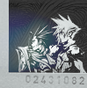
: Selphie
[-] The texture is really overpowering over the rest of the cast, especially with the mini-light flares, and it works to wash them out better than emphasize anything. The image as a whole looks over-sharpened, including the texture and the text.
[-] The image is really blurry and I cannot read the text at all.
[-] This icon just feels a bit unpolished (oversharpened, dull) compared to the others.
[-] The cropping is great & the text placements pretty nice as well, it's just that the icon is a bit pixilated esp. around the characters.
[-] I like the idea behind the icon but the image is blurry and the FF12 cast wasn't very cleanly masked or cut out of their background. That font makes the caption hard to read too.
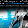
: Lightning
[+] Love the nice contrast of black&white against the blue background. The font could be better, but still very fitting overall.
[-] The cropping is sort of an interesting idea but something is lacking in the icon-- I think the text just doesn't flow with the rest of it.
[-] Interesting crop, but the black bar on top takes up too much of the icon. The text becomes too distracting and takes away from the main focus of the icon.
[-] The cropping is a little off. Its a strange place to "zoom" in on.. the top bar thing with the text on it just doesn't help.
[-] The cropping is odd; you've left a lot of space to the left side which seems too empty, and the black area comes a little too far down. It might've been better to move the figure further down to icon. The character also seems blurry in comparison to the sharp background & grainy texture you've used.
[-] I love the bright blues and cropping but I think the text needs a bit more work, it's a bit pixilated & it contrasts with the icon.
: Rikku
[+] Love the cropping on this one. Everything has such an ethereal feel. The text feels just a little too small, but the placement is good.
[+] The center crop works really well in the icon. A nice balance with the text and the colors.
[-] This is a nice icon but the textures and coloring on it seem to be taking away from it a bit. I think it could have been better if it was a bit clearer and sharper looking.
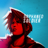
: Auron
[+] I really super love just how simple this icon is, but it works so well. The coloring isn't overwhelming, nor does it clash. And the text works to bring the focus right back to Squall's face.
[+] The color theme of Red + Blue is very daring, but this icon was pulled off nicely! The little white shadow gives off a nice overall look.
[+] Nice colours.
[+] I love the bold coloring on Squall; it really makes this icon stand out!
[+] Love the chosen hue of red and blue, the way the caption is placed and arranged, the placement of the light texture and the usage of the grainy one; the whole thing is gorgeous. It's all very modern looking.
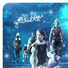
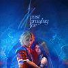
: Serah
[+] HOLY CRAP I LOVE THIS ICON. If I could use it I would! The textures used were done so well and I love this sort of cropping. Really awesome icon.
[+] Great cropping and use of textures. They're visible without being overhauling and taking away from the main focus.
[+] Great use of textures!
[+] I adore the textures, cropping, image placement, simplicity, etc. It's a fabulous amazing icon.
[+] Another super creative looking icon. Love the texture usage and the centering of the image.
[+] This is really cool. I like the placement and the coloring. Its sweet.
[-] I love the overall composition of this icon, but the numbers seem a little out of place, as does the yellow line over Ultimecia.
SAYING GOODBYE
Selphie - moonshadow_nal
Lightning - lefthandpenguin
Sorry to see you both go.
RESULTS
Zack: +7, -2 = +5
Scarlet: +1
Vanille: +2, -6 = -4
Selphie: -7
Lightning: +1, -8 = -7
Rikku: +5, -1 = +4
Auron: +17 Favorite Icon of the Phase!
Serah: +15, -1 = +14
[+] = positive vote; [-] = negative vote; [G] = General comment
: Zack
[+] The colors on this are gorgeous and still manage to fit with the theme without losing any depth.
[+] I love the way it looks. Everything is so crisp and vibrant!
[+] I love the way the coloring looks, the bright red orange really stands out in a cool way.
: Scarlet
no comments left
: Vanille
[+] I really, really like the simplicity of this, I just wish the theme was a little more evident in the icon.
[-] The area around his face is a bit dull in terms of lighting. Maybe use Curves or Levels to contrast the shades around that area.
[-] This icon just seems really plain and dull compared to the others.
[-] The icon's coloring is really flat and dark, it's hard to make out details like Noctis's hair and clothes. Maybe up the contrast so the viewer can make out exactly what's going on in the icon. The light texture is also either a little too big or bright, it draws the viewer's eye away from Noctis. Lower the opacity next time? Also, the required color scheme of this phase isn't as obvious in this icon as it is in the others.
[-] The cropping is too center that it throws the icon off. If it was offset either horizontally or vertically, the overall icon would be more appealing.
: Selphie
[-] The texture is really overpowering over the rest of the cast, especially with the mini-light flares, and it works to wash them out better than emphasize anything. The image as a whole looks over-sharpened, including the texture and the text.
[-] The image is really blurry and I cannot read the text at all.
[-] This icon just feels a bit unpolished (oversharpened, dull) compared to the others.
[-] The cropping is great & the text placements pretty nice as well, it's just that the icon is a bit pixilated esp. around the characters.
[-] I like the idea behind the icon but the image is blurry and the FF12 cast wasn't very cleanly masked or cut out of their background. That font makes the caption hard to read too.
: Lightning
[+] Love the nice contrast of black&white against the blue background. The font could be better, but still very fitting overall.
[-] The cropping is sort of an interesting idea but something is lacking in the icon-- I think the text just doesn't flow with the rest of it.
[-] Interesting crop, but the black bar on top takes up too much of the icon. The text becomes too distracting and takes away from the main focus of the icon.
[-] The cropping is a little off. Its a strange place to "zoom" in on.. the top bar thing with the text on it just doesn't help.
[-] The cropping is odd; you've left a lot of space to the left side which seems too empty, and the black area comes a little too far down. It might've been better to move the figure further down to icon. The character also seems blurry in comparison to the sharp background & grainy texture you've used.
[-] I love the bright blues and cropping but I think the text needs a bit more work, it's a bit pixilated & it contrasts with the icon.
: Rikku
[+] Love the cropping on this one. Everything has such an ethereal feel. The text feels just a little too small, but the placement is good.
[+] The center crop works really well in the icon. A nice balance with the text and the colors.
[-] This is a nice icon but the textures and coloring on it seem to be taking away from it a bit. I think it could have been better if it was a bit clearer and sharper looking.
: Auron
[+] I really super love just how simple this icon is, but it works so well. The coloring isn't overwhelming, nor does it clash. And the text works to bring the focus right back to Squall's face.
[+] The color theme of Red + Blue is very daring, but this icon was pulled off nicely! The little white shadow gives off a nice overall look.
[+] Nice colours.
[+] I love the bold coloring on Squall; it really makes this icon stand out!
[+] Love the chosen hue of red and blue, the way the caption is placed and arranged, the placement of the light texture and the usage of the grainy one; the whole thing is gorgeous. It's all very modern looking.
: Serah
[+] HOLY CRAP I LOVE THIS ICON. If I could use it I would! The textures used were done so well and I love this sort of cropping. Really awesome icon.
[+] Great cropping and use of textures. They're visible without being overhauling and taking away from the main focus.
[+] Great use of textures!
[+] I adore the textures, cropping, image placement, simplicity, etc. It's a fabulous amazing icon.
[+] Another super creative looking icon. Love the texture usage and the centering of the image.
[+] This is really cool. I like the placement and the coloring. Its sweet.
[-] I love the overall composition of this icon, but the numbers seem a little out of place, as does the yellow line over Ultimecia.