Round 14: Phase Four - Results
ROUND 14 : PHASE FOUR - RESULTS
Well, we finally have enough votes to clearly determine the eliminated iconmaker.
SAYING GOODBYE
Vincent - oulan
RESULTS
Agrias: -1
Sazh: -4, +2 = -2
Cloud: -1, +3 = 2 Favorite Icon of the Phase!
Aerith: +1, -3 = -2
Kadaj: -5
Vincent: -6
COMMENTS
[+] = positive vote; [-] = negative vote; [G] = General comment

: Agrias
[-] The placement of the bottom image looks awkward. Perhaps if both images were facing the same way, or if the colouring had been switched around (top - b&w, bottom - colour)...

: Sazh
[+] Great colouring and use of texture. Text blends in well with it too.
[-] The coloring is really too dark, the image gets lost a bit. The drop shadow on the text seems really noticeable too, maybe it could be toned down a bit.
[-] The way the textures are used in this icon is obscuring the image rather than bringing it out and I'm concentrating more on the textures rather than the image.
[-] I like the grunge, but the white part of the texture doesn't fit the image, in my opinion. It's way too distracting from the subject. I LOVE the cropping though.
[+] Love the colors, the angle, the textures - just beautiful composition

: Cloud
[+] The colors and textures work really well with the image
[+] I love how all the textures were used in this icon and how perfect the vintage look is in this.
[-] Muted and monochromatic, the lack of color is sort of boring
[+] Looks classy and divine, even. :)

: Aerith
[+] This came off really classy, and the darkness fits the mood of the image and the character well. The tones found in the image of Lulu are just right.
[-] Very dark with too low contrast
[-] The texture used look very overwhelming and takes away from the image

: Kadaj
[-] The colouring looks a little dirty/grimy somehow, and her hair has a greenish-tinge to it. Not exactly vintage, I think.
[-] I don't like the text. It's extremely hard to read. I had to strain my eyes to read "princess". The coloring is pretty & the image has a neat soft look to it.
[-] The image and text both look very blurry and the crop isn't very creative
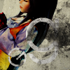
: Vincent
[-] I like the grunge, but the white part of the texture doesn't fit the image, in my opinion. It's way too distracting from the subject. I LOVE the cropping though.
[-] The way the textures are used in this icon is obscuring the image rather than bringing it out and I'm concentrating more on the textures rather than the image.
[-] I do like the effect created with the textures but they don't seem to fit well with the image choice. Also, the colors in the image seem too bright for the grunginess found in the rest of the icon.
[-] While the crop is really good, the texture overshadows it. The circular things would look better positioned in the bottom right corner instead of the centre.
[+] Love the colors, the angle, the textures - just beautiful composition
Well, we finally have enough votes to clearly determine the eliminated iconmaker.
SAYING GOODBYE
Vincent - oulan
RESULTS
Agrias: -1
Sazh: -4, +2 = -2
Cloud: -1, +3 = 2 Favorite Icon of the Phase!
Aerith: +1, -3 = -2
Kadaj: -5
Vincent: -6
COMMENTS
[+] = positive vote; [-] = negative vote; [G] = General comment
: Agrias
[-] The placement of the bottom image looks awkward. Perhaps if both images were facing the same way, or if the colouring had been switched around (top - b&w, bottom - colour)...
: Sazh
[+] Great colouring and use of texture. Text blends in well with it too.
[-] The coloring is really too dark, the image gets lost a bit. The drop shadow on the text seems really noticeable too, maybe it could be toned down a bit.
[-] The way the textures are used in this icon is obscuring the image rather than bringing it out and I'm concentrating more on the textures rather than the image.
[-] I like the grunge, but the white part of the texture doesn't fit the image, in my opinion. It's way too distracting from the subject. I LOVE the cropping though.
[+] Love the colors, the angle, the textures - just beautiful composition
: Cloud
[+] The colors and textures work really well with the image
[+] I love how all the textures were used in this icon and how perfect the vintage look is in this.
[-] Muted and monochromatic, the lack of color is sort of boring
[+] Looks classy and divine, even. :)
: Aerith
[+] This came off really classy, and the darkness fits the mood of the image and the character well. The tones found in the image of Lulu are just right.
[-] Very dark with too low contrast
[-] The texture used look very overwhelming and takes away from the image
: Kadaj
[-] The colouring looks a little dirty/grimy somehow, and her hair has a greenish-tinge to it. Not exactly vintage, I think.
[-] I don't like the text. It's extremely hard to read. I had to strain my eyes to read "princess". The coloring is pretty & the image has a neat soft look to it.
[-] The image and text both look very blurry and the crop isn't very creative
: Vincent
[-] I like the grunge, but the white part of the texture doesn't fit the image, in my opinion. It's way too distracting from the subject. I LOVE the cropping though.
[-] The way the textures are used in this icon is obscuring the image rather than bringing it out and I'm concentrating more on the textures rather than the image.
[-] I do like the effect created with the textures but they don't seem to fit well with the image choice. Also, the colors in the image seem too bright for the grunginess found in the rest of the icon.
[-] While the crop is really good, the texture overshadows it. The circular things would look better positioned in the bottom right corner instead of the centre.
[+] Love the colors, the angle, the textures - just beautiful composition