Round 14: Phase Two - Results
ROUND 14: PHASEN ONE - RESULTS
SAYING GOODBYE
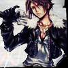
Fujin - margyydoodle
RESULTS
G = General comment
Cloud: -3
Yazoo: +3 Favorite icon of the phase!
Aerith: -2
Vincent: 0
Sazh: -1
Agrias: 0
Kadaj: -2
Yuna: +1
Ashe: -1
Lightning: +1
Larsa: -1
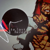
Fujin: -6
COMMENTS
[+] = positive vote; [-] = negative vote; [G] = General comment

: Cloud
[-] The coloring is dull and the paper texture doesn't really match the image.

: Yazoo
[+] The coloring and the cropping is amazing! I love the fire texture used as well.
[+] Creative use of texture.
[+] The coloring is fabulous and the texture background works very well with the background behind Oerba. Nicely unified.

: Aerith
[-] The text is hard to read, you really do have to squint to read what it is saying.
[-] It's a pretty icon, but I feel it's just a bit too blue and would have worked better without the text.
: Vincent
No comments

: Sazh
[-] It's hard to identify which texture was used in this icon.

: Agrias
No comments

: Kadaj
[-] It's a nice icon, I just feel it needed something else, perhaps a light texture to give it a lift.
: Yuna
[+] Lovely, eye-catching colouring.
: Ashe
[-] The text and the space behind it is really distracting. It doesn't seem to blend well with the icon even though the cropping is good.
: Lightning
[+] I love the originality of this icon. The fact that Yuna was placed upside down was very daring but it works. Also, I really like how the text follows the edge of the paper texture.
: Larsa
[-] It's not a very creative crop and the icon doesn't pop out like the other icons do.
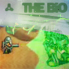
: Fujin
[-] The icon is very blurry and the light textures overlaying the provided texture seem unnecessary.
[-] I for one can't see what my central focus is supposed to be. Is it the text? The green blob in the corner? Or the tiny egg looking thing holding some kind of gun? You shouldn't have a person guessing at what they're supposed to be looking at. I find this icon to be very confusing.
[-] The background looks really blurry and unsharpened. The image quality in general isn't very high, but I think that's because it's a screencap. I like that they actually used Bio in the image
I'll have the next phase up in the next few minutes.
SAYING GOODBYE
Fujin - margyydoodle
RESULTS
G = General comment
Cloud: -3
Yazoo: +3 Favorite icon of the phase!
Aerith: -2
Vincent: 0
Sazh: -1
Agrias: 0
Kadaj: -2
Yuna: +1
Ashe: -1
Lightning: +1
Larsa: -1
Fujin: -6
COMMENTS
[+] = positive vote; [-] = negative vote; [G] = General comment
: Cloud
[-] The coloring is dull and the paper texture doesn't really match the image.
: Yazoo
[+] The coloring and the cropping is amazing! I love the fire texture used as well.
[+] Creative use of texture.
[+] The coloring is fabulous and the texture background works very well with the background behind Oerba. Nicely unified.
: Aerith
[-] The text is hard to read, you really do have to squint to read what it is saying.
[-] It's a pretty icon, but I feel it's just a bit too blue and would have worked better without the text.
: Vincent
No comments
: Sazh
[-] It's hard to identify which texture was used in this icon.
: Agrias
No comments
: Kadaj
[-] It's a nice icon, I just feel it needed something else, perhaps a light texture to give it a lift.
: Yuna
[+] Lovely, eye-catching colouring.
: Ashe
[-] The text and the space behind it is really distracting. It doesn't seem to blend well with the icon even though the cropping is good.
: Lightning
[+] I love the originality of this icon. The fact that Yuna was placed upside down was very daring but it works. Also, I really like how the text follows the edge of the paper texture.
: Larsa
[-] It's not a very creative crop and the icon doesn't pop out like the other icons do.
: Fujin
[-] The icon is very blurry and the light textures overlaying the provided texture seem unnecessary.
[-] I for one can't see what my central focus is supposed to be. Is it the text? The green blob in the corner? Or the tiny egg looking thing holding some kind of gun? You shouldn't have a person guessing at what they're supposed to be looking at. I find this icon to be very confusing.
[-] The background looks really blurry and unsharpened. The image quality in general isn't very high, but I think that's because it's a screencap. I like that they actually used Bio in the image
I'll have the next phase up in the next few minutes.