Series 2: #6 Results
I confess I'm not doing a good job of late. Anyways, let's post the results first and we'll think of the next step okay?
Yuna, Tifa, Demyx, Marche have been eliminated after this round.
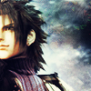
Icon #01 +7 Class 3
[-1] It just needs some more interest like text or something, but I like the crop.
[+2] I like the crop and the coloring of the background, but Zack is a little too yellow. Good job, nonetheless.
[+3] I love the subtle way the texture is incorporated into the clouds. And Zack. Zack is always nice. ^.^
[+1] The crop on this icon is great because you can see where you've used the stock image but still you aren't focusing on just the background and Zack looks really cool too! Well done!
[+2] Wow, that texture looks nothing like it originally did; great job changing it. I think the coloring and cropping are a great combination. You can see the lovely textured background and nice blue/purple hues that also match with Zack's clothes. I think the icon could benefit from a border but it looks nice as is as well.
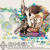
Icon #02 +18 Class 1
[+2] Lots of interest in this icon, love the text.
[-1] I'm not sure whats going on in this icon, its leaving me totally confused on what its trying to say
[+1] I like how Yuna was cropped far away and the background textures looks really good coupled with the image. Plus the texture did not overpower the icon.
[+1] There are a lot of elements in this, but I think it comes together well. A really nice use of the texture.
[+3] Wow! Just wow! This came out great! I love the design!
[+2] I like your unique usage of the texture. It seems natural and fits right in with Yuna.
[+2] Creative composition, the texture is used in an innovative way it doesn't feel forced.
[+3] This icon looks awesome, and I can see how the texture was used without it being obnoxious or messing up the overall appeal of the icon.
[+2] I love the creativity and uniqueness of this icon, the crop is fantastic and I love the use of the stock image.
[+2] Major props for very creative use of the texture! I almost didn't recognize it at first, it was integrated so well into the icon xD
[+1] I thought this icon was very unique, in terms of design and color.
[G] The design looks very creative but there are so many brushes and bubbles and other doo-dads that it looks too busy.
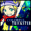
Icon #03 +2 Class 4
[+1] Love the contrast and the use of colors.
[-2] While this is a very cute icon I think it appears a little busy. The thick black border and the text look a little off.
[+1] Even though you didn't change the color as much, I feel like your integration of the pattern is really well done. Plus I love your typography.
[-1] The concept is emphasizing the color, but even so the color use seems a bit excessive. The texture just could have been worked with more. The right side of the image feels really confusing. The text could be a little crisper.
[+3] This icon caught my eye immediately. The bold colors of the lifestone go nicely with this image of Rikku.
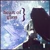
Icon #04 -19 Class 5
[-1] I do like the idea of this icon but the composition is a bit boring. The bracket beside the text looks out of place. The image also appears to be of poor quality.
[-2] It's a nice crop, but the image is too obscured by that scratchy, grainy brush. The font is unimaginative and steals focus by being so dark and hard-edged.
[-2] The texture turned blue in this icon is an interesting substitution for the night sky, but I don't see anything else intriguing about the icon. The text could be better (ex. the bracket isn't necessary) and a better crop might have worked to your advantage.
[-2] The image quality could be better. Maybe it's the texture use, in which case it may have been better not to have it cover Tifa so much to give the icon a cleaner area. The text seems grainy too, and maybe brown wasn't the best text color, it seems to flatten the image a little.
[-2] This icon could have pulled off the "glass" feel a lot better if it didn't look so grainy. The text looks grainy and slapped on in the empty space, and Tifa looks grainy also. The coloring is also not striking.
[-2] I can't tell who and what's in your icon. I can see you've used the stock image but I don't think it's done your icon justice. Sorry :(
[-2] It's hard to tell what exactly is going on in the image, and the text could have been more unique (a different font, maybe?).
[-2] The coloring is far too dull, and the pattern usage in this case makes the quality of the image appear much lower than it is. Also, the text seems just kind of slapped on.
[-2] The background looks really dithered, and the overall image quality of the icon appears to be very poor.
[-2] The texture is a little too much for the sky. It's turned the night sky into a pastel looking blue with a lot of fuzzy white blobs, overpowering the original image. I think the second line of text could have benefited from being either 1) a larger size or 2) a different font or 3) a different color. Text reads differently when different sizes/fonts/colors are used; right now the emphasis is the same for all words and it reads as bland and very static.
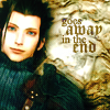
Icon #05 +1 Class 4
[+1] I love the originality of this icon, and how the use of the texture wasn't immediately obvious. It makes it stand out from the crowd. I'm not a huge fan of the coloring (Zack is highly contrasted while the bg is more "old" feeling), I think this icon does a good job.
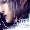
Icon #06+5 Class 3
[+2] I really like the text and texture use on this icon
[+3] One interesting crop, a great color scheme, well done text, and original use of the texture makes one great icon!
[G] Very nice use of texture and text! The XIII looks so awesome xD
Icon #07 -3 Class 4
[-2] I can see the coloring being from the texture, but without that, it's just a screenshot with mini-text on it. :(
[-1] Very plain :\
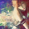
Icon #08 +7 Class 3
[+3] Beautiful colouring, great text
[+3] I like the text a lot and the color line intrigues me for some reason. O.o
[+2] I love the typography
[-1] While this icon shows a very good understanding of composition, brush and text use, the colouring is too muddy and is kind of distracting from all the good points I just mentioned :/ The colours don't go together very well and could have been handled better. Nice use of the texture, though.
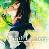
Icon #09 +5 Class 3
[+1] Beautifully bright colouring.
[-1] the text placement doesn't compliment the image
[+3] The coloring and typography are beautiful. I really like the concept.
[+1] The texture was used nicely as the background, and the caption fits nicely; however, the way the text was made to stand out could've been improved (such as a bar of solid color under the text, rather than the fuzzy shadow).
[+1] There's something about how the texture was used that just looks so natural for that image. It really looks like some mystical goo Sora is floating in. The caption compliments the way Sora looks, great choice for that as well.
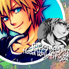
Icon #10 +1 Class 4
[G] I know this person's style~! I would've voted for it had it incorporated more of the Lifestone's texture... I don't get the blue background behind Sora.
[+1] I really like the bright colors and how the texture and insert image was used
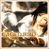
Icon #11
-9 Class 5
[-2] It looks too blurred, and the text box around the text could have been reduced and still helped the text to stand out
[-2] -the image is very blurry
[-1] Just not very interesting overall.
[-1] This icon looks grainy. Everything feels faded in this icon, because the colors don't pop. I'm not a fan of the text placement or the faded white behind it, and the border is not necessary either. It's just an ordinary icon.
[-1] I don't like the colouring that much, it's to brown, and I don't get the "caged bird" reference ex-specially with this picture, I can't tell whats going on in it.
[-1] The image is blurry and the quality of the image looks poor; also, the brush underneath looks really pixelated. Maybe putting it on screen instead of on what appears to be color dodge would've helped.
[-1] The image looks very fuzzy and could probably do with being sharpened once. Either because I am unfamiliar with this game or because of the fuzziness, I can't quite make out what's going on and as such don't feel the caption matches that image very well.
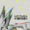
Icon #12 +12 Class 2
[-2] The colouring and little light effects are cool, I'm just not sure I like the crop
[-1] The arm's speckles is what bothers me... Especially under his arm. Color cooties! O___O
[+3] I love this one for its origniality and how they made the texture almost look like fragments or sparks of power
[+2] This icon instantly caught my eye. It's cropped at an odd angle and it makes for an interesting composition. The splatters of color from the texture make for a very different effect and I quite like it.
[+2] I'm a sucker for icons that use a lot of blank space. I think this one has just enough detail to be quite interesting.
[+3] I love how you used the texture!
[-1] It's an interesting crop but I think it ends up leaving too much space for you.
[+1] Really strong crop/composition. I'm a little undecided about how much I like the way the texture is used, but maybe that's part of what makes it so eye-catching.
[+3] This icon used the texture the best way out of all the icons, I can't stop staring *__* Yellow + gray is a great colour combination, and that combined with the cropping and text makes the icon so eye-catching! Super job~
[-1] Although I like the splatters of color and the crop of this icon, this particular b&w coloring makes it far too dull (some contrast would've been nice) and emphasizes the background's emptiness.
[G] At first, I was going to vote off this icon, but I've come to like it. I like the lines under the text, and the lines of the image (even though I can't for the life of me tell what it is) flow nicely across the icon. The speckles of color are really distracting, though.
[+3] This icon is amazing. Innovative, unique, and absolutely gorgeous. I love how the light touches of color create such a different look than most desaturated+color icons. The bar code under the text adds a nice, modern touch as well.
Icon #13 +6 Class 3
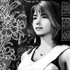
[+3] Usually I am not a big fan of the flower brush or even flowery textures. However, I think the use of the brush coupled with the tiny text looks great! I love the black and white image, it looks so crisp and clear. Great job all around!
[-1] There's too many brush elements in this icon, and without color, it all distracts from a single focus. The tiny text is the tipping point, I think - this would be nicer without it.
[+1] very nice usage of brushes
[+1] While the tinytext on the left side creates an enigma in the composition (which side of the icon should I look at first?), the desaturation was handled very well as the contrast stayed intact, and the image is lovely.
[+2] Nice use of flowers and tiny text; the monochrome works nicely.
Icon #14 +11 Class 2
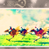
[+1] The coloring came out great!
[+2] I love the color of this icon. While I think the tiny text up top doesn't add anything, it doesn't detract unless you're actually looking for something negative in this icon.
[+3] I love the colouring on this icon, I've tried to icon this image before but I couldn't get it this beautiful! Great job!
[+2] The bright colors are gorgeous, although the grayish border seems a bit out of place.
[+3] Although the gray doesn't match with the rest of the icon, the coloring in the picture itself is lovely, and the composition is nice. Wonderful use of the rule of thirds :)
Icon #15 +2 Class 4 +75 gil
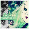
[G] The double image of the hair seems a bit awkward to me, and the text... At first, I thought it said "Las Summoner", but then I found the "T". I like the way her eyes gaze at the text. Nice touch.
[+2] This came out soo pretty :) Great coloring!
[M] Mod's choice by margyy.

Icon A +3
[+1] Def A :D sooo sweet!
[+1]
[+1] I really like this one because it seems more unique. The usage of the texture as an Earth focus really works well and I like how you got Aerith in a battle to fit the theme.
Icon B +11
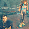
[+1] I love the color and the positionimg of the mini-text. I wonder who will be #1 in Organization XIII? Hmm... ;3
[+1]
[+1] lovely coloring!
[+1]
[+1]
[+1] While the image looks squished, I like the coloring and the simplicity of this icon.
[+1] The coulouring is amazing! I love the blue, it just POPS!!! And great crop! :)
[+1] The colouring on this icon is bright yet not overpowered by the texture used, and the tinytext ties the composition together.
[+1] Lovely crop + coloring. (:
[+1] I really like the coloring and tiny text :D
[+1] Great coloring and cropping, the image is also the perfect sharpness for a wide screen image.
And most of you are already very frustrated with me and this community and of course you have every right to be. At first it was an internet problem, but it sort of dragged on to other problems and really I have no excuses to make. Well, I'll let you decide on the next step.
We only have 11 participants left, so:
A) Continue with 2 more rounds to reach a conclusion. Iconmakers will be pitted with others of the same level.
B) Discontinue this series.
I don't mind if you be blunt, or honest with your answer really. I personally feel that I'm doing an extremely sucky job and I don't want to make any excuses. Instead of leaving all of you waiting, I want to get this on with.
and margyy is helping me all she can, but you know she's busy too, so it's my fault as the mod. Well, anyways I'll wait for an answer from the remaining participants.
I really wanted to make this work to the end and I'm sorry it turned out this way.
Yuna, Tifa, Demyx, Marche have been eliminated after this round.

Icon #01 +7 Class 3
[-1] It just needs some more interest like text or something, but I like the crop.
[+2] I like the crop and the coloring of the background, but Zack is a little too yellow. Good job, nonetheless.
[+3] I love the subtle way the texture is incorporated into the clouds. And Zack. Zack is always nice. ^.^
[+1] The crop on this icon is great because you can see where you've used the stock image but still you aren't focusing on just the background and Zack looks really cool too! Well done!
[+2] Wow, that texture looks nothing like it originally did; great job changing it. I think the coloring and cropping are a great combination. You can see the lovely textured background and nice blue/purple hues that also match with Zack's clothes. I think the icon could benefit from a border but it looks nice as is as well.

Icon #02 +18 Class 1
[+2] Lots of interest in this icon, love the text.
[-1] I'm not sure whats going on in this icon, its leaving me totally confused on what its trying to say
[+1] I like how Yuna was cropped far away and the background textures looks really good coupled with the image. Plus the texture did not overpower the icon.
[+1] There are a lot of elements in this, but I think it comes together well. A really nice use of the texture.
[+3] Wow! Just wow! This came out great! I love the design!
[+2] I like your unique usage of the texture. It seems natural and fits right in with Yuna.
[+2] Creative composition, the texture is used in an innovative way it doesn't feel forced.
[+3] This icon looks awesome, and I can see how the texture was used without it being obnoxious or messing up the overall appeal of the icon.
[+2] I love the creativity and uniqueness of this icon, the crop is fantastic and I love the use of the stock image.
[+2] Major props for very creative use of the texture! I almost didn't recognize it at first, it was integrated so well into the icon xD
[+1] I thought this icon was very unique, in terms of design and color.
[G] The design looks very creative but there are so many brushes and bubbles and other doo-dads that it looks too busy.

Icon #03 +2 Class 4
[+1] Love the contrast and the use of colors.
[-2] While this is a very cute icon I think it appears a little busy. The thick black border and the text look a little off.
[+1] Even though you didn't change the color as much, I feel like your integration of the pattern is really well done. Plus I love your typography.
[-1] The concept is emphasizing the color, but even so the color use seems a bit excessive. The texture just could have been worked with more. The right side of the image feels really confusing. The text could be a little crisper.
[+3] This icon caught my eye immediately. The bold colors of the lifestone go nicely with this image of Rikku.

Icon #04 -19 Class 5
[-1] I do like the idea of this icon but the composition is a bit boring. The bracket beside the text looks out of place. The image also appears to be of poor quality.
[-2] It's a nice crop, but the image is too obscured by that scratchy, grainy brush. The font is unimaginative and steals focus by being so dark and hard-edged.
[-2] The texture turned blue in this icon is an interesting substitution for the night sky, but I don't see anything else intriguing about the icon. The text could be better (ex. the bracket isn't necessary) and a better crop might have worked to your advantage.
[-2] The image quality could be better. Maybe it's the texture use, in which case it may have been better not to have it cover Tifa so much to give the icon a cleaner area. The text seems grainy too, and maybe brown wasn't the best text color, it seems to flatten the image a little.
[-2] This icon could have pulled off the "glass" feel a lot better if it didn't look so grainy. The text looks grainy and slapped on in the empty space, and Tifa looks grainy also. The coloring is also not striking.
[-2] I can't tell who and what's in your icon. I can see you've used the stock image but I don't think it's done your icon justice. Sorry :(
[-2] It's hard to tell what exactly is going on in the image, and the text could have been more unique (a different font, maybe?).
[-2] The coloring is far too dull, and the pattern usage in this case makes the quality of the image appear much lower than it is. Also, the text seems just kind of slapped on.
[-2] The background looks really dithered, and the overall image quality of the icon appears to be very poor.
[-2] The texture is a little too much for the sky. It's turned the night sky into a pastel looking blue with a lot of fuzzy white blobs, overpowering the original image. I think the second line of text could have benefited from being either 1) a larger size or 2) a different font or 3) a different color. Text reads differently when different sizes/fonts/colors are used; right now the emphasis is the same for all words and it reads as bland and very static.

Icon #05 +1 Class 4
[+1] I love the originality of this icon, and how the use of the texture wasn't immediately obvious. It makes it stand out from the crowd. I'm not a huge fan of the coloring (Zack is highly contrasted while the bg is more "old" feeling), I think this icon does a good job.

Icon #06+5 Class 3
[+2] I really like the text and texture use on this icon
[+3] One interesting crop, a great color scheme, well done text, and original use of the texture makes one great icon!
[G] Very nice use of texture and text! The XIII looks so awesome xD

Icon #07 -3 Class 4
[-2] I can see the coloring being from the texture, but without that, it's just a screenshot with mini-text on it. :(
[-1] Very plain :\

Icon #08 +7 Class 3
[+3] Beautiful colouring, great text
[+3] I like the text a lot and the color line intrigues me for some reason. O.o
[+2] I love the typography
[-1] While this icon shows a very good understanding of composition, brush and text use, the colouring is too muddy and is kind of distracting from all the good points I just mentioned :/ The colours don't go together very well and could have been handled better. Nice use of the texture, though.

Icon #09 +5 Class 3
[+1] Beautifully bright colouring.
[-1] the text placement doesn't compliment the image
[+3] The coloring and typography are beautiful. I really like the concept.
[+1] The texture was used nicely as the background, and the caption fits nicely; however, the way the text was made to stand out could've been improved (such as a bar of solid color under the text, rather than the fuzzy shadow).
[+1] There's something about how the texture was used that just looks so natural for that image. It really looks like some mystical goo Sora is floating in. The caption compliments the way Sora looks, great choice for that as well.

Icon #10 +1 Class 4
[G] I know this person's style~! I would've voted for it had it incorporated more of the Lifestone's texture... I don't get the blue background behind Sora.
[+1] I really like the bright colors and how the texture and insert image was used

Icon #11
-9 Class 5
[-2] It looks too blurred, and the text box around the text could have been reduced and still helped the text to stand out
[-2] -the image is very blurry
[-1] Just not very interesting overall.
[-1] This icon looks grainy. Everything feels faded in this icon, because the colors don't pop. I'm not a fan of the text placement or the faded white behind it, and the border is not necessary either. It's just an ordinary icon.
[-1] I don't like the colouring that much, it's to brown, and I don't get the "caged bird" reference ex-specially with this picture, I can't tell whats going on in it.
[-1] The image is blurry and the quality of the image looks poor; also, the brush underneath looks really pixelated. Maybe putting it on screen instead of on what appears to be color dodge would've helped.
[-1] The image looks very fuzzy and could probably do with being sharpened once. Either because I am unfamiliar with this game or because of the fuzziness, I can't quite make out what's going on and as such don't feel the caption matches that image very well.

Icon #12 +12 Class 2
[-2] The colouring and little light effects are cool, I'm just not sure I like the crop
[-1] The arm's speckles is what bothers me... Especially under his arm. Color cooties! O___O
[+3] I love this one for its origniality and how they made the texture almost look like fragments or sparks of power
[+2] This icon instantly caught my eye. It's cropped at an odd angle and it makes for an interesting composition. The splatters of color from the texture make for a very different effect and I quite like it.
[+2] I'm a sucker for icons that use a lot of blank space. I think this one has just enough detail to be quite interesting.
[+3] I love how you used the texture!
[-1] It's an interesting crop but I think it ends up leaving too much space for you.
[+1] Really strong crop/composition. I'm a little undecided about how much I like the way the texture is used, but maybe that's part of what makes it so eye-catching.
[+3] This icon used the texture the best way out of all the icons, I can't stop staring *__* Yellow + gray is a great colour combination, and that combined with the cropping and text makes the icon so eye-catching! Super job~
[-1] Although I like the splatters of color and the crop of this icon, this particular b&w coloring makes it far too dull (some contrast would've been nice) and emphasizes the background's emptiness.
[G] At first, I was going to vote off this icon, but I've come to like it. I like the lines under the text, and the lines of the image (even though I can't for the life of me tell what it is) flow nicely across the icon. The speckles of color are really distracting, though.
[+3] This icon is amazing. Innovative, unique, and absolutely gorgeous. I love how the light touches of color create such a different look than most desaturated+color icons. The bar code under the text adds a nice, modern touch as well.

Icon #13 +6 Class 3
[+3] Usually I am not a big fan of the flower brush or even flowery textures. However, I think the use of the brush coupled with the tiny text looks great! I love the black and white image, it looks so crisp and clear. Great job all around!
[-1] There's too many brush elements in this icon, and without color, it all distracts from a single focus. The tiny text is the tipping point, I think - this would be nicer without it.
[+1] very nice usage of brushes
[+1] While the tinytext on the left side creates an enigma in the composition (which side of the icon should I look at first?), the desaturation was handled very well as the contrast stayed intact, and the image is lovely.
[+2] Nice use of flowers and tiny text; the monochrome works nicely.

Icon #14 +11 Class 2
[+1] The coloring came out great!
[+2] I love the color of this icon. While I think the tiny text up top doesn't add anything, it doesn't detract unless you're actually looking for something negative in this icon.
[+3] I love the colouring on this icon, I've tried to icon this image before but I couldn't get it this beautiful! Great job!
[+2] The bright colors are gorgeous, although the grayish border seems a bit out of place.
[+3] Although the gray doesn't match with the rest of the icon, the coloring in the picture itself is lovely, and the composition is nice. Wonderful use of the rule of thirds :)

Icon #15 +2 Class 4 +75 gil
[G] The double image of the hair seems a bit awkward to me, and the text... At first, I thought it said "Las Summoner", but then I found the "T". I like the way her eyes gaze at the text. Nice touch.
[+2] This came out soo pretty :) Great coloring!
[M] Mod's choice by margyy.

Icon A +3
[+1] Def A :D sooo sweet!
[+1]
[+1] I really like this one because it seems more unique. The usage of the texture as an Earth focus really works well and I like how you got Aerith in a battle to fit the theme.

Icon B +11
[+1] I love the color and the positionimg of the mini-text. I wonder who will be #1 in Organization XIII? Hmm... ;3
[+1]
[+1] lovely coloring!
[+1]
[+1]
[+1] While the image looks squished, I like the coloring and the simplicity of this icon.
[+1] The coulouring is amazing! I love the blue, it just POPS!!! And great crop! :)
[+1] The colouring on this icon is bright yet not overpowered by the texture used, and the tinytext ties the composition together.
[+1] Lovely crop + coloring. (:
[+1] I really like the coloring and tiny text :D
[+1] Great coloring and cropping, the image is also the perfect sharpness for a wide screen image.
And most of you are already very frustrated with me and this community and of course you have every right to be. At first it was an internet problem, but it sort of dragged on to other problems and really I have no excuses to make. Well, I'll let you decide on the next step.
We only have 11 participants left, so:
A) Continue with 2 more rounds to reach a conclusion. Iconmakers will be pitted with others of the same level.
B) Discontinue this series.
I don't mind if you be blunt, or honest with your answer really. I personally feel that I'm doing an extremely sucky job and I don't want to make any excuses. Instead of leaving all of you waiting, I want to get this on with.
and margyy is helping me all she can, but you know she's busy too, so it's my fault as the mod. Well, anyways I'll wait for an answer from the remaining participants.
I really wanted to make this work to the end and I'm sorry it turned out this way.