OFFICIAL YEAR 2 STUD
23 Feb 2007, marks the end of summer school and I am officially a 2nd year student in the UNSW,College of Fine Arts.
I am really glad I quit my Commerce program and switched to Design. I really enjoyed it very much; even though there are times when you crack your skull to get the idea across but when you finally did it ( which you have to ) the sense of achievement is very fulfilling. And knowing that your effort is recongnised by your friends and lectruer just adds the cream to the cake.
Friends plays an important part the design progress. They provide a fresh eye to your ideas and concept. Luv you all .......
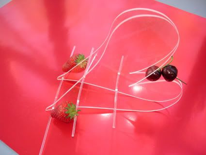
This is a conceptual assignment working with pespect( aka Acrylic ) elborating the idea of lushesness, sensual and all the stuff. Someone of my friends came out with ideas associated with sex... greeneries.... womb..... tighs.... vigina etc... But I choose to give a comical touch to it and used the idea of a lip(side profile) with cherries and strawberries. A subtle touch of initmacy with a hint of playfullness. This was suppose to be a conceptual project; not meant to be practical; is like watching a fashion show but knowing that not all the clothes can be worn on a daily basis. Spend 4.5 days trying to make it without any machineries... PURE HELL.
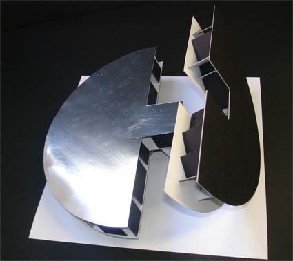
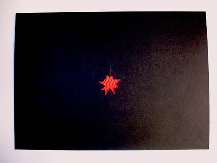
This is 1/3 of a major project which explores the ideas of a Paradise Carpet; It's a type of carpet and not the name of the carpet( please do your own research). I associate Paradise with harmony, peace, balance etc.. So I did an abstract of an "ying and yang" and erect it in a manner that you can match it visually-- elborating balace and harmony; using reflective material on one side showing a self-reflection quality of it. The graphic aspect of it shows the balance between the size and vast black space in contrast with the irregular red, textured shape in the center -- Visually balanced ! For something to look good, there must be a sense of balance and " correctness"; this concept is important in many aspects of design -- fashion, photography etc.... That's why there is a common understanding that you shouldn't wear too many colours because it actually breaks the balance.... or white and blace seemed to be the perfect match and they are both in the extreme side in a colour scheme.
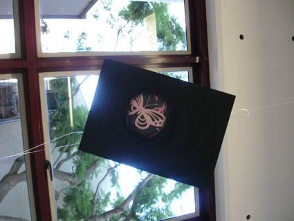
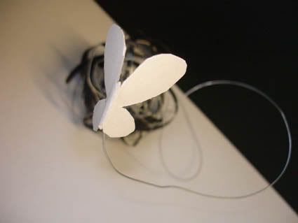
For the last assignment, we're constructing a model based on a music and doing research on the musician. In my research, this piece is based on the Holocaust of the Jews during the war. The emotions the music gave me are a mix of sorrow, rage, repressed, desperation etc.... I hang a graphic up in an angle where the viewer must look up at an angle potraying a glimpse of hope and freedom in near yet unreachable situation.
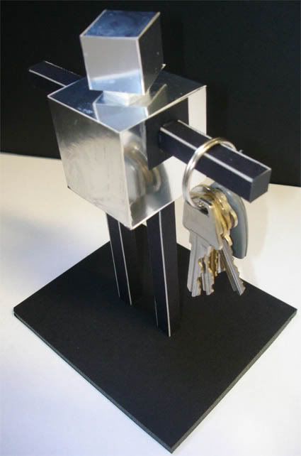
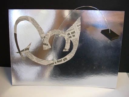
Lastly, my last project is on a teapot based on a achitect designer's teapot
http://www.alessi.com/catalogo/autore/Dalisi+Riccardo/43?idCollezione=3&ct=1
After several research, I want to potray the comical side of the teapot because to me, it resemble the tin-man in the Wizard of Oz. I want to show that the something that is comical and "fun" can actually be useful as well hence I created a key holder in the shape of a toy robot. The graphic is actually a abstract of a smiley face with news paper cutting potraying information can be done in a "fun" manner.
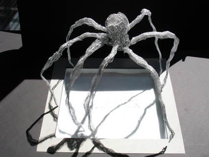
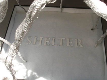
Lastly, my last assignment for summer school is based on the emotion and picking a metaphor for a park in Sydney CBD. The park is located in a park in Sydney City, however it miserable size of it as compared to the park in insignificant. After observation, I decided to give the park a different meaning to it; I decide to give a park a life using the metaphor of a spider-like creature -- protecting what is important in the park. It's is a shelter to the homeless and also provides a lunch space to people around it. But yet defending it from the modern civiliation and urbanisation of the city. For my graphic, I decide to give a soft touch to my model, in contrast of the "spider" by cushioning the inside model and a word-like graphic to convey my ideas of that it is protecting.
DONE !! Hope you guys enjoy it and spend sometime reading it.
I am really glad I quit my Commerce program and switched to Design. I really enjoyed it very much; even though there are times when you crack your skull to get the idea across but when you finally did it ( which you have to ) the sense of achievement is very fulfilling. And knowing that your effort is recongnised by your friends and lectruer just adds the cream to the cake.
Friends plays an important part the design progress. They provide a fresh eye to your ideas and concept. Luv you all .......

This is a conceptual assignment working with pespect( aka Acrylic ) elborating the idea of lushesness, sensual and all the stuff. Someone of my friends came out with ideas associated with sex... greeneries.... womb..... tighs.... vigina etc... But I choose to give a comical touch to it and used the idea of a lip(side profile) with cherries and strawberries. A subtle touch of initmacy with a hint of playfullness. This was suppose to be a conceptual project; not meant to be practical; is like watching a fashion show but knowing that not all the clothes can be worn on a daily basis. Spend 4.5 days trying to make it without any machineries... PURE HELL.


This is 1/3 of a major project which explores the ideas of a Paradise Carpet; It's a type of carpet and not the name of the carpet( please do your own research). I associate Paradise with harmony, peace, balance etc.. So I did an abstract of an "ying and yang" and erect it in a manner that you can match it visually-- elborating balace and harmony; using reflective material on one side showing a self-reflection quality of it. The graphic aspect of it shows the balance between the size and vast black space in contrast with the irregular red, textured shape in the center -- Visually balanced ! For something to look good, there must be a sense of balance and " correctness"; this concept is important in many aspects of design -- fashion, photography etc.... That's why there is a common understanding that you shouldn't wear too many colours because it actually breaks the balance.... or white and blace seemed to be the perfect match and they are both in the extreme side in a colour scheme.


For the last assignment, we're constructing a model based on a music and doing research on the musician. In my research, this piece is based on the Holocaust of the Jews during the war. The emotions the music gave me are a mix of sorrow, rage, repressed, desperation etc.... I hang a graphic up in an angle where the viewer must look up at an angle potraying a glimpse of hope and freedom in near yet unreachable situation.


Lastly, my last project is on a teapot based on a achitect designer's teapot
http://www.alessi.com/catalogo/autore/Dalisi+Riccardo/43?idCollezione=3&ct=1
After several research, I want to potray the comical side of the teapot because to me, it resemble the tin-man in the Wizard of Oz. I want to show that the something that is comical and "fun" can actually be useful as well hence I created a key holder in the shape of a toy robot. The graphic is actually a abstract of a smiley face with news paper cutting potraying information can be done in a "fun" manner.


Lastly, my last assignment for summer school is based on the emotion and picking a metaphor for a park in Sydney CBD. The park is located in a park in Sydney City, however it miserable size of it as compared to the park in insignificant. After observation, I decided to give the park a different meaning to it; I decide to give a park a life using the metaphor of a spider-like creature -- protecting what is important in the park. It's is a shelter to the homeless and also provides a lunch space to people around it. But yet defending it from the modern civiliation and urbanisation of the city. For my graphic, I decide to give a soft touch to my model, in contrast of the "spider" by cushioning the inside model and a word-like graphic to convey my ideas of that it is protecting.
DONE !! Hope you guys enjoy it and spend sometime reading it.