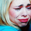
147 - tutorial 32
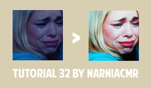
Requested by ladyhadhafang.
Made in PSCS5
Uses selective coloring, color balance, and curves.
Recreating:

This icon is from a year and a half ago so I know this is not how I made the original because my processes have changed, but I think I recreated it rather well considering. I hope this is helpful ladyhadhafang. If you have any questions let me know :)
01. The icon was made for a 20in20 using the theme 'tears' so I choose this cap. I cropped, resized, and sharpened using the Unsharp Mask feature set at 25%.
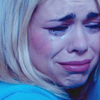
02. I then duplicated my base twice, setting both layers on Screen with the first at 100% opacity and the second at 50%. That brightens up the icon and shows that there is great potential for some really beautiful colors.
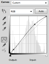
03. I wanted it a bit brighter without brightening the shadows as much, so I added a Curves layer that looked like this:
>
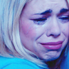
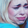
04. Next to color the icon. I added a Color Balance layer with some warm colors to counteract the cool blues in the original image:
Red: +22
Green: +5
Blue: -64
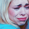
05. I added a Selective Color layer with these settings:
Reds - Cyan: -75, Yellow: +74
Yellows - Cyan: -20, Magenta: +13, Yellow: +55
Blues - Cyan: -37, Yellow: +54
Magentas - Cyan: -39, Magenta: +15, Yellow: +35
06: I wanted the yellow to be slightly stronger, so I added another Color Balance layer with these settings:
Blue: -36

07. I added a Vibrance layer with the vibrance at +40 to make the colors pop just a bit more, it really effects Rose's lips the most.

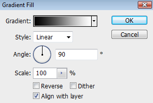
08. Next I added a simple black and white gradient set on Soft Light at 48%.
>
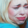
09. In the original icon I am pretty sure I used a texture, but I don't remember what texture I may have used, so to add the depth around her hair, eye, and below her chin I used a soft brush and drew some blobs in black which I then blurred to soften. That layer I set on Soft Light at 100%.
This is what the layer looks like on a white background so you can see where I drew:

>
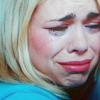
10. Lastly I merged everything and duplicated the layer and set it on Soft Light at 100%.
