134 - tutorial 31
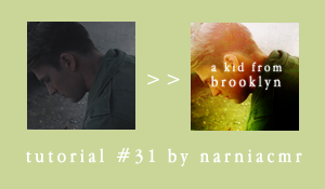
Requested by setentpet.
Made in PSCS5
Uses selective coloring, color balance, and curves.
First I cropped and resized my cap.
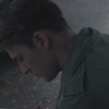
Then I duplicated my base two times, the first one I set on Soft Light 100% and the second on Screen 100%. This brightened it up and gave it some contrast.
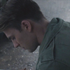
Next I added a Color Balance layer with these settings:
Red: +24
Green: -9
Blue: -16
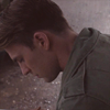
That added a lot of reds to my icon and though I didn’t really know what exactly I wanted I knew I wanted to add greens, so I wanted to add those reds at the beginning to keep some flesh tones in the end product.
I added a Gradient layer with #1f3205 on the left and #d3e1e6 on the right. The settings look like this:
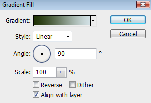
That added some of the green coloring that I wanted to bring out in Captain America’s shirt while also starting to work on the lighting that I knew I wanted.
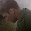
I added a Hue/Saturation layer and bumped the saturation up +25.
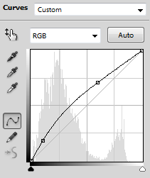
I wanted to brighten it up some more, so I added a Curves layer that looked like this:
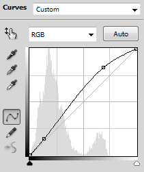
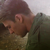
Now for a Selective Coloring layer to really start bringing out those greens:
Reds - Cyan: -54, Yellow: +21
Yellows - Cyan: +100, Magenta: -55, Yellow: +60
Cyans - Cyan: +77, Yellow: -69
I still wanted it brighter, so I added another Curves layer and really bumped up the brightness.
There is already a lot of color, but I wanted more yellows so I added a second Color Balance layer:
Red+19
Green: -1
Blue: -29
Texture time! I am 99% sure that both textures I used were made by drankmywar, but I smudged and desaturated them to the point that I can't figure out which ones were the originals. I took this texture:
set on Soft Light 100%
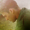
I love using textures like that one to add depth and lighting to icons.
Next I made a new layer and stamp visible (shift+ctrl+alt+E) I set it on Soft Light 100% and then duplicated it (I think Overlay gives you the same effect, but I never remember to do that).
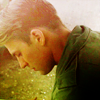
Now this part is the tricky part because I started playing around trying to get the coloring I wanted.
So I made a new layer and stamp visible (shift+ctrl+alt+E) again and set that on Soft Light 100% and then blurred it, probably Gaussian Blur around 3-4px. That gives it a nice glowy effect that I really like right now, plus it hides some of the graininess that tends to come up in Captain America caps.
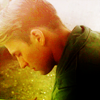
I didn’t like how red his hair and neck were, so I added a Color Balance layer with these settings:
Cyan: -29
Magenta: -3
Yellow: +13
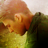
But I think I pulled that layer under the blurred layer, that way it doesn’t affect the coloring as much.
I also added another texture that I put under the blurred layer as well:
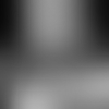
set on Soft Light 100%
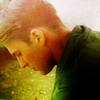
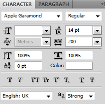
For the text I used Apple Garamond. I set the letter spacing at 200 and the line spacing at 14. “a kid from” is 12px and “Brooklyn” is 14px. Anti-alias is set on strong. Here is what it looks like:
I thought the text was too sharp, so I rasterized the layer and took the blur tool and went over the text with the blur set on a very low opacity.
And this is what I ended up with:
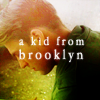
Hopefully that makes sense and is helpful :D