Challenge #6: Round #4 Results
The votes are in and here are the results. Also thank you to all those who voted :)
Eliminated:
goldbrokenheart: -6

irati86: -4
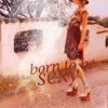
People's choice:
thedreamygirl: +1
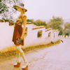
hel_lansky: +1
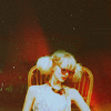
kisuncha: +1

No Mod's choice.
1-1/+1=0
2+1
3+1
4-3
5-4
6-3
7-1
8-6
9-2/+2=0
10-2
11-2/+1=-1
12-3/+2=-1
13+1
If your icon number is not listed, you received no votes. Congratulations :)
Comments:
Eliminate:
07: The font wasn't the best choice in this icon.
05: The coloring kind of threw the icon off, the font is the same color as the icon therefore not much is shown.
11: too many different colors that didn't really blend in well together.
12 - the texture makes the icon look kinda washed out, there's not enough contrast
08 - it looks like there was nothing done with the pic, the quality of the pic is bad
06 - bad crop, and the text doesn't really fit in
04 - too much cyan color, text is too heavy and contrasting
05 - too much orange color, text doesn't fit the icon (its font and meaning). And also it's hard to understand the idea of this light stain in the center of icon
10 - colouring is really strange, icon is in colored stains. Honestly, I don't understand the idea of such colouring, cuz it doesn't look pretty
5 - the text "to" is very hard to read; also looks as if her head was chopped off
8 - dunno what happened to the image quality of this; looks poorly executed
9 - the cut of the icon makes everything look awkward; coloring also a bit too dark
12. the black and white does nothing for the icon and the background decoration is not attractive
08. the coloring is dull and the icon looks pixely
06. the text is too big and doesn't look well done and the tiny text doesn't add anything to the icon
04 - very pale colouring
05 - brown text on the dark background isn't visible promptly
10 - bad effect of b/w and colour parts
6: The text is too large and overpowering. Maybe if the coloring was brighter and more eye-catching, the text wouldn't look so distracting. Also, the font seems too sharp.
8: The icon looks like it was made from an image of a very low quality: the icon seems pixelated and oversharpened at the same time.
11: The icon seems too sharp (maybe because of the cololring?), it is also too dark and could use more contrast. The model's skin is unhealthy yellow.
#o4 - Very blurry and overlighted. All focus is on the text.
#o8 - Colors are really fage and seem overlighted.
#o9 - Really dark coloring here. the light texture though looks good.
To keep:
#11 - Amazing coloring!
13: At first this icon didn't catch my eye, but when I looked closer I realized how beautiful the coloring is and how much work was put into it. I also like that the icon is crisp without being oversharpened.
12 - use of textures is amazing! love them
o1. great textures/coloring. the icon looks really vintage
3 - the crop and coloring on the icon is fantastic
12 - good b&w colouring, icon looks really creative with all decorative elements
02. perfect coloring
09 - beautiful coloring, outstanding crop, and the texture matches the icon perfectly. great job!
09: The style was very classy, nice coloring :P
Good luck to everyone next round :)
Eliminated:
goldbrokenheart: -6

irati86: -4

People's choice:
thedreamygirl: +1

hel_lansky: +1

kisuncha: +1

No Mod's choice.
1-1/+1=0
2+1
3+1
4-3
5-4
6-3
7-1
8-6
9-2/+2=0
10-2
11-2/+1=-1
12-3/+2=-1
13+1
If your icon number is not listed, you received no votes. Congratulations :)
Comments:
Eliminate:
07: The font wasn't the best choice in this icon.
05: The coloring kind of threw the icon off, the font is the same color as the icon therefore not much is shown.
11: too many different colors that didn't really blend in well together.
12 - the texture makes the icon look kinda washed out, there's not enough contrast
08 - it looks like there was nothing done with the pic, the quality of the pic is bad
06 - bad crop, and the text doesn't really fit in
04 - too much cyan color, text is too heavy and contrasting
05 - too much orange color, text doesn't fit the icon (its font and meaning). And also it's hard to understand the idea of this light stain in the center of icon
10 - colouring is really strange, icon is in colored stains. Honestly, I don't understand the idea of such colouring, cuz it doesn't look pretty
5 - the text "to" is very hard to read; also looks as if her head was chopped off
8 - dunno what happened to the image quality of this; looks poorly executed
9 - the cut of the icon makes everything look awkward; coloring also a bit too dark
12. the black and white does nothing for the icon and the background decoration is not attractive
08. the coloring is dull and the icon looks pixely
06. the text is too big and doesn't look well done and the tiny text doesn't add anything to the icon
04 - very pale colouring
05 - brown text on the dark background isn't visible promptly
10 - bad effect of b/w and colour parts
6: The text is too large and overpowering. Maybe if the coloring was brighter and more eye-catching, the text wouldn't look so distracting. Also, the font seems too sharp.
8: The icon looks like it was made from an image of a very low quality: the icon seems pixelated and oversharpened at the same time.
11: The icon seems too sharp (maybe because of the cololring?), it is also too dark and could use more contrast. The model's skin is unhealthy yellow.
#o4 - Very blurry and overlighted. All focus is on the text.
#o8 - Colors are really fage and seem overlighted.
#o9 - Really dark coloring here. the light texture though looks good.
To keep:
#11 - Amazing coloring!
13: At first this icon didn't catch my eye, but when I looked closer I realized how beautiful the coloring is and how much work was put into it. I also like that the icon is crisp without being oversharpened.
12 - use of textures is amazing! love them
o1. great textures/coloring. the icon looks really vintage
3 - the crop and coloring on the icon is fantastic
12 - good b&w colouring, icon looks really creative with all decorative elements
02. perfect coloring
09 - beautiful coloring, outstanding crop, and the texture matches the icon perfectly. great job!
09: The style was very classy, nice coloring :P
Good luck to everyone next round :)