Challenge #2 Winnner!
Finally here are the results for the winner of Round #2 :D
The Last Icon Maker Standing is...
luosxterces
The runner-up is mariarita! Congrats :)
I'm in a hurry so no banners ready but I will post them soon :)
Tally:
Set A:
01. +6
02. +2
Set B:
01. +7
02. +1
Set C:
01. +6
02. +2
Comments:
Votes:
SET A
01;the textures work really well with the image and they do not over power it, the colouring is lovely too
1 - I really like how the blue is brought out without being overpowering. Good subtle use of lightning textures. Border adds a nice touch.
01: i love the crop & coloring. the texture doesnt overpower the image and teh frame is a nice subtle touch
1 - We can see that there's much more work done on this icon. The cropping and that border look good together. The green coloring suits the image.
01 - beautiful coloration and texture use!
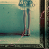
#01 There's more to the picture than meets the eye. Because of thr unfinished picture frame - it leaves the viewer wondering what the rest of the picture entails. The faint colours, yet amass of light let through the window behind the girl give a resemblance of stillness.
02 - I love the colorization and the texture and how it all blends together
2 - THE LIGHT TEXTURE REALLY WORKS AT THE BOTTOM
SET B
01; the icon is beautiful! the colouring is amazing and really brings out the image well the textures are simple but give an extra edge to the image, amazing! :)
01 - I love the coloring
1 - I love the color palette of this icon; the colors are vivid and complement each other nicely.
01: i love the crop and the light texture is a nice subtle touch that adds a lot to the icon
1 - The icon is very colorful, which is a big plus. The image is nicely cropped. Also the light texture is a lovely touch.
1 - I LOVE THE CROPPING AND COLOURING
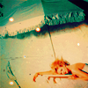
#01 I'm attracted to icons that give off bright, saturated colour and this icon is a prime example of such. The rich blue of the umbrella is the main focus of the icon - yet, the woman down the bottom also draws attention. I also like the texture used - the glowing dots (not sure what they are called) add another dimension.
#02 - beautiful cropping and style...
SET C
01; the colouring works really well with the image as it is light and soft, the light textures work well with the image and the way the text is put on also compliments the image really well, the crop is lovely as well :)
01 - It's very elegant and simple and everything just fit perfectly.
1 - The cropping is very eyecatching. Very nice coloring. Light textures aren't overpowering, but complement the image nicely.
01: i love the crop & the text placement. The texture is nice as well. The composition of this icon is just perfect.
#01 -good crooping, color and text use...
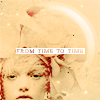
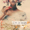
#01 Nice cropping - as you don't have to see the whole of the face to tell her emotions. The text "i'm in bloom" adds a nice touch to the subject whom is wearing and holding flowers. The soft texture is also nice.
2 - The icon immediately caught my eye. The coloring is stunning. This contrasty beige suits the icon well. I love how the text is placed. The light textures and that half-circle brush are well used. Excellent icon.
2 - SLIGHTLY BETTER CROPPING THAN #1
Comments:
SET A
01 - It's somewhat dark and the coloring is somewhat monotone
1 - too blue which gives a darkened look. the cropping's not good either.
02; i love this icon but i think it is a little pinky and the light texture on her dress would look better without, it may look good with a little text, the icon is still beautiful though :)
02: i love the cropping on this icon as well. the coloring is gorgeous as well. It just came down to the fact that this icon had nothing to set it apart from the other one that had equally nice crop & color.
2 - I like the icon because the textures used are great and coloring is nice too. But the cropping is too simple. Sometimes such cropping fits images, but not this one.
#02 - the textures used kind of overpower the icon...
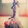
#02 Because of the overuse of light, at first (almost second too) glance, you cannot tell what the subject in the middle is. It is only when you focus on the middle that you can tell it is a person kneeling. But I like the texture.
SET B
#01 - the girl is too small in the icon and the screen texture doesn't is a bit strong..
02; it was so hard to choose between the two as this icon is also amazing i cant find many faults, maybe lighten it a little
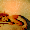
02 - It's nice, but the spider web is a bit much
2 - The web texture adds a nice effect. However, this icon doesn't have as much color contrast as the other, and has mostly yellow undertones.
02: i would have preferred the icon if it wasnt so dark. i love the spiderweb and the red color bubble
2 - overly orange giving a somewhat burnt / distressed look which is unflattering.
#02 I do not like the space at the top of the icon, although there is a spider-web texture, it is to faint. The sepia colours however add a nice touch.
SET C
1 - The icon looks nice, but the 2nd one is better. The text and the brush behind it don't look pretty together. Maybe if the brush was a bit more visible, it would work out just fine. Also I think a Soft Light layer would be good, because the icon is a little washed out.
1 - the text is more of a distraction than anything else and the cropping is unflattering.
02; its a little to sharp and the text and textures a little distracting, i cant really tell whats ubove her head its also a little yellow
2 - The yellow hues that wash over the icon make it a bit monotonous. Text is a little sharp and hard to read.
02: the only thing i could say about improving this icon is to get a different color - this particular coloring method didnt work with the image, but the composition is great
2 - Though the web texture is a nice touch, the coloring could've been improved. The model looks to dark and .. orange.
#02 - beautiful icon but it is a bit blurry and the coloration is too light...
#02 I like this icon, but the colours are too light.
------------------
We really enjoyed this challenge and hope you guys did as well :D
Thank you everyone who participated and voted in Challenge #2. We really appreciate it :*
The Last Icon Maker Standing is...
luosxterces


The runner-up is mariarita! Congrats :)


I'm in a hurry so no banners ready but I will post them soon :)
Tally:
Set A:
01. +6
02. +2
Set B:
01. +7
02. +1
Set C:
01. +6
02. +2
Comments:
Votes:
SET A
01;the textures work really well with the image and they do not over power it, the colouring is lovely too
1 - I really like how the blue is brought out without being overpowering. Good subtle use of lightning textures. Border adds a nice touch.
01: i love the crop & coloring. the texture doesnt overpower the image and teh frame is a nice subtle touch
1 - We can see that there's much more work done on this icon. The cropping and that border look good together. The green coloring suits the image.
01 - beautiful coloration and texture use!
#01 There's more to the picture than meets the eye. Because of thr unfinished picture frame - it leaves the viewer wondering what the rest of the picture entails. The faint colours, yet amass of light let through the window behind the girl give a resemblance of stillness.
02 - I love the colorization and the texture and how it all blends together
2 - THE LIGHT TEXTURE REALLY WORKS AT THE BOTTOM
SET B
01; the icon is beautiful! the colouring is amazing and really brings out the image well the textures are simple but give an extra edge to the image, amazing! :)
01 - I love the coloring
1 - I love the color palette of this icon; the colors are vivid and complement each other nicely.
01: i love the crop and the light texture is a nice subtle touch that adds a lot to the icon
1 - The icon is very colorful, which is a big plus. The image is nicely cropped. Also the light texture is a lovely touch.
1 - I LOVE THE CROPPING AND COLOURING
#01 I'm attracted to icons that give off bright, saturated colour and this icon is a prime example of such. The rich blue of the umbrella is the main focus of the icon - yet, the woman down the bottom also draws attention. I also like the texture used - the glowing dots (not sure what they are called) add another dimension.
#02 - beautiful cropping and style...
SET C
01; the colouring works really well with the image as it is light and soft, the light textures work well with the image and the way the text is put on also compliments the image really well, the crop is lovely as well :)
01 - It's very elegant and simple and everything just fit perfectly.
1 - The cropping is very eyecatching. Very nice coloring. Light textures aren't overpowering, but complement the image nicely.
01: i love the crop & the text placement. The texture is nice as well. The composition of this icon is just perfect.
#01 -good crooping, color and text use...
#01 Nice cropping - as you don't have to see the whole of the face to tell her emotions. The text "i'm in bloom" adds a nice touch to the subject whom is wearing and holding flowers. The soft texture is also nice.
2 - The icon immediately caught my eye. The coloring is stunning. This contrasty beige suits the icon well. I love how the text is placed. The light textures and that half-circle brush are well used. Excellent icon.
2 - SLIGHTLY BETTER CROPPING THAN #1
Comments:
SET A
01 - It's somewhat dark and the coloring is somewhat monotone
1 - too blue which gives a darkened look. the cropping's not good either.
02; i love this icon but i think it is a little pinky and the light texture on her dress would look better without, it may look good with a little text, the icon is still beautiful though :)
02: i love the cropping on this icon as well. the coloring is gorgeous as well. It just came down to the fact that this icon had nothing to set it apart from the other one that had equally nice crop & color.
2 - I like the icon because the textures used are great and coloring is nice too. But the cropping is too simple. Sometimes such cropping fits images, but not this one.
#02 - the textures used kind of overpower the icon...
#02 Because of the overuse of light, at first (almost second too) glance, you cannot tell what the subject in the middle is. It is only when you focus on the middle that you can tell it is a person kneeling. But I like the texture.
SET B
#01 - the girl is too small in the icon and the screen texture doesn't is a bit strong..
02; it was so hard to choose between the two as this icon is also amazing i cant find many faults, maybe lighten it a little
02 - It's nice, but the spider web is a bit much
2 - The web texture adds a nice effect. However, this icon doesn't have as much color contrast as the other, and has mostly yellow undertones.
02: i would have preferred the icon if it wasnt so dark. i love the spiderweb and the red color bubble
2 - overly orange giving a somewhat burnt / distressed look which is unflattering.
#02 I do not like the space at the top of the icon, although there is a spider-web texture, it is to faint. The sepia colours however add a nice touch.
SET C
1 - The icon looks nice, but the 2nd one is better. The text and the brush behind it don't look pretty together. Maybe if the brush was a bit more visible, it would work out just fine. Also I think a Soft Light layer would be good, because the icon is a little washed out.
1 - the text is more of a distraction than anything else and the cropping is unflattering.
02; its a little to sharp and the text and textures a little distracting, i cant really tell whats ubove her head its also a little yellow
2 - The yellow hues that wash over the icon make it a bit monotonous. Text is a little sharp and hard to read.
02: the only thing i could say about improving this icon is to get a different color - this particular coloring method didnt work with the image, but the composition is great
2 - Though the web texture is a nice touch, the coloring could've been improved. The model looks to dark and .. orange.
#02 - beautiful icon but it is a bit blurry and the coloration is too light...
#02 I like this icon, but the colours are too light.
------------------
We really enjoyed this challenge and hope you guys did as well :D
Thank you everyone who participated and voted in Challenge #2. We really appreciate it :*