Challenge #7: Round #7 Results
The votes are in and here are the results. Also thank you to all those who voted :)
Eliminated:
spriink : -4

People's choice:
llean : +2

Mod's choice:
lihana: love use of the textures..

1.-4
2.-1+1=0
3.-1+3=+2
4.-1
5.-4+2=-2
6.-3+1=-2
If your icon number is not listed, you received no votes. Congratulations :)
Comments:
Eliminate:
2 - pale, need more contrast
4 - pixel frame should be more transparent
1 - cropping is boring and the use of textures is not the best
5 - the icon is not bad but comparing to the others - it is not intresting and original enough
06. the coloring is a bit too red/orange and the textures are too busy
05. the white around the image makes it hard to see where the icon starts and stops
1 - the thunder texture doesn't fit the coloring and mood of the icon
5 - the centered crop looks awkward and doesn't fit in
#1 - It's not like there's something obvious missing in this icon. It's great! But it lacks a bit sharpness and the cropping isn't that exciting. Overall it's pretty good.
#3 - Very creative use of frame and stars texture, but the model is just too small here and doesn't seem connected with the textures.
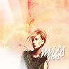
6: the text does not go with the icon at all
1: the icon is a bit blurry and the coloring is lacking in quality compared with the other entries
05 -- overall, it's too dull. more could have been done with textures and cropping.
06 -- picture looks squished, badly cropped, and text is almost unreadable and oversharpened
To keep:
03 -- verrry nice composition and texture use
5: I like the simple texture and the soft coloring
#5 - Good cropping and sharpness. The maker managed to drag the attention of the viewer to the dress and to the model's face.
2 - love the sky background behind her
03. great coloring and the star textures are really well done
6 - nice text and background
3 - original composition, use of textures is cool!
Good luck to everyone next round :)
Eliminated:
spriink : -4
People's choice:
llean : +2

Mod's choice:
lihana: love use of the textures..

1.-4
2.-1+1=0
3.-1+3=+2
4.-1
5.-4+2=-2
6.-3+1=-2
If your icon number is not listed, you received no votes. Congratulations :)
Comments:
Eliminate:
2 - pale, need more contrast
4 - pixel frame should be more transparent
1 - cropping is boring and the use of textures is not the best
5 - the icon is not bad but comparing to the others - it is not intresting and original enough
06. the coloring is a bit too red/orange and the textures are too busy
05. the white around the image makes it hard to see where the icon starts and stops
1 - the thunder texture doesn't fit the coloring and mood of the icon
5 - the centered crop looks awkward and doesn't fit in
#1 - It's not like there's something obvious missing in this icon. It's great! But it lacks a bit sharpness and the cropping isn't that exciting. Overall it's pretty good.
#3 - Very creative use of frame and stars texture, but the model is just too small here and doesn't seem connected with the textures.
6: the text does not go with the icon at all
1: the icon is a bit blurry and the coloring is lacking in quality compared with the other entries
05 -- overall, it's too dull. more could have been done with textures and cropping.
06 -- picture looks squished, badly cropped, and text is almost unreadable and oversharpened
To keep:
03 -- verrry nice composition and texture use
5: I like the simple texture and the soft coloring
#5 - Good cropping and sharpness. The maker managed to drag the attention of the viewer to the dress and to the model's face.
2 - love the sky background behind her
03. great coloring and the star textures are really well done
6 - nice text and background
3 - original composition, use of textures is cool!
Good luck to everyone next round :)