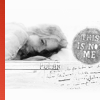
Challenge #7: Round #5 Results
The votes are in and here are the results. Also thank you to all those who voted :)
Eliminated:
meow_kiss: -4

People's choice:
llean : +2

Mod's choice:
None.
1.-1+1=0
2.-5+1=-4
3.-1+1=0
4.-3
5.-1+3=+2
6.-3+1=-2
If your icon number is not listed, you received no votes. Congratulations :)
Comments:
Eliminate:
#2 - The icon is too faded and the texture is badly placed.
#6 - The icon is too white and the light texture used makes it look awkward.
#5 - The contrast is very nice, the picture's also sharp, but the texture use seems random. The red stripe doesn't fit.
#6 - The face is hardly recognizable, due to the textures covering it. It looks dirty.
4 - light texture doesn't look well, too blurry
6 - simple, pale... icon need any akcent
04. the coloring doesn't work well and makes her too dark and shaded
02. the image is a tad blurry, maybe the crop is too close
01 -- model is too yellow and red around the edges, very unnatural
02 -- poor texture use and crop
№4-bad crop, dim colors
№2-oversharpness,bad crop,unsuccessful composition
2 - her face is blurry and the branches get in the way of the icon
3 - the roses are distracting and i can't make the text out
To keep:
5 - its very creative and i like the use of b&w
№5-beautiful combination of colour gamut, textures
02 -- nice soft coloring, and original use of textures that make the icon feel very romantic
06. lovely coloring, the lightness of the icon works very well with this picture.
5 - original use of texture makes icon much better
#3 - I'm a fan of those rose textures. Good cropping and use of text.
#1 - Great use of text, borders, and coloring.
Good luck to everyone next round :)
Eliminated:
meow_kiss: -4

People's choice:
llean : +2

Mod's choice:
None.
1.-1+1=0
2.-5+1=-4
3.-1+1=0
4.-3
5.-1+3=+2
6.-3+1=-2
If your icon number is not listed, you received no votes. Congratulations :)
Comments:
Eliminate:
#2 - The icon is too faded and the texture is badly placed.
#6 - The icon is too white and the light texture used makes it look awkward.
#5 - The contrast is very nice, the picture's also sharp, but the texture use seems random. The red stripe doesn't fit.
#6 - The face is hardly recognizable, due to the textures covering it. It looks dirty.
4 - light texture doesn't look well, too blurry
6 - simple, pale... icon need any akcent
04. the coloring doesn't work well and makes her too dark and shaded
02. the image is a tad blurry, maybe the crop is too close
01 -- model is too yellow and red around the edges, very unnatural
02 -- poor texture use and crop
№4-bad crop, dim colors
№2-oversharpness,bad crop,unsuccessful composition
2 - her face is blurry and the branches get in the way of the icon
3 - the roses are distracting and i can't make the text out
To keep:
5 - its very creative and i like the use of b&w
№5-beautiful combination of colour gamut, textures
02 -- nice soft coloring, and original use of textures that make the icon feel very romantic
06. lovely coloring, the lightness of the icon works very well with this picture.
5 - original use of texture makes icon much better
#3 - I'm a fan of those rose textures. Good cropping and use of text.
#1 - Great use of text, borders, and coloring.
Good luck to everyone next round :)