Challenge #7: Round #4 Results
The votes are in and here are the results. Also thank you to all those who voted :)
Eliminated:
nasirah: -5
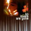
electrical_s: -5
People's choice:
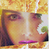
meow_kiss: +2
Mod's choice:
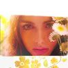
lihana: love the coloring and use of the frame is nice..
1.-2
2.-2
3.-1
4.-5
5.-2/+3=+1
6.-3
7.-5
8.+2
9.-1/+2=+1
If your icon number is not listed, you received no votes. Congratulations :)
Comments:
Eliminate:
1 - bad cropping and boring coloring
4 - text's font is dull and color is too bright
7 - model's face looks weird...
#6 - colouring is too red
#5 - too lighten
#1 - too red and light textures don't fit the icon
#6 - Oversaturated coloring
#4 - The coloring is fine, but the texture underneath is just too distracting.
#7 - I like the frame, it's very pretty, but the cropping is just disadvantageous.
#7 - texture is not combined, kolorizatsiya persons unnatural
#4 - peresvet on face, too much black, lower texture does not resemble, text of bad
#2 - too faded work, a chin is badly cut, dirtily
3 - too weird coloring on her lips, acid
4 - text use isn't nice, font choice too. bottom part looks bad
9 - very dark icon, light textures are too random
#7 - i think there are too much things, looks overload, yellow skin
#6 - too red/pink coloring, bottom looks empty
#5 - too much contrast and crop looks not good
2 - the girl looks more zombie-like than an actual person; weird coloring
4 - the text font does not fit the rest of the icon; the background is awkward as well
7 - there's too much of a yellow tint in her skin and make it look unnatural
To keep:
5 - i love the cut and the coloring on the icon is good as well
#9 - amazing using of textures, great b/w!
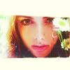
8 - cool frame, lovely texture of flowers on it
#9 - strong work, excellent application of tekstur
#5 - lovely white frame and pleasant, light coloring.
#8 - great texture use
5 - awesome coloring
Good luck to everyone next round :)
Eliminated:
nasirah: -5

electrical_s: -5

People's choice:
meow_kiss: +2

Mod's choice:
lihana: love the coloring and use of the frame is nice..

1.-2
2.-2
3.-1
4.-5
5.-2/+3=+1
6.-3
7.-5
8.+2
9.-1/+2=+1
If your icon number is not listed, you received no votes. Congratulations :)
Comments:
Eliminate:
1 - bad cropping and boring coloring
4 - text's font is dull and color is too bright
7 - model's face looks weird...
#6 - colouring is too red
#5 - too lighten
#1 - too red and light textures don't fit the icon
#6 - Oversaturated coloring
#4 - The coloring is fine, but the texture underneath is just too distracting.
#7 - I like the frame, it's very pretty, but the cropping is just disadvantageous.
#7 - texture is not combined, kolorizatsiya persons unnatural
#4 - peresvet on face, too much black, lower texture does not resemble, text of bad
#2 - too faded work, a chin is badly cut, dirtily
3 - too weird coloring on her lips, acid
4 - text use isn't nice, font choice too. bottom part looks bad
9 - very dark icon, light textures are too random
#7 - i think there are too much things, looks overload, yellow skin
#6 - too red/pink coloring, bottom looks empty
#5 - too much contrast and crop looks not good
2 - the girl looks more zombie-like than an actual person; weird coloring
4 - the text font does not fit the rest of the icon; the background is awkward as well
7 - there's too much of a yellow tint in her skin and make it look unnatural
To keep:
5 - i love the cut and the coloring on the icon is good as well
#9 - amazing using of textures, great b/w!
8 - cool frame, lovely texture of flowers on it
#9 - strong work, excellent application of tekstur
#5 - lovely white frame and pleasant, light coloring.
#8 - great texture use
5 - awesome coloring
Good luck to everyone next round :)