Challenge #7: Round #2 Results
The votes are in and here are the results. Also thank you to all those who voted :)
Eliminated:
canceria: -10
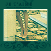
lovelydecoy: -8
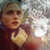
People's choice:
looni_ma: +4
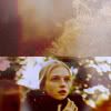
Mod's choice:
llean: love the colors and sharpness of the icon..

1.-1
2.-1/+3=+2
4.-10
5.-4/+1=-3
7.+1
8.+1
9.-2/+2=0
10.-1/+5=+4
11.-7
12.-6
13.-7
14.-8
15.-2
16.-3
If your icon number is not listed, you received no votes. Congratulations :)
Comments:
Eliminate:
#4 - the coloring is too yellow, and the use of textures is too simple and doesn't look good
#5 - the coloring is kinda boring, the doubled picture along with the black detail look too heave for this icon
#11 - the cut out is been made bad, it looks like a part of her face is gone
#14 - the icon is blurry and dark, and the texture absolutely doesn't fit in
#1 - the cropping is boring and the icon is blurry.
#11 - the cropping is very strange and the model looks odd, the background doesn't fit.
#13 - the coloring is too saturated and too green/blue
#14 - i think that the textures don't compliment the icon and the icon looks messy.
#4 - not nice colors, dirty execution
#13 - acid colors, bad crop
#5 - composition clashes, bad crop and insertion from below
#14 - dirty job, colors are dim, texture is not combined
09 - I can barely see her face and the textures are distracting
04 - The words are very hard to read
11 - To me, it looks like the texture is "eating" the model
13 - Weird colouring, looks a little greenish
#11 - Badly cut. Not keen enough.
#13 - Coloring is too green.
#04 - I don't think her feet are the most important thing. The coloring is also too green.
#12 - The negative space here is just not used. Everything seems so empty. Coloring is just too much yellow.
4 - the crop looks awkward and out of place
5 - the bottom part of the icon is distracting and awkward
12 - the coloring is too yellow
16 - the icon looks very blurry
14: texture is overpowering. icon is too dark and lacks contrast.
04: green/yellow coloring is overpowering. green border overpowers the image.
12: cropping hasn't be utilized well. yellow coloring adds a sickly glow to the icon.
13: Grainy. too bright.
13 - the icon is too bright & the blues are too saturated.
16 - the icon is way too dark
15 - the textures used seem cluttered & the colors are too faded
04 - the icon is too green & sharp
9. Texture takes focus away from image, which is nearly unrecognisable. Composition of image in frame is jarring to the eye.
14. Texture is too distracting from main image. Bright white texture and darkened image don't work well together.
11. Part of her face has been erased. Over-blurry background does not compliment the image.
10. Large empty space is fairly distracting.
04 - bad quality, the text is out of place
12 - acid coloring looks bad
16 - the model looks blurry and needs more contrast
14 - also, too blurry and the lace texture doesn't really fit
02 -- text is too sharpened, and the model is overall too red
11 -- looks badly cut out and blirry
12 -- too much yellow/orange
14 -- too dark and blurry
15. the texture/text does not compliment the icon and the coloring is dull
4. all you can see of the icon are the legs and the coloring doesn't work
13. the coloring makes her extremely pale and washed out
12. there is too much red/orange in the coloring and her face is too orange.
04 - frame looks boring and colouring is washed out
05 - duplicated image is a bit distracting and doesn't fit to overall of the icon
11 - icon is too blurry and there's also too much blue colours on her face
14 - I can hardly see the image, icon is too dark
To keep:
02 - I love the composition and brushes used here - amazing!
10. amazing crop/use of texture. the icon is so unique and great
10 -- love the coloring and texture use
09 - awesome b/w with multicolor and the text use is really good
5. Interesting cropping makes for good composition, and the inset image at the bottom compliments and highlights the main image rather than detracting from it.
02 - amazing composition/colouring/use of texute & brushes. It all fits perfectly together.
10: wonderful use of color, texture, and negative space. the clarity is great and overall composition is outstanding.
7 - i like the texture use and overall look of the icon =]
#08 - I like the text, the texture use and the crop. The coloring is very pleasant.
10. Creative idea
9 - beautiful work, interesting colors
#2 love the idea, the coloring and the textures :)
#10 - beautiful coloring, though could've been lighter, but looks nice, and the textures fits
Good luck to everyone next round :)
Eliminated:
canceria: -10

lovelydecoy: -8

People's choice:
looni_ma: +4

Mod's choice:
llean: love the colors and sharpness of the icon..

1.-1
2.-1/+3=+2
4.-10
5.-4/+1=-3
7.+1
8.+1
9.-2/+2=0
10.-1/+5=+4
11.-7
12.-6
13.-7
14.-8
15.-2
16.-3
If your icon number is not listed, you received no votes. Congratulations :)
Comments:
Eliminate:
#4 - the coloring is too yellow, and the use of textures is too simple and doesn't look good
#5 - the coloring is kinda boring, the doubled picture along with the black detail look too heave for this icon
#11 - the cut out is been made bad, it looks like a part of her face is gone
#14 - the icon is blurry and dark, and the texture absolutely doesn't fit in
#1 - the cropping is boring and the icon is blurry.
#11 - the cropping is very strange and the model looks odd, the background doesn't fit.
#13 - the coloring is too saturated and too green/blue
#14 - i think that the textures don't compliment the icon and the icon looks messy.
#4 - not nice colors, dirty execution
#13 - acid colors, bad crop
#5 - composition clashes, bad crop and insertion from below
#14 - dirty job, colors are dim, texture is not combined
09 - I can barely see her face and the textures are distracting
04 - The words are very hard to read
11 - To me, it looks like the texture is "eating" the model
13 - Weird colouring, looks a little greenish
#11 - Badly cut. Not keen enough.
#13 - Coloring is too green.
#04 - I don't think her feet are the most important thing. The coloring is also too green.
#12 - The negative space here is just not used. Everything seems so empty. Coloring is just too much yellow.
4 - the crop looks awkward and out of place
5 - the bottom part of the icon is distracting and awkward
12 - the coloring is too yellow
16 - the icon looks very blurry
14: texture is overpowering. icon is too dark and lacks contrast.
04: green/yellow coloring is overpowering. green border overpowers the image.
12: cropping hasn't be utilized well. yellow coloring adds a sickly glow to the icon.
13: Grainy. too bright.
13 - the icon is too bright & the blues are too saturated.
16 - the icon is way too dark
15 - the textures used seem cluttered & the colors are too faded
04 - the icon is too green & sharp
9. Texture takes focus away from image, which is nearly unrecognisable. Composition of image in frame is jarring to the eye.
14. Texture is too distracting from main image. Bright white texture and darkened image don't work well together.
11. Part of her face has been erased. Over-blurry background does not compliment the image.
10. Large empty space is fairly distracting.
04 - bad quality, the text is out of place
12 - acid coloring looks bad
16 - the model looks blurry and needs more contrast
14 - also, too blurry and the lace texture doesn't really fit
02 -- text is too sharpened, and the model is overall too red
11 -- looks badly cut out and blirry
12 -- too much yellow/orange
14 -- too dark and blurry
15. the texture/text does not compliment the icon and the coloring is dull
4. all you can see of the icon are the legs and the coloring doesn't work
13. the coloring makes her extremely pale and washed out
12. there is too much red/orange in the coloring and her face is too orange.
04 - frame looks boring and colouring is washed out
05 - duplicated image is a bit distracting and doesn't fit to overall of the icon
11 - icon is too blurry and there's also too much blue colours on her face
14 - I can hardly see the image, icon is too dark
To keep:
02 - I love the composition and brushes used here - amazing!
10. amazing crop/use of texture. the icon is so unique and great
10 -- love the coloring and texture use
09 - awesome b/w with multicolor and the text use is really good
5. Interesting cropping makes for good composition, and the inset image at the bottom compliments and highlights the main image rather than detracting from it.
02 - amazing composition/colouring/use of texute & brushes. It all fits perfectly together.
10: wonderful use of color, texture, and negative space. the clarity is great and overall composition is outstanding.
7 - i like the texture use and overall look of the icon =]
#08 - I like the text, the texture use and the crop. The coloring is very pleasant.
10. Creative idea
9 - beautiful work, interesting colors
#2 love the idea, the coloring and the textures :)
#10 - beautiful coloring, though could've been lighter, but looks nice, and the textures fits
Good luck to everyone next round :)