Challenge #7: Round #1 Results
The votes are in and here are the results. Also thank you to all those who voted :)
Eliminated:
maesstria: -8
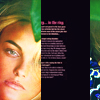
flatlined: -6
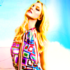
People's choice:
lihana: +2

llean: +2
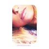
Mod's choice:
canceria: love the colors and sharpness of the icon..
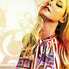
1.+2
2.-1
3.+1
4.-2
6.1/+1=0
7.-8
8.-2
9.-4
11.-4
12.+1
13.+1
14.+2
15.+1
16.-1
17.-3
18.-4
19.-6
20.-1/+1=0
If your icon number is not listed, you received no votes. Congratulations :)
Comments:
Eliminate:
19 - too much contrast
7-dont liek using of black/text . it looks strange
11-text dont fit. monotone
8- strange skin coloring, her neck mixed with hair
19 - the colors are obviously overdone
07 - bad quality and the black stripe is too heavy for this icon
04 - the icon is overloaded, black&white, colors and the texture, it's too much
11 - the icon is too dark and dull and the text doesn't fit in
#o2 - The pink texture takes away from the image, it also gives her a very unnatural coloring
#o7 - The black stroke doesn't fit in
#o9 - The texture seems to be in main focus of the icon, colors are a bit dull.
#11 - Not so well cropped and the icon is blurry
7 - black stripe doesn't look nice, destroys composition
11 - low quality, very dark
17 - a bit greenish hair color :\ texture on the bottom isn't quite popular now
18 - coloring isn't suitable, composition could be another - duplicate doesn't bring any beauty and originality
04 - too blurry and poor texture use
07 - poor texture use (it cuts the picture in half in a strange way)
17 - poor coloring, she's too washed out
19 - wayy over saturated
#02 - The colouring with the textures is way too strong & red.
#09 - the textures are very distracting & take away from the overall quality of the icon.
#17 - The crop is very uninspired & the colouring is way too faded.
#18 - The icon is too green & the blending is very poor.
#19 - the coloring is too radiant, too colorful. You can't note the details anymore.
#18 - random double use of the picture, both times the model is put in the opposite corner.
#08 - the coloring's fine, but the cropping is not that exciting, and some textures would have balanced this defect.
#7 - I think the cropping is fine, but the black balk seems too random, and so does the text(which is also too small).
2 - the texture on her face is too dark and heavy
7 - the cut makes the icon look awkward
9 - the texture over the body makes it look busy
16 - her face is slightly cut off from the texture
02: The texture is covering her face and is rather distracting
19: Over-saturated(?) Seems a little too bright.
09: The white colour looking texture thats is covering her doesnt seem to fit in
20: The subject is so small, I can barely see her
19 - coloring is too bright
7 - texture doesn't match
18 - color is too pale and suplicated layer doesn't look good
6 - blurry and too many textures
To keep:
1 - great compostiont
03: Interesting concept and nice colouring
15 - love the coloring and texture usage
#13 - Lovely close-up crop and nice coloring!
#06 - The textures used for impecciable. The colouring compliments the textures & it's very original too =)
20 -- great crop and composition
12 - I like natural color and their clarity.
#14 - Great crop and beautiful colors.
01 - beautiful coloring and good use of textures
14 - crop is amazing, round corners are perfect :) coloring is also good!
Good luck to everyone next round :)
Eliminated:
maesstria: -8

flatlined: -6

People's choice:
lihana: +2

llean: +2

Mod's choice:
canceria: love the colors and sharpness of the icon..

1.+2
2.-1
3.+1
4.-2
6.1/+1=0
7.-8
8.-2
9.-4
11.-4
12.+1
13.+1
14.+2
15.+1
16.-1
17.-3
18.-4
19.-6
20.-1/+1=0
If your icon number is not listed, you received no votes. Congratulations :)
Comments:
Eliminate:
19 - too much contrast
7-dont liek using of black/text . it looks strange
11-text dont fit. monotone
8- strange skin coloring, her neck mixed with hair
19 - the colors are obviously overdone
07 - bad quality and the black stripe is too heavy for this icon
04 - the icon is overloaded, black&white, colors and the texture, it's too much
11 - the icon is too dark and dull and the text doesn't fit in
#o2 - The pink texture takes away from the image, it also gives her a very unnatural coloring
#o7 - The black stroke doesn't fit in
#o9 - The texture seems to be in main focus of the icon, colors are a bit dull.
#11 - Not so well cropped and the icon is blurry
7 - black stripe doesn't look nice, destroys composition
11 - low quality, very dark
17 - a bit greenish hair color :\ texture on the bottom isn't quite popular now
18 - coloring isn't suitable, composition could be another - duplicate doesn't bring any beauty and originality
04 - too blurry and poor texture use
07 - poor texture use (it cuts the picture in half in a strange way)
17 - poor coloring, she's too washed out
19 - wayy over saturated
#02 - The colouring with the textures is way too strong & red.
#09 - the textures are very distracting & take away from the overall quality of the icon.
#17 - The crop is very uninspired & the colouring is way too faded.
#18 - The icon is too green & the blending is very poor.
#19 - the coloring is too radiant, too colorful. You can't note the details anymore.
#18 - random double use of the picture, both times the model is put in the opposite corner.
#08 - the coloring's fine, but the cropping is not that exciting, and some textures would have balanced this defect.
#7 - I think the cropping is fine, but the black balk seems too random, and so does the text(which is also too small).
2 - the texture on her face is too dark and heavy
7 - the cut makes the icon look awkward
9 - the texture over the body makes it look busy
16 - her face is slightly cut off from the texture
02: The texture is covering her face and is rather distracting
19: Over-saturated(?) Seems a little too bright.
09: The white colour looking texture thats is covering her doesnt seem to fit in
20: The subject is so small, I can barely see her
19 - coloring is too bright
7 - texture doesn't match
18 - color is too pale and suplicated layer doesn't look good
6 - blurry and too many textures
To keep:
1 - great compostiont
03: Interesting concept and nice colouring
15 - love the coloring and texture usage
#13 - Lovely close-up crop and nice coloring!
#06 - The textures used for impecciable. The colouring compliments the textures & it's very original too =)
20 -- great crop and composition
12 - I like natural color and their clarity.
#14 - Great crop and beautiful colors.
01 - beautiful coloring and good use of textures
14 - crop is amazing, round corners are perfect :) coloring is also good!
Good luck to everyone next round :)