Challenge #6: Round #11 Results
The votes are in and here are the results. Also thank you to all those who voted :)
Eliminated:
llean: -2

This means that llean wins Third Place in this challenge. Congratulations! :)
People's choice:
kisuncha: +2 (Thanks)

1.+2
2.-3/+3=0
3.-4/+2=-2
If your icon number is not listed, you received no votes. Congratulations :)
Comments:
Eliminate:
02: too busy and cluttered
02 - bad crop, cause eyes are cut off and position of her head depends on the crop
2 - the icon seems to be too busy and cluttered
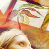
03 The placement of the texture makes it look like she has a plant growing out of her head.
3 - composition is really weird, flower above her head doesn't match..
3: The cropping isn't done well, and that weird plant looks like it grows from her head, it's creative of course, but seems distracting to me.
03. there is too much cropped off her face and the decoration above her head just looks odd and out of place
To keep:
1: Zomg, gorgeous coloring! I do like the simplicity of the icon, nothing else is needed here
01 - awesome colour and nothing spare
2 - nice composition, great colors..
02 Its a lovely use of textures, text and colors.
02. really, really beautiful composition. the text is gorgeous and the textures are done really well. wonderful icon
3 - the idea is really original and the coloring is great =]
03: nice overall composition
Good luck to everyone next round, cuz it'll be the final one :)
Eliminated:
llean: -2

This means that llean wins Third Place in this challenge. Congratulations! :)
People's choice:
kisuncha: +2 (Thanks)

1.+2
2.-3/+3=0
3.-4/+2=-2
If your icon number is not listed, you received no votes. Congratulations :)
Comments:
Eliminate:
02: too busy and cluttered
02 - bad crop, cause eyes are cut off and position of her head depends on the crop
2 - the icon seems to be too busy and cluttered
03 The placement of the texture makes it look like she has a plant growing out of her head.
3 - composition is really weird, flower above her head doesn't match..
3: The cropping isn't done well, and that weird plant looks like it grows from her head, it's creative of course, but seems distracting to me.
03. there is too much cropped off her face and the decoration above her head just looks odd and out of place
To keep:
1: Zomg, gorgeous coloring! I do like the simplicity of the icon, nothing else is needed here
01 - awesome colour and nothing spare
2 - nice composition, great colors..
02 Its a lovely use of textures, text and colors.
02. really, really beautiful composition. the text is gorgeous and the textures are done really well. wonderful icon
3 - the idea is really original and the coloring is great =]
03: nice overall composition
Good luck to everyone next round, cuz it'll be the final one :)