Challenge #6: Round #10 Results
The votes are in and here are the results. Also thank you to all those who voted :)
Eliminated:
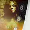
t00tsy: -5
People's choice:
hel_lansky: +3
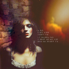
llean: +3
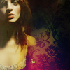
1.+3
2.-1
3.+3
4.-1/+1=0
5.-5
If your icon number is not listed, you received no votes. Congratulations :)
Comments:
Eliminate:
2: I think more could have been done to the icon: the coloring is too ordinary and the icon is lacking of some accent, maybe of a small decoration.
04 - text use isn't so good, soft blue light texture looks incongruous with the icon
05 textures are too heavy and distract attention
05: The icon is too busy with different textures, colors are too yellow.
#5 because the numbers don't have anything to do with the icon & they distract away from the subject.
5 - her skin looks too yellow and the icon seems off balanced because it has been cut off
05: the numbers are too bold and detract from the image
To keep:
01 - nice colouring, composition in well balanced
#1 because the textures & colors really compliment the subject.
1: Beauftiful coloring and I love the use of space. I'm not sure if the tiny text fits the composition, but everything else is perfect, I especially like the orange texture.
3 - I love textures use and colors
03 - Really beautiful texture used. And crop is nice.
3 - the coloring and texture/brush use is amazing as well as a good crop
04: good cropping and coloring, text works well
Good luck to everyone next round :)
Eliminated:
t00tsy: -5

People's choice:
hel_lansky: +3

llean: +3

1.+3
2.-1
3.+3
4.-1/+1=0
5.-5
If your icon number is not listed, you received no votes. Congratulations :)
Comments:
Eliminate:
2: I think more could have been done to the icon: the coloring is too ordinary and the icon is lacking of some accent, maybe of a small decoration.
04 - text use isn't so good, soft blue light texture looks incongruous with the icon
05 textures are too heavy and distract attention
05: The icon is too busy with different textures, colors are too yellow.
#5 because the numbers don't have anything to do with the icon & they distract away from the subject.
5 - her skin looks too yellow and the icon seems off balanced because it has been cut off
05: the numbers are too bold and detract from the image
To keep:
01 - nice colouring, composition in well balanced
#1 because the textures & colors really compliment the subject.
1: Beauftiful coloring and I love the use of space. I'm not sure if the tiny text fits the composition, but everything else is perfect, I especially like the orange texture.
3 - I love textures use and colors
03 - Really beautiful texture used. And crop is nice.
3 - the coloring and texture/brush use is amazing as well as a good crop
04: good cropping and coloring, text works well
Good luck to everyone next round :)