credit where credit is due
As some of you know, my urban fantasy series (the Onyx Court) is historical, rather than modern. What you may not know is that this leads to interesting hijinks when it comes to my book covers.
For the third book in the series, A Star Shall Fall, I sent my editor an e-mail full of information to be passed along to the cover designer: descriptions of the main characters, details on eighteenth-century clothing (the book takes place in 1759), pointers to locations that show up in the book, etc. I had no idea what they were planning for the cover, much less whether they would use anything I said, but I figure it's my job to be as helpful to the process as I can. There was only one thing I really tried to control in my e-mail: that they should please please for the love of Sir Christopher Wren not put Tower Bridge on the cover. It may be a recognizable London landmark, but it's wildly out of period, as it wasn't built until the 1890s.
So a while later a mockup for the cover arrives in my inbox, and I slam my head into the desk . . . because I didn't think to include the Houses of Parliament in that plea.
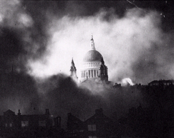
In the grand scheme of things, this is a very small problem. 95% of readers will probably not know that Westminster Palace largely burned down in 1834 and was replaced with the current (very famous) structure. But one of the things I've really focused on in writing this series is the changing face of London through the centuries -- so I when I reply to my editor, I say many nice things about the cover design and then respectfully request that they change that detail. In its place I suggest St. Paul's Cathedral, which is also a moderately recognizable landmark; I even include this famous photo of the cathedral during the Blitz, in the hopes that it may inspire the cover folks.
Here is the result:

As you can see, they took that idea and ran with it. So, credit where credit is due: thank you to the folks at Tor for listening to one neurotic author when she started wibbling about historical accuracy.
What I've taken away from this is that, while I have little control over my covers, there are things I can do to affect them. Presenting a logical argument for why those landmarks shouldn't be included probably helped my case, even if the logic wasn't a life-or-death, "readers will hate this" kind of scenario. Including a concrete suggestion for an alternative was probably another helpful factor, especially since I included an image reference to show what I had in mind. And I certainly made the right decision in approaching it all rationally and politely, rather than pitching a hissy-fit, like you sometimes hear stories of authors doing.
Sometimes none of that will have an effect. Ultimately, the cover's job is to advertise the book to readers, and the most effective way to do that might not be what the author has in mind. (After all, what I know about marketing would fit into a thimble.) But it rarely hurts to try, so long as you're polite about it. In this case, the attempt paid off, for which I am duly grateful.
For the third book in the series, A Star Shall Fall, I sent my editor an e-mail full of information to be passed along to the cover designer: descriptions of the main characters, details on eighteenth-century clothing (the book takes place in 1759), pointers to locations that show up in the book, etc. I had no idea what they were planning for the cover, much less whether they would use anything I said, but I figure it's my job to be as helpful to the process as I can. There was only one thing I really tried to control in my e-mail: that they should please please for the love of Sir Christopher Wren not put Tower Bridge on the cover. It may be a recognizable London landmark, but it's wildly out of period, as it wasn't built until the 1890s.
So a while later a mockup for the cover arrives in my inbox, and I slam my head into the desk . . . because I didn't think to include the Houses of Parliament in that plea.
In the grand scheme of things, this is a very small problem. 95% of readers will probably not know that Westminster Palace largely burned down in 1834 and was replaced with the current (very famous) structure. But one of the things I've really focused on in writing this series is the changing face of London through the centuries -- so I when I reply to my editor, I say many nice things about the cover design and then respectfully request that they change that detail. In its place I suggest St. Paul's Cathedral, which is also a moderately recognizable landmark; I even include this famous photo of the cathedral during the Blitz, in the hopes that it may inspire the cover folks.
Here is the result:
As you can see, they took that idea and ran with it. So, credit where credit is due: thank you to the folks at Tor for listening to one neurotic author when she started wibbling about historical accuracy.
What I've taken away from this is that, while I have little control over my covers, there are things I can do to affect them. Presenting a logical argument for why those landmarks shouldn't be included probably helped my case, even if the logic wasn't a life-or-death, "readers will hate this" kind of scenario. Including a concrete suggestion for an alternative was probably another helpful factor, especially since I included an image reference to show what I had in mind. And I certainly made the right decision in approaching it all rationally and politely, rather than pitching a hissy-fit, like you sometimes hear stories of authors doing.
Sometimes none of that will have an effect. Ultimately, the cover's job is to advertise the book to readers, and the most effective way to do that might not be what the author has in mind. (After all, what I know about marketing would fit into a thimble.) But it rarely hurts to try, so long as you're polite about it. In this case, the attempt paid off, for which I am duly grateful.