tutorial #3
from this to 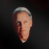
in Gimp.
Requested by
dischargie :)
1. step: brighten the cap
colour - values: 0; 1,70; 255.
colour - brightness/contrast: contrast +10
[result]
2. step - coloring:
[the first steps are the same as in this tutorial]
- duplicate the base and set this layer to screen. If the cap is really dark you'll need more than one screenlayer.
- new layer with a dark blue (#0b0f42), screen, 50. Duplicate this layer once.
- new layer with a birghter blue (#7eb4d0, Burn, 90. Duplicate this layer once.
- new layer with red (#ff0000), Overlay, 10
- new layer with skintone (#edc673) , multiply, 80.
Now change the opacities [result]
Merge all layers.
3. step - channel mixer:
(colour - component - channel mixer)
Red: 90; -20; 0
Green: -10; 40; 60
Blue: -50; 80; 60
(preserve luminosity off)
I changed the opacity of this layer to 80% and screened my base twice [result]
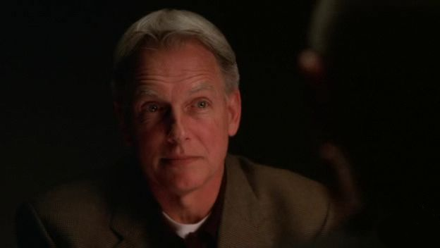
4. step:
After cropping and resizing it I painted with black over the cap so only his head and the collar is visible [result]
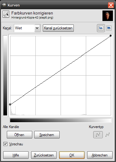
5. step:
To lighten up parts of the icon I usually duplicate the base and change it with some curves modifications so that the layer gets brighter. You also can set the layer to screen.
Then I pick a brush and erase some parts of the layer. Here I erased everything except those parts which I wanted to have brighter (in this case a diagonal band).
the result:
Other examples:

Just out of interest... is anybody interested in tutorials for these two icons:
from
to
from
to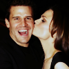
? (with Gimp, as always^^)
I tried to translate some tutorials with SC-steps and kinda stumbled over those results (light-years away from the result I wanted to have but yeah xP). And as I most probably won't post new icons before the final episodes of Bones and NCIS have aired I would have time to post those tutorials^^ If anyone wants them.
Anyway, *hugs*
in Gimp.
Requested by
dischargie :)
1. step: brighten the cap
colour - values: 0; 1,70; 255.
colour - brightness/contrast: contrast +10
[result]
![[result]](http://i235.photobucket.com/albums/ee155/fan_cifully/tuts/tut1/step2.png)
2. step - coloring:
[the first steps are the same as in this tutorial]
- duplicate the base and set this layer to screen. If the cap is really dark you'll need more than one screenlayer.
- new layer with a dark blue (#0b0f42), screen, 50. Duplicate this layer once.
- new layer with a birghter blue (#7eb4d0, Burn, 90. Duplicate this layer once.
- new layer with red (#ff0000), Overlay, 10
- new layer with skintone (#edc673) , multiply, 80.
Now change the opacities [result]
![[result]](http://i235.photobucket.com/albums/ee155/fan_cifully/tuts/tut1/step3.png)
Merge all layers.
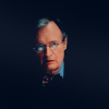
3. step - channel mixer:
(colour - component - channel mixer)
Red: 90; -20; 0
Green: -10; 40; 60
Blue: -50; 80; 60
(preserve luminosity off)
I changed the opacity of this layer to 80% and screened my base twice [result]
![[result]](http://i235.photobucket.com/albums/ee155/fan_cifully/tuts/tut1/step4.png)
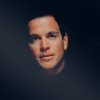
4. step:
After cropping and resizing it I painted with black over the cap so only his head and the collar is visible [result]
![[result]](http://i235.photobucket.com/albums/ee155/fan_cifully/tuts/tut1/step6.png)
5. step:
To lighten up parts of the icon I usually duplicate the base and change it with some curves modifications so that the layer gets brighter. You also can set the layer to screen.
Then I pick a brush and erase some parts of the layer. Here I erased everything except those parts which I wanted to have brighter (in this case a diagonal band).
the result:
Other examples:
Just out of interest... is anybody interested in tutorials for these two icons:
from
to
from
to
? (with Gimp, as always^^)
I tried to translate some tutorials with SC-steps and kinda stumbled over those results (light-years away from the result I wanted to have but yeah xP). And as I most probably won't post new icons before the final episodes of Bones and NCIS have aired I would have time to post those tutorials^^ If anyone wants them.
Anyway, *hugs*