Tutorial 02: Obi-Wan and Padme
For some reason I think writing tutorials is oddly fun.
So here's another one, mostly about lighting and color. Pretty different from the first one I posted, but I've tried to still keep it pretty straightforward.
Making this icon:
I did it in PSP 9, but I think it'll translate pretty easily again.
As usual, if you have any questions, let me know! :D
So, we begin with this base, simply cropped and resized from an image I found through a google image search which lead to Obidala.

A pretty scene, but the quality leaves something to be desired.
Start by sharpening it by going to Adjust-->Sharpness-->Sharpen.
If anything comes out too jagged or pixely after that, take the Soften brush to smooth them out. I used it in size 2, opacity 40, on the side of Obi's head as well as Padme's tiara and sleeve.

Nothing too drastic thus far...
Now, duplicate your base three times, so that you have four identical layers on top of each other.
(As you read this next step, keep in mind that you should adjust opacities and saturations according to what you think looks best for your image. No need to do it exactly like this.)
Leave the original (the very bottom layer) as it is.
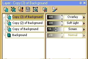
Select the next one up and set its blend mode to Screen. Also, desaturate it partially (do this by going to Adjust-->Hue and Saturation-->Hue/Saturation/Lightness and drag the Saturation slider to something below zero). Lower this layer's opacity to 56.
Select the next one above this and set its blend mode to Soft Light.
Select the next one (should be the very top layer) and set its blend mode to Overlay. Desaturate it completely (drag the Saturation slider all the way to the bottom).
To avoid further confusion, this is what my Layers palette looked like:
Merge all (Layers-->Merge-->Merge all). This is what I had:

Now, we add the light effects, using this texture (made by me).
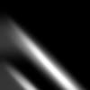
Copy and paste it onto your base as a new layer (Edit-->Paste-->Paste as New Layer) and set the blend mode to Screen.

Not quite what I wanted it to be. So, I duplicated the texture twice, and arranged them in a way (using the Move Tool) that roughly fitted what I had in mind.

I then used the background eraser to erase the parts I didn't want (which was quite a lot), and also to make some of it look like it was behind Obi and Padme. (When you're erasing, be sure that the layer you want to erase on is selected in the layers palette). I used the Background eraser in size 13, Opacity 100, and Hardness 50.
After this, I also lowered the opacities of the light layers.

Once you're happy with how your light looks, merge all the layers.
Coloring is next.
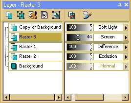
These are the layers I put on top of the icon--in order from bottom to top--with their blend modes and opacities.

(#dae3e6) Exclusion, 100%

(#ded2c2) Difference, 100%

Screen, 44%

Duplicate of the base, Soft Light, 100%
My layers palette at this point:
Merge all, aaaaaaand...

When choosing colors for the difference and exclusion layers, it's best to pick soft, light colors, otherwise the image might get blotted out altogether. Also, make sure the Exclusion layer is below the Difference layer, or it looks kinda messy.
The red and yellow gradient used above is by me, and you're welcome to use it. :) But any other bright gradient or color will probably work just as well.
As a finishing touch, type in some tiny text. I used Arial Black, size 2. To pick the color, I used the eyedropper on a dark area of the image. But, for most practical purposes, the color is black. :P
This is the end result:

Edit: Oh, and if you want to use this icon, help yourself. Just let me know, and credit.
So here's another one, mostly about lighting and color. Pretty different from the first one I posted, but I've tried to still keep it pretty straightforward.
Making this icon:

I did it in PSP 9, but I think it'll translate pretty easily again.
As usual, if you have any questions, let me know! :D
So, we begin with this base, simply cropped and resized from an image I found through a google image search which lead to Obidala.

A pretty scene, but the quality leaves something to be desired.
Start by sharpening it by going to Adjust-->Sharpness-->Sharpen.
If anything comes out too jagged or pixely after that, take the Soften brush to smooth them out. I used it in size 2, opacity 40, on the side of Obi's head as well as Padme's tiara and sleeve.

Nothing too drastic thus far...
Now, duplicate your base three times, so that you have four identical layers on top of each other.
(As you read this next step, keep in mind that you should adjust opacities and saturations according to what you think looks best for your image. No need to do it exactly like this.)
Leave the original (the very bottom layer) as it is.
Select the next one up and set its blend mode to Screen. Also, desaturate it partially (do this by going to Adjust-->Hue and Saturation-->Hue/Saturation/Lightness and drag the Saturation slider to something below zero). Lower this layer's opacity to 56.
Select the next one above this and set its blend mode to Soft Light.
Select the next one (should be the very top layer) and set its blend mode to Overlay. Desaturate it completely (drag the Saturation slider all the way to the bottom).
To avoid further confusion, this is what my Layers palette looked like:

Merge all (Layers-->Merge-->Merge all). This is what I had:

Now, we add the light effects, using this texture (made by me).

Copy and paste it onto your base as a new layer (Edit-->Paste-->Paste as New Layer) and set the blend mode to Screen.

Not quite what I wanted it to be. So, I duplicated the texture twice, and arranged them in a way (using the Move Tool) that roughly fitted what I had in mind.

I then used the background eraser to erase the parts I didn't want (which was quite a lot), and also to make some of it look like it was behind Obi and Padme. (When you're erasing, be sure that the layer you want to erase on is selected in the layers palette). I used the Background eraser in size 13, Opacity 100, and Hardness 50.
After this, I also lowered the opacities of the light layers.

Once you're happy with how your light looks, merge all the layers.
Coloring is next.
These are the layers I put on top of the icon--in order from bottom to top--with their blend modes and opacities.

(#dae3e6) Exclusion, 100%

(#ded2c2) Difference, 100%

Screen, 44%

Duplicate of the base, Soft Light, 100%
My layers palette at this point:

Merge all, aaaaaaand...

When choosing colors for the difference and exclusion layers, it's best to pick soft, light colors, otherwise the image might get blotted out altogether. Also, make sure the Exclusion layer is below the Difference layer, or it looks kinda messy.
The red and yellow gradient used above is by me, and you're welcome to use it. :) But any other bright gradient or color will probably work just as well.
As a finishing touch, type in some tiny text. I used Arial Black, size 2. To pick the color, I used the eyedropper on a dark area of the image. But, for most practical purposes, the color is black. :P
This is the end result:

Edit: Oh, and if you want to use this icon, help yourself. Just let me know, and credit.