Full icon tutorial - Veronica and Logan
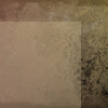
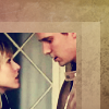
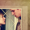
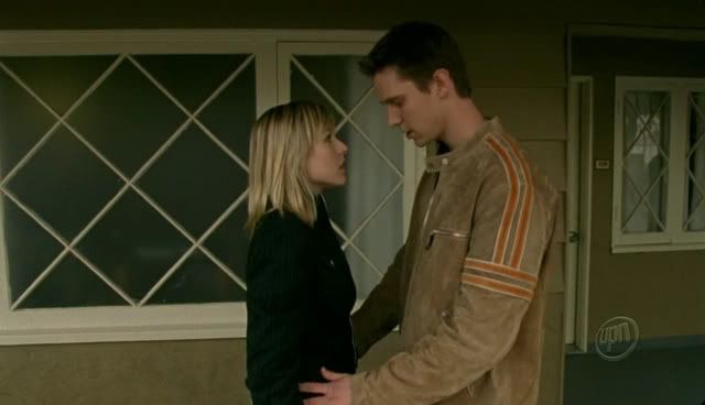
How to go from this to 
Made in PSP9. Not checked it in Photoshop - I guess it should translate okay, there's one step (which,l of course, happens to be the one that gives the image its colouring) that might not.
1. Start with your base. I created mine using a gradient by crumblingwalls and some brushes in black and white over the top, but you can make your own or use a pre-made base if you prefer.

2. I selected an area of 75x80 pixels in the bottom left corner, filled it with #cab78e and reduced the layer opacity to 34%.
3. I then created another rectangle beside the first, and this time changed the opacity to 56%.

4. I applied this gradient by crumblingwalls on screen, 42%.


5. I applied this gradient, also by crumblingwalls, on soft light, 26%.


6. I cropped my cap to 70x70, adjusted the brightness and contrast a little (there's a reason why I've left it so dark, honestly), then put it in the bottom left hand corner of my icon.
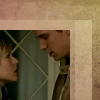
7. This is where things might get a little weird if you're not using PSP9. I duplicated the layer with the cap then went to Adjust -> Color Balance -> Black and White Points. I set black to a bright blue (#000080), grey to a mid-yellowish colour (#f4ebb2) and white to cream (#fcfade). I then set this layer to screen.
8. I then duplicated my original base (not the screen layer), dragged it above the screen layer, and set it to overlay at 50%.
9. I selected the area over the cap only (not the border part), filled it with #d0b8a2 and set it to color at 20%.
10. I added a 2px border to the top and right edges of the cap in #ffffca and set it to lighten, 60%.
11. For the text, I chose lyrics from Vanessa Carlton's "Who's To Say". I added the line "Who's to say" in Times New Roman 8pt bold, all caps, black and set it to soft light.
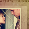
12. The icon still looked a little empty, so I added the line "That this is not our love" underneath, in Times New Roman 4pt bold, also on soft light.

This tutorial is designed as a guide to show you how I achieved effects in this icon, please do not copy it exactly. If you make something using it, I'd love to see.
The icon itself is part of my next set of VM icons, which will be posted once this week's round of icontests are over. If you want to take it now, that's fine, just make sure to credit me (fadedpages) if you do, please.
Made in PSP9. Not checked it in Photoshop - I guess it should translate okay, there's one step (which,l of course, happens to be the one that gives the image its colouring) that might not.
1. Start with your base. I created mine using a gradient by crumblingwalls and some brushes in black and white over the top, but you can make your own or use a pre-made base if you prefer.
2. I selected an area of 75x80 pixels in the bottom left corner, filled it with #cab78e and reduced the layer opacity to 34%.
3. I then created another rectangle beside the first, and this time changed the opacity to 56%.
4. I applied this gradient by crumblingwalls on screen, 42%.
5. I applied this gradient, also by crumblingwalls, on soft light, 26%.
6. I cropped my cap to 70x70, adjusted the brightness and contrast a little (there's a reason why I've left it so dark, honestly), then put it in the bottom left hand corner of my icon.
7. This is where things might get a little weird if you're not using PSP9. I duplicated the layer with the cap then went to Adjust -> Color Balance -> Black and White Points. I set black to a bright blue (#000080), grey to a mid-yellowish colour (#f4ebb2) and white to cream (#fcfade). I then set this layer to screen.
8. I then duplicated my original base (not the screen layer), dragged it above the screen layer, and set it to overlay at 50%.
9. I selected the area over the cap only (not the border part), filled it with #d0b8a2 and set it to color at 20%.
10. I added a 2px border to the top and right edges of the cap in #ffffca and set it to lighten, 60%.
11. For the text, I chose lyrics from Vanessa Carlton's "Who's To Say". I added the line "Who's to say" in Times New Roman 8pt bold, all caps, black and set it to soft light.
12. The icon still looked a little empty, so I added the line "That this is not our love" underneath, in Times New Roman 4pt bold, also on soft light.
This tutorial is designed as a guide to show you how I achieved effects in this icon, please do not copy it exactly. If you make something using it, I'd love to see.
The icon itself is part of my next set of VM icons, which will be posted once this week's round of icontests are over. If you want to take it now, that's fine, just make sure to credit me (fadedpages) if you do, please.