Full icon tutorial - Rose
Go from 
to
or
Note: The cap used is from last night's season finale of Doctor Who, but I don't really consider it to be spoilery if you don't know the context. If anyone majorly disagrees, do let me know (politely, please). I've replaced the text of the icon above, but the text on the icon behind the cut is spoilery. You have been warned.
Made using PS CS2 and PSP9 (but can easily be done with just PS).
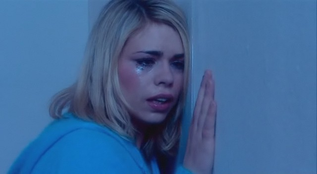
1. I started with this cap from Wicked Elf, which I cropped and sharpened to make my base.
2. I wanted to remove the blue filter on the cap to make my icon more naturally coloured. I opened Variations (Image -> Adjustments -> Variations) and clicked once on more red then once on more yellow. This will be different depending on the cap you use. Use your judgement - the aim is to get the colouring as natural as possible.

As of this step, I moved back to PSP, simply because I'm more comfortable with the program. You can continue just as well using Photoshop, though.
3. I duplicated the base layer and set it to screen at 70%.

4. I then duplicated it again, and set this layer to soft light, 68%.

5. The icon was now too bright for my tastes, and it doesn't really suit the cap. I selected the bottom layer and desaturated it.

6. It's now gone from being too bright to a bit too washed out. I selected the screen layer and upped both the brightness and contrast by 20. I then did the same thing to the soft light layer.

7. Almost there. I still wasn't entirely happy with the colour. I added a Brightness/Contrast adjustment layer on top - brightness +10, contrast +5. I then finished off with a Hue/Saturation/Adjustment layer to increase the saturation by 13.
You can stop here if you wish, or you can continue to make the second icon above.
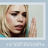
8. I cropped and resized the picture of Rose to 90x68 and pasted it as a new layer onto a background of #afc1ce.

9. I then created a new layer below the picture of Rose and added a 5 pixel border in #d7e0e6.

10. I decided I wanted Rose to stand out a bit more, so I duplicated the layer with the pic, desaturated it and set it to soft light at 70%.

11. I finished off the icon by adding a quote from the episode in #d7e0e6 - "I'm burning up a sun to say goodbye". The font I used is Arial Black, all caps - "I'm burning up a sun" is in 3pt with tracking set to 200; "to say goodbye" is in 5pt with tracking set to 150.
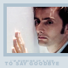
The final result. I also made an icon of the Doctor in the same way.
This tutorial is designed as a guide to show you how I achieved the colouring of this icon, please do not copy it exactly. If you make something using it, I'd love to see.
to
or
Note: The cap used is from last night's season finale of Doctor Who, but I don't really consider it to be spoilery if you don't know the context. If anyone majorly disagrees, do let me know (politely, please). I've replaced the text of the icon above, but the text on the icon behind the cut is spoilery. You have been warned.
Made using PS CS2 and PSP9 (but can easily be done with just PS).
1. I started with this cap from Wicked Elf, which I cropped and sharpened to make my base.
2. I wanted to remove the blue filter on the cap to make my icon more naturally coloured. I opened Variations (Image -> Adjustments -> Variations) and clicked once on more red then once on more yellow. This will be different depending on the cap you use. Use your judgement - the aim is to get the colouring as natural as possible.
As of this step, I moved back to PSP, simply because I'm more comfortable with the program. You can continue just as well using Photoshop, though.
3. I duplicated the base layer and set it to screen at 70%.
4. I then duplicated it again, and set this layer to soft light, 68%.
5. The icon was now too bright for my tastes, and it doesn't really suit the cap. I selected the bottom layer and desaturated it.
6. It's now gone from being too bright to a bit too washed out. I selected the screen layer and upped both the brightness and contrast by 20. I then did the same thing to the soft light layer.
7. Almost there. I still wasn't entirely happy with the colour. I added a Brightness/Contrast adjustment layer on top - brightness +10, contrast +5. I then finished off with a Hue/Saturation/Adjustment layer to increase the saturation by 13.
You can stop here if you wish, or you can continue to make the second icon above.
8. I cropped and resized the picture of Rose to 90x68 and pasted it as a new layer onto a background of #afc1ce.
9. I then created a new layer below the picture of Rose and added a 5 pixel border in #d7e0e6.
10. I decided I wanted Rose to stand out a bit more, so I duplicated the layer with the pic, desaturated it and set it to soft light at 70%.
11. I finished off the icon by adding a quote from the episode in #d7e0e6 - "I'm burning up a sun to say goodbye". The font I used is Arial Black, all caps - "I'm burning up a sun" is in 3pt with tracking set to 200; "to say goodbye" is in 5pt with tracking set to 150.
The final result. I also made an icon of the Doctor in the same way.
This tutorial is designed as a guide to show you how I achieved the colouring of this icon, please do not copy it exactly. If you make something using it, I'd love to see.