Icon Tutorial
So, a while ago, somebody asked me to recreate this icon. And I finally have. This is a tutorial, a guide. I actually don't care if you copy it word for word, but how are you supposed to grow as an icon maker if you don't experiment. Srsly. XD
But anyway. Made in PSP9. I'm almost positive that it's translatable into other programs.
1. I started out with this cap. I forget who made it, but they are credited in the eye_knead_icons userinfo.
2. Cropped it down. Messed around with it a bit until I get the base. XD I'm not putting details here, because cropping and sharpening and whathaveyou all really depend upon the base.
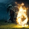
3. Duplicated the base twice. The first duplicate I set to Screen. Second duplicate I set to Soft Light and desaturated the layer 100%.
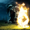
4. Then between the Screen and Soft Light layers, I created two new layers. The one on the bottom, I filled with a brownish color (#caba9e) and set it to multiply. Then the one on top of that, I filled with blue (#04163a) and set to exclusion.
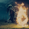
5. Yeah, I realize that this is getting worse as we go along. XD But it'll get better, I promise. So I decided that what we had was way too dark. So I duplicated the Screen layer of the base, and moved it on top of the blue Exclusion layer. Then, I duplicated the blue exclusion layer, and moved the duplicate down below the brown Multiply layer. Then I sharpened the layers that were duplicates of the base until satisfied. :P
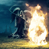
6. Done! Not that hard, really. It's pretty much a slightly more roundabout blue exlusion/tan multiply layer coloring tutorial. XD But if it helps, I'm glad!
Icons will be coming soon, I hope. >_>
But anyway. Made in PSP9. I'm almost positive that it's translatable into other programs.
1. I started out with this cap. I forget who made it, but they are credited in the eye_knead_icons userinfo.
2. Cropped it down. Messed around with it a bit until I get the base. XD I'm not putting details here, because cropping and sharpening and whathaveyou all really depend upon the base.

3. Duplicated the base twice. The first duplicate I set to Screen. Second duplicate I set to Soft Light and desaturated the layer 100%.

4. Then between the Screen and Soft Light layers, I created two new layers. The one on the bottom, I filled with a brownish color (#caba9e) and set it to multiply. Then the one on top of that, I filled with blue (#04163a) and set to exclusion.

5. Yeah, I realize that this is getting worse as we go along. XD But it'll get better, I promise. So I decided that what we had was way too dark. So I duplicated the Screen layer of the base, and moved it on top of the blue Exclusion layer. Then, I duplicated the blue exclusion layer, and moved the duplicate down below the brown Multiply layer. Then I sharpened the layers that were duplicates of the base until satisfied. :P

6. Done! Not that hard, really. It's pretty much a slightly more roundabout blue exlusion/tan multiply layer coloring tutorial. XD But if it helps, I'm glad!
Icons will be coming soon, I hope. >_>