inquisitory ✭ 54; give it up for me please.
Long time, no tutorial! Let's fix that today \o/
Request by eclairvoyant and dragonsquee ♥
start
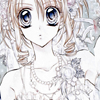
to finish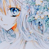

program Photoshop. Uses Selective Color, so not translatable.
✎ abbreviations/terms
AL ➝ adjustment layer
L ➝ levels
HS ➝ hue/saturation
SC ➝ selective color
BC ➝ brightness/contrast
for example, SC/AL will mean Selective Color Adjustment Layer.
Two pictures to start with today! \o/


Let's work on the L/AL first to bring out the darker tones in the artwork, it's a bit too light. Try this :>
RGB: 11, 0.80, 255
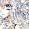
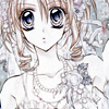
Better already! For some more subtle darker tones, put this tannish brown (b19b6f) on Multiply, 10%. lol sounds kind of pointless, but it makes a difference!

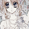
Okay have this texture by dusty_memories and this by loveicon. \o/ Slap them both on, on Multiply, 60% and Multiply, 100 respectively~
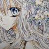
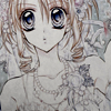
Now that we've worked to make the bottom dark, why not go the exact opposite way? 8D I just brushed some white on the bottom softly, and then used a Gaussian Blur to make it smoother. Because who doesn't like glowy bits, really?
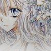
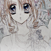
I think we've messed it up enough by now to add a Soft Light duplicate and fix it, don't you? Go for it~
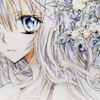
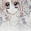
This is one of those places where you could stop and call it a day, but I want to go a bit further >:D Put a dark gray (161616) on Exclusion, 70% to go for a mellower feel.
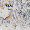
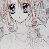
Now for a HS/AL~ Move Saturation to 36 and - shocker - Lightness to -6. I don't normally mess with the Lightness setting on one of these ALs because it tends to make the image look gross reeeaaallly quickly, but a little bit works here :D
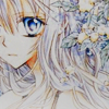
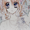
Now please use the SC/AL settings outlined here by indolence. They really brighten up the image and add a bit of a blue tone, which I like here!
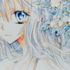
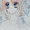
Almost there hnnnngh! Have another really quick SC/AL for the heck of it, can't remember the source:
Reds: -55, 0, 31, 0
Yellows: -11, 0, 8, 0
Greens: 100, -100, 100, 0
Magentas: -100, 100, 100, 0
Whites: 0, 0, -51, 0
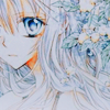
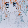
Because it feels a tad flat, use two final BC/ALs: one with -15 Brightness and 58 Contrast, the other with 27 Contrast (I suppose you could use one and just add the two contrasts together but oh look a squirrel!). And we out! /o/


✖ other examples
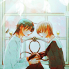
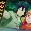
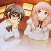
try it out! then friend us?
Request by eclairvoyant and dragonsquee ♥
start


to finish


program Photoshop. Uses Selective Color, so not translatable.
✎ abbreviations/terms
AL ➝ adjustment layer
L ➝ levels
HS ➝ hue/saturation
SC ➝ selective color
BC ➝ brightness/contrast
for example, SC/AL will mean Selective Color Adjustment Layer.
Two pictures to start with today! \o/


Let's work on the L/AL first to bring out the darker tones in the artwork, it's a bit too light. Try this :>
RGB: 11, 0.80, 255


Better already! For some more subtle darker tones, put this tannish brown (b19b6f) on Multiply, 10%. lol sounds kind of pointless, but it makes a difference!


Okay have this texture by dusty_memories and this by loveicon. \o/ Slap them both on, on Multiply, 60% and Multiply, 100 respectively~


Now that we've worked to make the bottom dark, why not go the exact opposite way? 8D I just brushed some white on the bottom softly, and then used a Gaussian Blur to make it smoother. Because who doesn't like glowy bits, really?


I think we've messed it up enough by now to add a Soft Light duplicate and fix it, don't you? Go for it~


This is one of those places where you could stop and call it a day, but I want to go a bit further >:D Put a dark gray (161616) on Exclusion, 70% to go for a mellower feel.


Now for a HS/AL~ Move Saturation to 36 and - shocker - Lightness to -6. I don't normally mess with the Lightness setting on one of these ALs because it tends to make the image look gross reeeaaallly quickly, but a little bit works here :D


Now please use the SC/AL settings outlined here by indolence. They really brighten up the image and add a bit of a blue tone, which I like here!


Almost there hnnnngh! Have another really quick SC/AL for the heck of it, can't remember the source:
Reds: -55, 0, 31, 0
Yellows: -11, 0, 8, 0
Greens: 100, -100, 100, 0
Magentas: -100, 100, 100, 0
Whites: 0, 0, -51, 0


Because it feels a tad flat, use two final BC/ALs: one with -15 Brightness and 58 Contrast, the other with 27 Contrast (I suppose you could use one and just add the two contrasts together but oh look a squirrel!). And we out! /o/


✖ other examples


try it out! then friend us?