inquisitory ✭ 52; alright, let's go outside.
chugachugchug
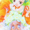
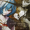
Request by almateria ♥
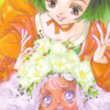
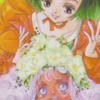
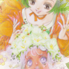
start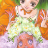
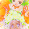
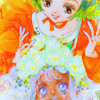
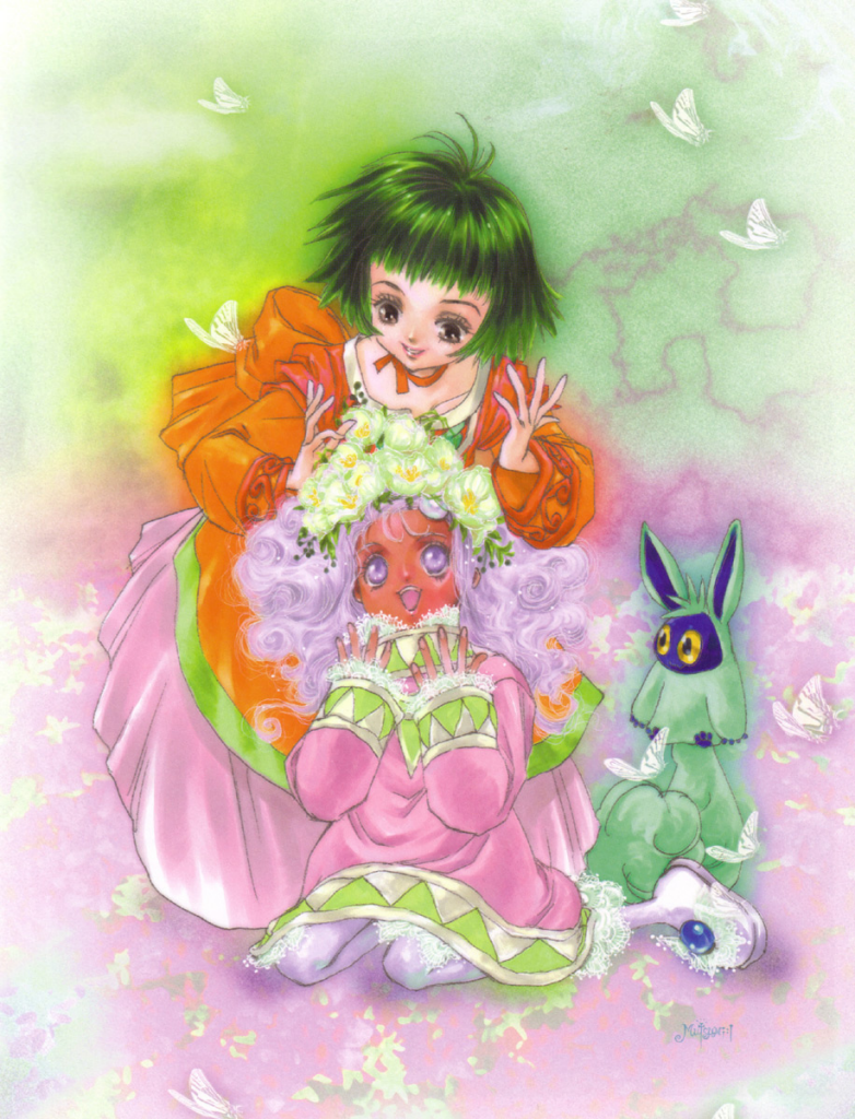
to finish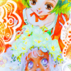
program Photoshop. Uses Selective Color and Channel Mixer, so not translatable.
✎ abbreviations/terms
AL ➝ adjustment layer
HS ➝ hue/saturation
SC ➝ selective color
BC ➝ brightness/contrast
CM ➝ channel mixer
for example, SC/AL will mean Selective Color Adjustment Layer.
kay before we go anywhere, I gotta say, even for me, this colouring is pretty weird xD Still, let's go for it and see where it takes us~
totally hotlinking from Sei's photobucket whoops |D;; /shot. YAY to_a image theme!
Two quick duplicates from the get-go, one Color Burn, 20% and one Screen, 60%. Why? I DON'T KNOW, I DON'T DECIDE THESE THINGS- wait
Take a light gray (c2c2c2) on Multiply, 50%. This one's really necessary later on;;;
kay this is kind of a weird one, idek. I wanted a really really subtle texture around the edges, kind of vintage and floral to emphasize the flowers in Meredy's hair. I chose this by toybirds, and I made a layer mask (the button at the bottom of the window with the circle in the square) and used a soft brush to take out everything except the corners.

yeeeesh. OKAY base duplicate on Screen, 40% plz, this is kinda dark!
kay maybe that's a bit overboard oh well we'll fix it later lol. Don't you just love my iconing attitude 8D Make a HS/AL and shove Saturation up to 47 or something similar, we really want a lot of colour here! Notice that I had to use the mask to block out Meredy's face, it went ridiculously red after all that saturation.
Getting there, right? now have two SC/ALs in a row. I honestly can't be bothered to figure out where the settings are from, don't remember whether I made them or not etc but here you go
Reds: -100, 0, 62, 0
Yellows: -100, 0, -40, 0
Neutrals: 30, -10, -23, 0
Reds: -37, -41, -55, 100
Whites: 100, -22, -55, -10
Blacks: -22, 25, 44, 12
Love it 8D so I know I defs made these CM/AL settings because I saved them, yay! The function is to slightly darken the icon, I think it gives a nice effect. You may want to try it out on other images, it's kinda neat :>
Red: 110, -29, -6
Green: -6, 106, -6
Blue: 3, -9, 110
High time for a Soft Light, 100% base duplicate, wouldn't you agree?
Now that the colouring is sufficiently wacky, I think we have to add the finishing touches soon. BUT FIRST another SC/AL ftw lolol, on 50%:
Reds: -68, 9, 100, 0
Yellows: -100, 0, 83, 0
Cyans: 49, 0, -66, 0
Whites: 30, 0, -51, 0
Neutrals: -14, 0, 50, -9

Still a tad light though, so let's use a BC/AL for balance! I put Brightness to -38 and Contrast to 48; usually Contrast goes higher than however much Brightness is lowered, you see, idk why
augh I am a terrible person I forgot another source ;; this time for the texture on the sides! You'd think I would know this, it's quite distinctive and part of a larger texture! Well please tell me if you know, but for now, just use it on Screen, 100%.
one more BC/AL because I can do that rofl. Brightness 08, Contrast +53 (whut) and now iiisss naiiice ;D
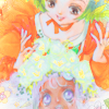
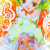
✖ other examples

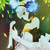
yeah that last one was altered a lot, but the basic structure is the same
try it out! then friend us?
Request by almateria ♥
start
to finish
program Photoshop. Uses Selective Color and Channel Mixer, so not translatable.
✎ abbreviations/terms
AL ➝ adjustment layer
HS ➝ hue/saturation
SC ➝ selective color
BC ➝ brightness/contrast
CM ➝ channel mixer
for example, SC/AL will mean Selective Color Adjustment Layer.
kay before we go anywhere, I gotta say, even for me, this colouring is pretty weird xD Still, let's go for it and see where it takes us~
totally hotlinking from Sei's photobucket whoops |D;; /shot. YAY to_a image theme!
Two quick duplicates from the get-go, one Color Burn, 20% and one Screen, 60%. Why? I DON'T KNOW, I DON'T DECIDE THESE THINGS- wait
Take a light gray (c2c2c2) on Multiply, 50%. This one's really necessary later on;;;
kay this is kind of a weird one, idek. I wanted a really really subtle texture around the edges, kind of vintage and floral to emphasize the flowers in Meredy's hair. I chose this by toybirds, and I made a layer mask (the button at the bottom of the window with the circle in the square) and used a soft brush to take out everything except the corners.
yeeeesh. OKAY base duplicate on Screen, 40% plz, this is kinda dark!
kay maybe that's a bit overboard oh well we'll fix it later lol. Don't you just love my iconing attitude 8D Make a HS/AL and shove Saturation up to 47 or something similar, we really want a lot of colour here! Notice that I had to use the mask to block out Meredy's face, it went ridiculously red after all that saturation.
Getting there, right? now have two SC/ALs in a row. I honestly can't be bothered to figure out where the settings are from, don't remember whether I made them or not etc but here you go
Reds: -100, 0, 62, 0
Yellows: -100, 0, -40, 0
Neutrals: 30, -10, -23, 0
Reds: -37, -41, -55, 100
Whites: 100, -22, -55, -10
Blacks: -22, 25, 44, 12
Love it 8D so I know I defs made these CM/AL settings because I saved them, yay! The function is to slightly darken the icon, I think it gives a nice effect. You may want to try it out on other images, it's kinda neat :>
Red: 110, -29, -6
Green: -6, 106, -6
Blue: 3, -9, 110
High time for a Soft Light, 100% base duplicate, wouldn't you agree?
Now that the colouring is sufficiently wacky, I think we have to add the finishing touches soon. BUT FIRST another SC/AL ftw lolol, on 50%:
Reds: -68, 9, 100, 0
Yellows: -100, 0, 83, 0
Cyans: 49, 0, -66, 0
Whites: 30, 0, -51, 0
Neutrals: -14, 0, 50, -9
Still a tad light though, so let's use a BC/AL for balance! I put Brightness to -38 and Contrast to 48; usually Contrast goes higher than however much Brightness is lowered, you see, idk why
augh I am a terrible person I forgot another source ;; this time for the texture on the sides! You'd think I would know this, it's quite distinctive and part of a larger texture! Well please tell me if you know, but for now, just use it on Screen, 100%.
one more BC/AL because I can do that rofl. Brightness 08, Contrast +53 (whut) and now iiisss naiiice ;D
✖ other examples
yeah that last one was altered a lot, but the basic structure is the same
try it out! then friend us?