inquisitory ✭ 47; we can get along.
asdflkjas there is an absolutely ridiculous gap between my tutorials, sorry :'D But I hope they're worth the wait?
Request by sun_soraya again rofl. ilu ♥
start
to finish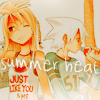
program Photoshop. Uses Selective Color, Channel Mixer and Color Balance, so not translatable.
✎ abbreviations/terms
AL ➝ adjustment layer
SC ➝ selective color
BC ➝ brightness/contrast
CB ➝ color balance
CM ➝ channel mixer
for example, SC/AL will mean Selective Color Adjustment Layer.
Cutest Soul Eater image ever, asdlkfjhs. xD I love Maka and Soul in this one, so I cropped them by themselves~

First things first, knock up the contrast with a Soft Light, 100% duplicate, and desaturate it (Image > Adjustments > Desaturate). This just makes it so that the red is a little less... offensive later on, lol.
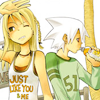
Because you can't see the text for this one on the page (ffffff) I'll just tell you it's pure white on Soft Light, 100% xD This lights it up a ton; almost like a Screen layer, only not! 8)
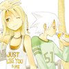
CB/AL time /o/ Use this and alter as needed:
Midtones: -29, 0, 26
Highlights: 9, 0, 0

More blue, but what now? how about a SC/AL with a ton of random settings lol. WHAT FUN TO TYPE OUT, RIGHT?
Greens: 0, 0, -100, 100
Cyans: 15, 20, -100, 10
Blues: 0, 0, -60, 100
Neutrals: -10, 0, 0, -15
Blacks: 26, 5, 0, 45
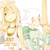
Because we clearly haven't had our fill of random today, let's give it a bluish tint with a dark red (181818) on Exclusion, 100%~~
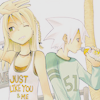
Now for those quintessential SC/AL settings by hl_upics! Boy I hope you saved them already, you probably have if you've used any of my tutorials at all :'D but here they are anyway~
Reds: -52, 0, 0, 26
Yellows: -57, -7, 0, 34
Cyans: 48, -44, 0, -27
Whites: 100, 0, -63, 21
Neutrals: 20, 0, 24, 9
Blacks: -1, 0, 0, 32
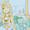
Cool, cool! As if we needed to make it any darker, but. I've been pretty addicted to some CM/AL settings by whiz that go like this (btw I have no idea how channel mixer works, I just mess with it xD):
Red: 85, -10, 10, 0
Green: -15, 50, 55, 0
Blue: -50, 75, 60, 0
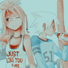
Spiffy - and now that we've darkened it, what better to do than lighten it up again! One more SC/AL just to be weirder! Use the settings in step 2 here by mutebox.
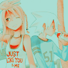
adlkfhs I think it's about time for another duplicate of the base, don't you? Soft Light, 100% ftw!
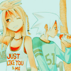
BUT WAIT! Shock and horror, this was another icon for manga_battle so I needed a more red colour scheme! Gosh, what have I done xD Well let's try to fix it with a bright red (ec1713) on Color, 30%!
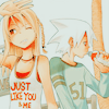
Now for a BC/AL to balance it some more. Brightness to -30 (you prolly won't need that much though), and Contrast to 60!
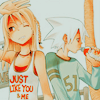
I think we need one more fix to fully make the colour scheme red: another CB/AL, perhaps! It's elementary, my dear Watson~ /dons Sherlock hat
Shadows: 19, 0, -14
Midtones: 32, 0, -35
Highlights: 13, 0, 0
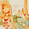
Hey, remember the weirdo swirls we made near the end of this tutorial? Well, pull those out again and use 'em! Also, swipe a soft, white brush over the bottom of the icon to get that misty effect. It doesn't really convey the point of the icon that well, but uh. Next step! /o/;;
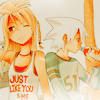
Because of my fail in showing the heat of summer in the icon's colouring, let's try it with the text instead! :'D I used Cataclysmic in white with a bit of a drop shadow, on 80% and rotated slightly to get the effect.
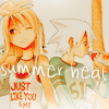
We all know I can't finish an icon without a final BC/AL, so move Brightness to -14 and Contrast to 41 to finally, finally be done :'D Sorry that was so long!

✖ other examples
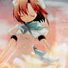
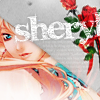
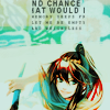
(the examples aren't very unique this time because I already posted them :'D oops!)
try it out! then friend us?
Request by sun_soraya again rofl. ilu ♥
start

to finish

program Photoshop. Uses Selective Color, Channel Mixer and Color Balance, so not translatable.
✎ abbreviations/terms
AL ➝ adjustment layer
SC ➝ selective color
BC ➝ brightness/contrast
CB ➝ color balance
CM ➝ channel mixer
for example, SC/AL will mean Selective Color Adjustment Layer.
Cutest Soul Eater image ever, asdlkfjhs. xD I love Maka and Soul in this one, so I cropped them by themselves~

First things first, knock up the contrast with a Soft Light, 100% duplicate, and desaturate it (Image > Adjustments > Desaturate). This just makes it so that the red is a little less... offensive later on, lol.

Because you can't see the text for this one on the page (ffffff) I'll just tell you it's pure white on Soft Light, 100% xD This lights it up a ton; almost like a Screen layer, only not! 8)

CB/AL time /o/ Use this and alter as needed:
Midtones: -29, 0, 26
Highlights: 9, 0, 0

More blue, but what now? how about a SC/AL with a ton of random settings lol. WHAT FUN TO TYPE OUT, RIGHT?
Greens: 0, 0, -100, 100
Cyans: 15, 20, -100, 10
Blues: 0, 0, -60, 100
Neutrals: -10, 0, 0, -15
Blacks: 26, 5, 0, 45

Because we clearly haven't had our fill of random today, let's give it a bluish tint with a dark red (181818) on Exclusion, 100%~~

Now for those quintessential SC/AL settings by hl_upics! Boy I hope you saved them already, you probably have if you've used any of my tutorials at all :'D but here they are anyway~
Reds: -52, 0, 0, 26
Yellows: -57, -7, 0, 34
Cyans: 48, -44, 0, -27
Whites: 100, 0, -63, 21
Neutrals: 20, 0, 24, 9
Blacks: -1, 0, 0, 32

Cool, cool! As if we needed to make it any darker, but. I've been pretty addicted to some CM/AL settings by whiz that go like this (btw I have no idea how channel mixer works, I just mess with it xD):
Red: 85, -10, 10, 0
Green: -15, 50, 55, 0
Blue: -50, 75, 60, 0

Spiffy - and now that we've darkened it, what better to do than lighten it up again! One more SC/AL just to be weirder! Use the settings in step 2 here by mutebox.

adlkfhs I think it's about time for another duplicate of the base, don't you? Soft Light, 100% ftw!

BUT WAIT! Shock and horror, this was another icon for manga_battle so I needed a more red colour scheme! Gosh, what have I done xD Well let's try to fix it with a bright red (ec1713) on Color, 30%!

Now for a BC/AL to balance it some more. Brightness to -30 (you prolly won't need that much though), and Contrast to 60!

I think we need one more fix to fully make the colour scheme red: another CB/AL, perhaps! It's elementary, my dear Watson~ /dons Sherlock hat
Shadows: 19, 0, -14
Midtones: 32, 0, -35
Highlights: 13, 0, 0

Hey, remember the weirdo swirls we made near the end of this tutorial? Well, pull those out again and use 'em! Also, swipe a soft, white brush over the bottom of the icon to get that misty effect. It doesn't really convey the point of the icon that well, but uh. Next step! /o/;;

Because of my fail in showing the heat of summer in the icon's colouring, let's try it with the text instead! :'D I used Cataclysmic in white with a bit of a drop shadow, on 80% and rotated slightly to get the effect.

We all know I can't finish an icon without a final BC/AL, so move Brightness to -14 and Contrast to 41 to finally, finally be done :'D Sorry that was so long!

✖ other examples


(the examples aren't very unique this time because I already posted them :'D oops!)
try it out! then friend us?