Narnia Friends Only Banner Tutorial
I'm sure many of you have seen my friends only banner for my own LJ and wondered how I got that coloring. Well wonder no more; I've provided a pretty extensive tutorial for you here. I saved the PSD of my banner, so I do in fact know each and every layer I used--I will warn you, however, that I will NOT give anyone the PSD and that these steps do not work for every image--they don't even work for an image from the same scene--so don't expect them to work for every image; believe me, I've tried. Thanks, and enjoy!
from
to
(previews are scaled down to save f-list space; click on the preview to get the actual sized image)
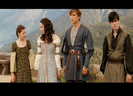
So we're starting with this image, basically a cropped screencap from the end of the Prince Caspian movie. (It's from my own set of screencaps, by the way.) The coloring really isn't too ugly to begin with, but I really want to accentuate the blues, greens and yellows in this picture.
First thing I'm going to do is put a dark brown color fill layer (I used #380301) on exclusion (100% opacity; vary this depending on your image) to get some of the yellows I want in the picture.
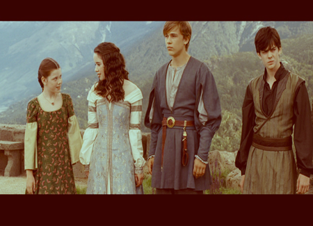
This is what you get--actually, it isn't that bad of a start and honestly, if I really wanted I could just flatten the image and duplicate the background layer (putting it on soft light) once to get a really nice image.
But I'm making a friends only banner here--and darn it, I want it to be unique.
So we're NOT going to do what I suggested about the soft light layer, though you can do that if you'd like. Instead, we're going to use a hue/saturation layer (master saturation: +15; opacity: 100%--again, vary this according to your image; my image was kind of lacking in bright colors so I put it to a little under a quarter opacity, you can use a lot less saturation if your image is very brightly colored) to accentuate all of the colors we already have in the picture.
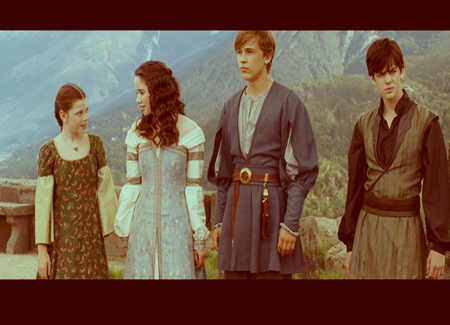
A little brighter, right?
Well, now we're going to use a little trick I learned in this tutorial to get pretty yellows and greens WITHOUT selective coloring. First, use a mustard yellow (I used #ffcc00) on multiply (I used 67% opacity to not make the ending image too yellow) to start the "fake" selective coloring trick.
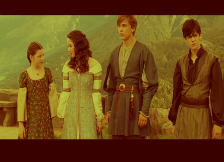
Ugly, right?
Trust me on this one. Now we want to get rid of most of those yellows--by using a light blue (it doesn't matter really what the exact numbers are; I used #95fffe and in the tutorial I mentioned before #8dcff5 is used) layer on screen (opacity about 50%; I used 45% to make the image not too light; higher than 50% opacity makes the image a lot lighter, lower than 50% opacity makes the image a lot darker)
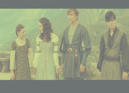
It looks even uglier, right?
Again, trust me. Things will all work out in the end. :) Now we're going to duplicate our base layer (the bottommost layer; the original image) and put it on soft light (I used 100% opacity because the previous blue layer made the image so light--you may need to lower the soft light opacity if it makes your image too dark).
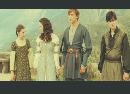
Still pretty ugly, right? But it's getting slowly better....
To make the image darker, we're going to duplicate our soft light layer in the previous step; you may have to SKIP this step if it makes your image way too dark.
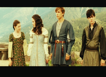
Wow, doesn't that look nice?
Except I still think my image is a little too light--so we're going to duplicate the soft light layer again--only this time de-saturating the duplicated layer. (Make a hue/saturation layer above the new soft light layer, drag master saturation down to -100, right-click the hue/saturation layer and click MERGE DOWN to make the layer de-saturated.)
I put this layer on 16% opacity, because I didn't want to make the dark colors in the image too dark now. You may need to skip this step or put the opacity down even lower to not make the dark colors too dark (i.e., making Edmund's sleeves look REALLY dark black, ect.).
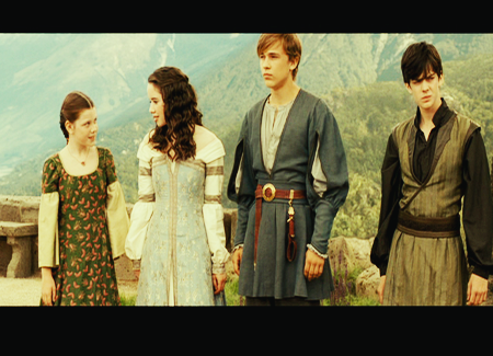
It doesn't look like much of a change, but it really depends on your image. Anyway, I'm pretty satisfied with the darkness/lightness of the colors in the image now--except I think now we've got a touch too much yellow in the picture and not enough blue or green.
So we're going to put a dark blue layer on exclusion (I used #000828 on 100% exclusion; again, this will vary with your image) to get rid of some of those yellows and dim the really bright colors in the image.
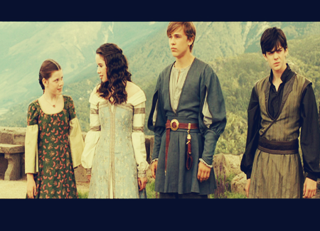
But hmmm, now it seems too dull and/or blue. So we're going to use a trick of mine: a forest green layer on exclusion (opacity at 85% for me to not make the image too light--using more than 85% for me--or make the image too dark--using less than 85% for me).
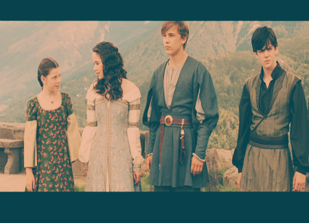
Right now it seems too light, though, right?
It's got nice greens and blues, though--so we're just going to use a brightness/contrast layer (-39 brightness, +25 contrast for me on 100% opacity) to make the image darker and with more contrast.
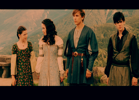
Oooh, almost perfect!
However, now I think it's too dark and has too much contrast--but I don't want to mess with the brightness/contrast layer above because that would just take away too much of the colors/contrast from the picture.
So I'm going to use this texture (by bambinainnero) on soft light (100% opacity--but as I've said multiple times, it really depends on your image)--after I've blurred it with Gaussian Blur (radius = 7.6 pixels for me) This texture will make the image lighter without removing any of its colors--actually adding colors, in fact.
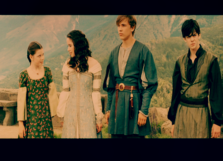
And that, my friends, is the final image with coloring. To spruce my friends only banner up, I added some text and a light blob (yes, light blobs can be used well!) behind the text and cropped the image a little to get this:
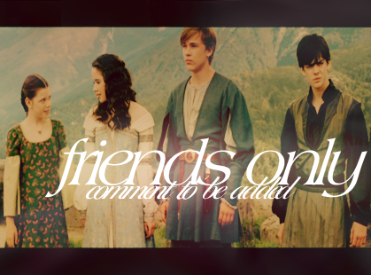
Hope the tutorial read well and I hope it can help you achieve similar coloring in your own icons and other graphics! :) Feel free to comment and ask questions if you'd like; feedback is much appreciated.
from

to

(previews are scaled down to save f-list space; click on the preview to get the actual sized image)

So we're starting with this image, basically a cropped screencap from the end of the Prince Caspian movie. (It's from my own set of screencaps, by the way.) The coloring really isn't too ugly to begin with, but I really want to accentuate the blues, greens and yellows in this picture.
First thing I'm going to do is put a dark brown color fill layer (I used #380301) on exclusion (100% opacity; vary this depending on your image) to get some of the yellows I want in the picture.

This is what you get--actually, it isn't that bad of a start and honestly, if I really wanted I could just flatten the image and duplicate the background layer (putting it on soft light) once to get a really nice image.
But I'm making a friends only banner here--and darn it, I want it to be unique.
So we're NOT going to do what I suggested about the soft light layer, though you can do that if you'd like. Instead, we're going to use a hue/saturation layer (master saturation: +15; opacity: 100%--again, vary this according to your image; my image was kind of lacking in bright colors so I put it to a little under a quarter opacity, you can use a lot less saturation if your image is very brightly colored) to accentuate all of the colors we already have in the picture.

A little brighter, right?
Well, now we're going to use a little trick I learned in this tutorial to get pretty yellows and greens WITHOUT selective coloring. First, use a mustard yellow (I used #ffcc00) on multiply (I used 67% opacity to not make the ending image too yellow) to start the "fake" selective coloring trick.

Ugly, right?
Trust me on this one. Now we want to get rid of most of those yellows--by using a light blue (it doesn't matter really what the exact numbers are; I used #95fffe and in the tutorial I mentioned before #8dcff5 is used) layer on screen (opacity about 50%; I used 45% to make the image not too light; higher than 50% opacity makes the image a lot lighter, lower than 50% opacity makes the image a lot darker)

It looks even uglier, right?
Again, trust me. Things will all work out in the end. :) Now we're going to duplicate our base layer (the bottommost layer; the original image) and put it on soft light (I used 100% opacity because the previous blue layer made the image so light--you may need to lower the soft light opacity if it makes your image too dark).

Still pretty ugly, right? But it's getting slowly better....
To make the image darker, we're going to duplicate our soft light layer in the previous step; you may have to SKIP this step if it makes your image way too dark.

Wow, doesn't that look nice?
Except I still think my image is a little too light--so we're going to duplicate the soft light layer again--only this time de-saturating the duplicated layer. (Make a hue/saturation layer above the new soft light layer, drag master saturation down to -100, right-click the hue/saturation layer and click MERGE DOWN to make the layer de-saturated.)
I put this layer on 16% opacity, because I didn't want to make the dark colors in the image too dark now. You may need to skip this step or put the opacity down even lower to not make the dark colors too dark (i.e., making Edmund's sleeves look REALLY dark black, ect.).

It doesn't look like much of a change, but it really depends on your image. Anyway, I'm pretty satisfied with the darkness/lightness of the colors in the image now--except I think now we've got a touch too much yellow in the picture and not enough blue or green.
So we're going to put a dark blue layer on exclusion (I used #000828 on 100% exclusion; again, this will vary with your image) to get rid of some of those yellows and dim the really bright colors in the image.

But hmmm, now it seems too dull and/or blue. So we're going to use a trick of mine: a forest green layer on exclusion (opacity at 85% for me to not make the image too light--using more than 85% for me--or make the image too dark--using less than 85% for me).

Right now it seems too light, though, right?
It's got nice greens and blues, though--so we're just going to use a brightness/contrast layer (-39 brightness, +25 contrast for me on 100% opacity) to make the image darker and with more contrast.

Oooh, almost perfect!
However, now I think it's too dark and has too much contrast--but I don't want to mess with the brightness/contrast layer above because that would just take away too much of the colors/contrast from the picture.
So I'm going to use this texture (by bambinainnero) on soft light (100% opacity--but as I've said multiple times, it really depends on your image)--after I've blurred it with Gaussian Blur (radius = 7.6 pixels for me) This texture will make the image lighter without removing any of its colors--actually adding colors, in fact.

And that, my friends, is the final image with coloring. To spruce my friends only banner up, I added some text and a light blob (yes, light blobs can be used well!) behind the text and cropped the image a little to get this:

Hope the tutorial read well and I hope it can help you achieve similar coloring in your own icons and other graphics! :) Feel free to comment and ask questions if you'd like; feedback is much appreciated.