Anne of Green Gables Paint Shop Pro Tutorial #1
Made at the request of msantimacassar. I think you'll be pleased to hear GIMP tutorials for icons featuring Romola Garai are also in the works, since I couldn't figure out a way to translate this particular icon to GIMP. :)
Okay, today I'll show you how I changed this: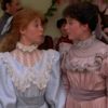
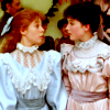
into this:
I had no idea how involved making this particular icon was, until I tried to explain it. This probably clocks in at the intermediate level, at the very least.
1. Crop your base. I wanted to focus on both Anne and Diana's expressions and dresses in the center of attention, so I cropped just inside the edges of their shoulders, and just along Anne's sash at the bottom and just above Diana's head at the top.
Result:
2. Brighten your image. I duplicated my base twice and set both duplicates to Screen 100.
Result: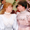
But now Anne's pale blue dress is almost too bright for us to appreciate all the pretty frills and lacework, so I created a Mask Layer
and applied it to only one of the duplicates, to tone down Anne's dress just a little.
Result: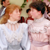
3. Tweak the coloring. First, I wanted to bring more pale blue and green into the picture, so I created a Color Balance layer and set it to
Midtones: -63
-24
-10
Result: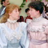
Second, a dramatic orange-red. I filled a New Layer with #d45502 and set it to Burn 37.
Result: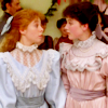
Third, brighter colors with more pale blue and green. I created a Channel Mixer Layer and set it to
Green:
R: 8
G:100
B: 6
Blue:
R: 0
G: 21
B: 100
Result: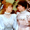
Fourth, MOAR ORANGE. New Layer filled with #f79873 and set to Burn 14.
Result: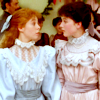
.
Fifth, a little purplish-blue. New Layer filled with #c0c0f4 and set to Burn 36.
Result: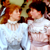
.
Sixth, a wee bit o' green. New Layer filled with #04bc20 and set to Burn 14.
Result: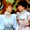
.
Seventh, last call for orange. New Layer filled with #f59c8b and set to Burn 27.
Yeah, there's a lot of tiny tweaks. I love to complicate things for myself. XD But put all together, those tiny tweaks go a long way, at least for me.
Result:
> > >
.
4. Bump up contrast and color. First, I adapt a tip I learned in a tut I saw a long time ago and haven't been able to find again. I create a New Layer, fill it with #e7d1f5, and set it to Luminance (Legacy) 100.
It makes the icon itself look like this:
.
Now I hit Copy-Merged and Paste, which captures that funny image in a new layer on top of all the other layers. I set duplicate that new layer and set the upper duplicate to Hard Light 20 and the lower duplicate to Burn 20. Finally, I delete the layer filled with #e7d1f5, so that it's out of the way.
Result: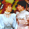
Next, I hit Copy-Merged again, and this time I hit Paste twice. I leave the lower of these two new layers, but I apply a Colorize to the upper layer, with the settings Hue: 72 and Saturation: 41.
The lower layer should look like this:
And the upper like this: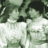
Set the lower to Soft Light 79 and the upper to Soft Light 52.
Result: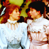
5. Hang in there, almost done. Now for light blobs to brighten and soften stuff up at the same time.
First, I set this one

to Screen 17,
this one
to Screen 36,
and this one

to Screen 23.
Result:
Then I Copy Merged again, hit Paste, and then moved the new layer down beneath the layers that look like this:
I set it to Multiply 36.
Result: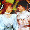
Finally, I hit Copy Merged and Paste, hit Sharpen, and set this last layer on top to Normal 43.
Result:
There! It is finished.
Okay, today I'll show you how I changed this:
into this:
I had no idea how involved making this particular icon was, until I tried to explain it. This probably clocks in at the intermediate level, at the very least.
1. Crop your base. I wanted to focus on both Anne and Diana's expressions and dresses in the center of attention, so I cropped just inside the edges of their shoulders, and just along Anne's sash at the bottom and just above Diana's head at the top.
Result:
2. Brighten your image. I duplicated my base twice and set both duplicates to Screen 100.
Result:
But now Anne's pale blue dress is almost too bright for us to appreciate all the pretty frills and lacework, so I created a Mask Layer
and applied it to only one of the duplicates, to tone down Anne's dress just a little.
Result:
3. Tweak the coloring. First, I wanted to bring more pale blue and green into the picture, so I created a Color Balance layer and set it to
Midtones: -63
-24
-10
Result:
Second, a dramatic orange-red. I filled a New Layer with #d45502 and set it to Burn 37.
Result:
Third, brighter colors with more pale blue and green. I created a Channel Mixer Layer and set it to
Green:
R: 8
G:100
B: 6
Blue:
R: 0
G: 21
B: 100
Result:
Fourth, MOAR ORANGE. New Layer filled with #f79873 and set to Burn 14.
Result:
.
Fifth, a little purplish-blue. New Layer filled with #c0c0f4 and set to Burn 36.
Result:
.
Sixth, a wee bit o' green. New Layer filled with #04bc20 and set to Burn 14.
Result:
.
Seventh, last call for orange. New Layer filled with #f59c8b and set to Burn 27.
Yeah, there's a lot of tiny tweaks. I love to complicate things for myself. XD But put all together, those tiny tweaks go a long way, at least for me.
Result:
> > >
.
4. Bump up contrast and color. First, I adapt a tip I learned in a tut I saw a long time ago and haven't been able to find again. I create a New Layer, fill it with #e7d1f5, and set it to Luminance (Legacy) 100.
It makes the icon itself look like this:
.
Now I hit Copy-Merged and Paste, which captures that funny image in a new layer on top of all the other layers. I set duplicate that new layer and set the upper duplicate to Hard Light 20 and the lower duplicate to Burn 20. Finally, I delete the layer filled with #e7d1f5, so that it's out of the way.
Result:
Next, I hit Copy-Merged again, and this time I hit Paste twice. I leave the lower of these two new layers, but I apply a Colorize to the upper layer, with the settings Hue: 72 and Saturation: 41.
The lower layer should look like this:
And the upper like this:
Set the lower to Soft Light 79 and the upper to Soft Light 52.
Result:
5. Hang in there, almost done. Now for light blobs to brighten and soften stuff up at the same time.
First, I set this one
to Screen 17,
this one
to Screen 36,
and this one
to Screen 23.
Result:
Then I Copy Merged again, hit Paste, and then moved the new layer down beneath the layers that look like this:
I set it to Multiply 36.
Result:
Finally, I hit Copy Merged and Paste, hit Sharpen, and set this last layer on top to Normal 43.
Result:
There! It is finished.