Round 4, Challenge 4, Results
The votes are counted again, so here are the results!
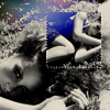
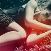
Unfortunately, we have to say goodbye to one iconmaker this week, but I'll put up the comeback challenge asap, so stay put!
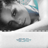
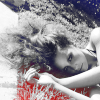
And congratulations to the winner!
Eliminated:
allllure : -4
People's Choice:
dance_the_dance : +4
( I'll make the banner as soon as I have time!)
- No mod's choice as there are so few entries.
[ voting tally]
Set 01: -1-1-1-1= -4
Set 02: -1-1+1+1= 0
Set 03: +1+1+1+1= +4
Comments:
To eliminate:
01 - poorly contrasted and colors do not enhance icon
01 - Coloring is really dark, the added bits of color don't seem to make that any different. Also the duplicated box in first icon seems misplaced.
01 - The coloured textures don´t fit with the rest of the icons.
01 - The light flairs are distracting and force attention away from the subject and the first icon of the set is too busy, and much too dark, while the second one is oversharpened.
02 - The font doesnt compliment the icon
02 - The icons are too dark and plain.
To keep:
02 - great contrast and crops on both icons, good font choice
02 - Simple, good b&w colouring and good croping.
03 - Good use of textures and good contrast
03 - The icons are beautifully contrasted and the simple textures are easy on the eyes, and don't take over the icons.
03 - Very nice use of textures, and lovely crop on the first icon.
03 - Beautiful lighting & textures used
Unfortunately, we have to say goodbye to one iconmaker this week, but I'll put up the comeback challenge asap, so stay put!
And congratulations to the winner!
Eliminated:
allllure : -4


People's Choice:
dance_the_dance : +4


( I'll make the banner as soon as I have time!)
- No mod's choice as there are so few entries.
[ voting tally]
Set 01: -1-1-1-1= -4
Set 02: -1-1+1+1= 0
Set 03: +1+1+1+1= +4
Comments:
To eliminate:
01 - poorly contrasted and colors do not enhance icon
01 - Coloring is really dark, the added bits of color don't seem to make that any different. Also the duplicated box in first icon seems misplaced.
01 - The coloured textures don´t fit with the rest of the icons.
01 - The light flairs are distracting and force attention away from the subject and the first icon of the set is too busy, and much too dark, while the second one is oversharpened.
02 - The font doesnt compliment the icon
02 - The icons are too dark and plain.
To keep:
02 - great contrast and crops on both icons, good font choice
02 - Simple, good b&w colouring and good croping.
03 - Good use of textures and good contrast
03 - The icons are beautifully contrasted and the simple textures are easy on the eyes, and don't take over the icons.
03 - Very nice use of textures, and lovely crop on the first icon.
03 - Beautiful lighting & textures used