Round 4, Challenge 3, Results
The votes are counted, thanks to all who voted!
I'm really sorry for the delay this week, but I've had so much to do!:/
Unfortunately, we have to say goodbye to two iconmakers this week too, but please stay put for the comeback challenge;)
But congratulations to the winner!
New challenge and banners will come asap!
Eliminated:
russian_hotness : -8

misses_turner : -4
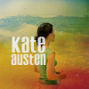
People's Choice:
imaginary_lives : +2
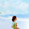
Mod's choice:
roukinelj
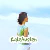
- I love the way the sky and ocean is all smudged, and the coloring is really beautiful.
[ voting tally]
01: -1+1+1+1= +2
02: -1-1-1-1-1-1-1-1= -8
03: -1-1-1-1= -4
04: -1-1+1+1= 0
05: +1= +1
06: -1-1-1+1+1+1= 0
(If your icon number is not listed, you recieved no votes).
Comments:
(If you didn't vote, you will not recieve your comments).
To eliminate:
01 - Extremely oversharpened, and too much unused negative space.
04 - The font isnt doesnt suit the icon
04 - The blues are oversaturated and overpower the icon
06 - Kate looks too dark and the textures (especially the text one) don't really fit in the icon.
06 - Too dark, the red light spot is distracting
06 - I don't see the point with the tiny text texture
To keep:
01 - Cool colouring
01 - Simple but nice
01 - It's very simple and plain, and looks quite nice.
04 - Very nice coloring. It makes the colors of the icon bright. The cropping is also good and the color of the font matches the coloring very well.
04 - Very nicely lightened up
05 - Great coloring and use of textures!
06 - Elegant use of color and text
06 - I love the light flare in the corner, and the unique cropping. Brilliant colouring.
06 - Nice crop and effects, the icon has atmosphere :)
I'm really sorry for the delay this week, but I've had so much to do!:/
Unfortunately, we have to say goodbye to two iconmakers this week too, but please stay put for the comeback challenge;)
But congratulations to the winner!
New challenge and banners will come asap!
Eliminated:
russian_hotness : -8

misses_turner : -4

People's Choice:
imaginary_lives : +2

Mod's choice:
roukinelj

- I love the way the sky and ocean is all smudged, and the coloring is really beautiful.
[ voting tally]
01: -1+1+1+1= +2
02: -1-1-1-1-1-1-1-1= -8
03: -1-1-1-1= -4
04: -1-1+1+1= 0
05: +1= +1
06: -1-1-1+1+1+1= 0
(If your icon number is not listed, you recieved no votes).
Comments:
(If you didn't vote, you will not recieve your comments).
To eliminate:
01 - Extremely oversharpened, and too much unused negative space.
04 - The font isnt doesnt suit the icon
04 - The blues are oversaturated and overpower the icon
06 - Kate looks too dark and the textures (especially the text one) don't really fit in the icon.
06 - Too dark, the red light spot is distracting
06 - I don't see the point with the tiny text texture
To keep:
01 - Cool colouring
01 - Simple but nice
01 - It's very simple and plain, and looks quite nice.
04 - Very nice coloring. It makes the colors of the icon bright. The cropping is also good and the color of the font matches the coloring very well.
04 - Very nicely lightened up
05 - Great coloring and use of textures!
06 - Elegant use of color and text
06 - I love the light flare in the corner, and the unique cropping. Brilliant colouring.
06 - Nice crop and effects, the icon has atmosphere :)