Round 3, Challenge 10, Results
The votes are counted, thanks to all that voted.
Unfortunately, we have to say goodbye to one iconmaker this week too, but stay tuned for the next round;)
The new and final challenge will be up sometime tonight!
Eliminated:
roukinelj : -4

I'm sorry hun, but I hope you'll still be up for round 4:)
People's Choices (tie):
good_memories : +2

tove_91 : +2

Thanks a lot! And since I am through to the final, I unscreened the votes in the voting post.
[ voting tally]
1:-1+1-1+1= 0
2:-1-1+1+1+1+1= +2
3:-1-1-1-1= -4
4:+1+1= +2
Comments:
To eliminate:
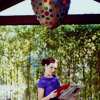
01: The icon looks a bit dull and without enough contrast.
01: The image is a bit blurry
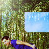
02: I don't see the point with the blue sky texture
02: I didn't like the cropping and the blue brush
03: The icon is to dark
03: The textures are too overpowering and the tiny text looses it's point
03: Oversharp; the tiny text is barely noticeable (because of the background) and therefore redundant
03: The textures overpower the image and are too distracting
To keep:
01: Nice colouring and cropping
01: I like the cropping and a little bit the coloring
02: Awesome cropping, but you could better use a green texture ;)
02: Very cool composition and original use of text and texture or stock image (whatever that is)
02: Cool crop and good use of texture
02: Interesting cropping
04: Simple and elegant
04: The zoom-out crop really fits and it's just the right amount of contrast.
Unfortunately, we have to say goodbye to one iconmaker this week too, but stay tuned for the next round;)
The new and final challenge will be up sometime tonight!
Eliminated:
roukinelj : -4

I'm sorry hun, but I hope you'll still be up for round 4:)
People's Choices (tie):
good_memories : +2

tove_91 : +2

Thanks a lot! And since I am through to the final, I unscreened the votes in the voting post.
[ voting tally]
1:-1+1-1+1= 0
2:-1-1+1+1+1+1= +2
3:-1-1-1-1= -4
4:+1+1= +2
Comments:
To eliminate:
01: The icon looks a bit dull and without enough contrast.
01: The image is a bit blurry
02: I don't see the point with the blue sky texture
02: I didn't like the cropping and the blue brush
03: The icon is to dark
03: The textures are too overpowering and the tiny text looses it's point
03: Oversharp; the tiny text is barely noticeable (because of the background) and therefore redundant
03: The textures overpower the image and are too distracting
To keep:
01: Nice colouring and cropping
01: I like the cropping and a little bit the coloring
02: Awesome cropping, but you could better use a green texture ;)
02: Very cool composition and original use of text and texture or stock image (whatever that is)
02: Cool crop and good use of texture
02: Interesting cropping
04: Simple and elegant
04: The zoom-out crop really fits and it's just the right amount of contrast.