Tutorial numero 11
It's been a while since I did one of these. But being off sick has given me a fair bit of spare time, so here we go...

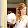
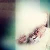
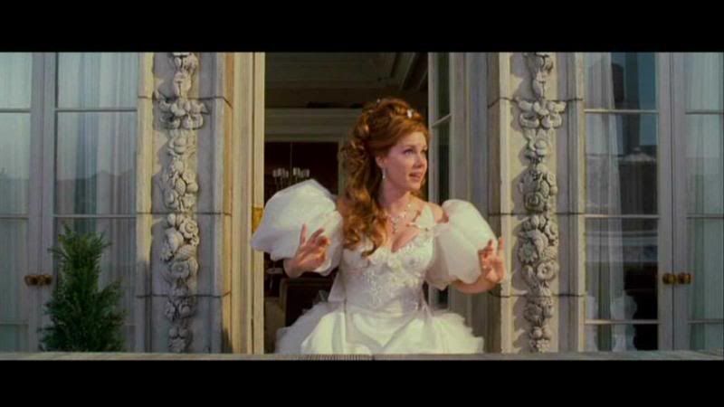
We begin with our starting pic from Disney's Enchanted, shrinking it to fit and sharpening it once so it looks like this:

I want it a bit lighter so I duplicated the layer and adjusted its levels (I'm afraid I don't remember the settings, but its always fun to tweak it until it works!) to make it a bit brighter. I then set that layer to soft light:
>>
I wanted to increase the contrast a little, so I then duplicated the lighter layer and desaturated it. I set this layer at soft light:
>>
Because I'll be adding alot of colour later on when I add the textures, I wanted to tone down the yellows and reds a bit, so I added a selected colour adjustment layer at these settings:
Cyan Magenta Yellow Black
Red: -30% -25% - 45% +2%
Yellow: +100% -5% -100% 0
Cyan: 0 -100% -100% 0
Neutral: 0 0 0 +25%
So that it looks like this:

I then added a texture, deleted the part of the texture which covered Giselle, and set it to lighten:
>>
>>
I then took the same texture and changed its colour using selected colour at these settings:
Cyan Magenta Yellow Black
Red: -50% -60% - 100% +6%
Yellow: 0 0 -90% 0
Neutral: 0 0 0 -16%
Black 0 0 0 -30%
So it looked like this:
I then deleted the area around Giselle again and set it to Multiply:

>>
I took the next texture and again deleted the area around Giselle, but this time I set it to soft light:
>>
>>
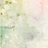
I repeated the process with the next texture, deleting some of the texture around Giselle and setting the layer to soft light, but this time I left a bit of (whitish) texture over her face to make it paler:
>>
>>
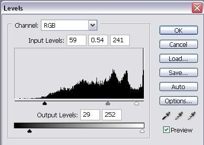
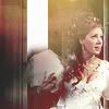
Getting there! I wanted a bit more contrast, so next I added a level adjustment layer at these settings:
So it looked like this:

The levels layer had made the colour a bit too intense, so I added a hue/saturation layer at these settings:
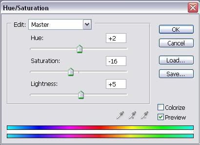
So it looked like this:

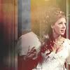
I wanted a bit of a red sheen on Giselle so I added a black and red gradient, set it at lighten, so my icon looks like this:

>>
Now I'm happy with the colour it's time to go on to the decoration...
I added a white bar (you can create this by using the shape tool to create the bar then rasterising the layer so you can edit it), deleted the bottom of the bar so it rests on Giselle's shoulder, and I set it to saturation so it looks like this:
>>
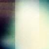
I next added a black bar down the left of the image:
I then took this pink 'dot' (you can create the 'dot' by using the brush tool to make a round pink circle on a new layer and then gaussian blurring it, if it's too pale then duplicate the layer until its as strong as you want it and then merge the duplicated layers together) (NB: the black is there to illustrate the dot and isn't part of the layer which contains the dot only) and set it to soft light:
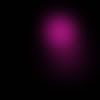
>>
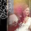
Finally I added a flower brush (normal 100%) and some mini-text (soft light) - you can add any brushes that take your fancy - and viola! The icon is complete:
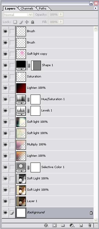
Here's the layers:
We begin with our starting pic from Disney's Enchanted, shrinking it to fit and sharpening it once so it looks like this:
I want it a bit lighter so I duplicated the layer and adjusted its levels (I'm afraid I don't remember the settings, but its always fun to tweak it until it works!) to make it a bit brighter. I then set that layer to soft light:
>>
I wanted to increase the contrast a little, so I then duplicated the lighter layer and desaturated it. I set this layer at soft light:
>>
Because I'll be adding alot of colour later on when I add the textures, I wanted to tone down the yellows and reds a bit, so I added a selected colour adjustment layer at these settings:
Cyan Magenta Yellow Black
Red: -30% -25% - 45% +2%
Yellow: +100% -5% -100% 0
Cyan: 0 -100% -100% 0
Neutral: 0 0 0 +25%
So that it looks like this:
I then added a texture, deleted the part of the texture which covered Giselle, and set it to lighten:
>>
>>
I then took the same texture and changed its colour using selected colour at these settings:
Cyan Magenta Yellow Black
Red: -50% -60% - 100% +6%
Yellow: 0 0 -90% 0
Neutral: 0 0 0 -16%
Black 0 0 0 -30%
So it looked like this:
I then deleted the area around Giselle again and set it to Multiply:
>>
I took the next texture and again deleted the area around Giselle, but this time I set it to soft light:
>>
>>
I repeated the process with the next texture, deleting some of the texture around Giselle and setting the layer to soft light, but this time I left a bit of (whitish) texture over her face to make it paler:
>>
>>
Getting there! I wanted a bit more contrast, so next I added a level adjustment layer at these settings:
So it looked like this:
The levels layer had made the colour a bit too intense, so I added a hue/saturation layer at these settings:
So it looked like this:
I wanted a bit of a red sheen on Giselle so I added a black and red gradient, set it at lighten, so my icon looks like this:
>>
Now I'm happy with the colour it's time to go on to the decoration...
I added a white bar (you can create this by using the shape tool to create the bar then rasterising the layer so you can edit it), deleted the bottom of the bar so it rests on Giselle's shoulder, and I set it to saturation so it looks like this:
>>
I next added a black bar down the left of the image:
I then took this pink 'dot' (you can create the 'dot' by using the brush tool to make a round pink circle on a new layer and then gaussian blurring it, if it's too pale then duplicate the layer until its as strong as you want it and then merge the duplicated layers together) (NB: the black is there to illustrate the dot and isn't part of the layer which contains the dot only) and set it to soft light:
>>
Finally I added a flower brush (normal 100%) and some mini-text (soft light) - you can add any brushes that take your fancy - and viola! The icon is complete:
Here's the layers:
