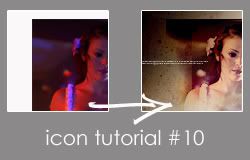
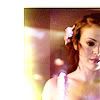
Icon tutorial
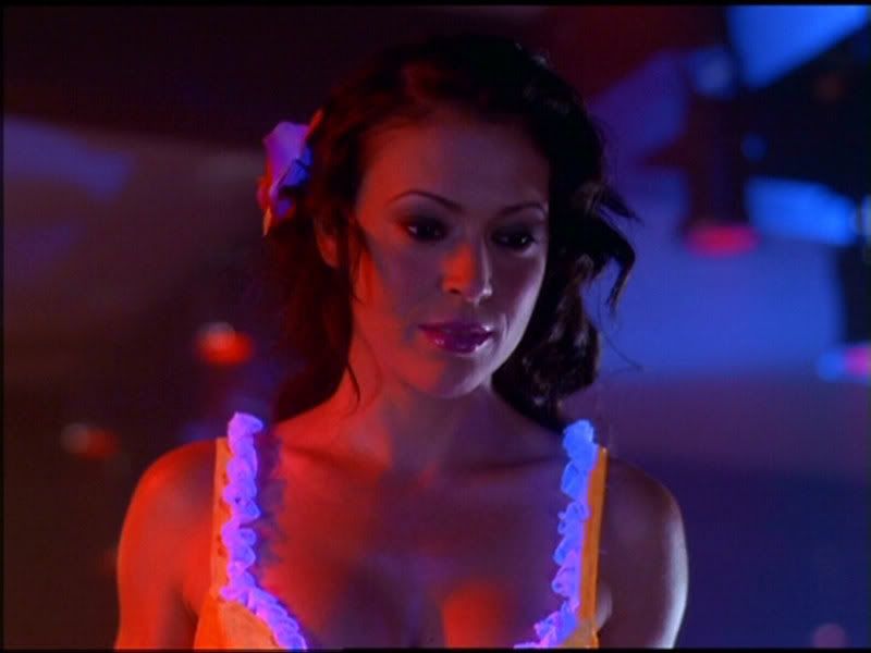
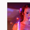
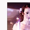
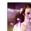
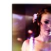
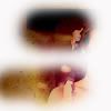
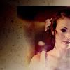
Here's our starting image
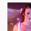
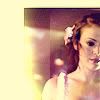
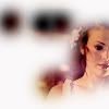
Once I had shrunk the image down and placed it where I wanted it, I decided the best way to lighten the image was, of course, screen layers. I duplicated the base layer, sharpened the copy, and set it to screen. (I always sharpen upper layers rather than the base layer - it helps prevents that nasty over-sharpened look). I then duplicated the screened layer:
(base) >
>
>
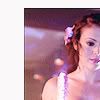
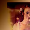
The colours are a bit too dark for my tastes, so I duplicated the screened layer again and desaturated it. I then duplicated the desaturated screened layer a further 3 times:
>
>
>

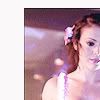
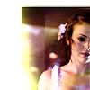
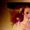
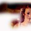
It looks a bit dodgy but bear with me. I duplicated the desaturated layer again and set it to soft light 40% opacity:
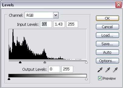
To get better contrast between the light and the dark I changed the soft light layer's levels slightly:
>

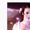
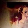
Then to soften the face I blurred the soft light layer a few times:
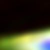
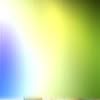
I wanted to make the colours more interesting so I took this light texture:
(it's one of my own and can be downloaded HERE)
And bent it and shaped it, and set several different layers to different settings until I had the effect I wanted:
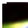
> Lighten @ 55% opacity >

> Soft Light @ 70% opacity >
> Soft Light @ 70% opacity >
> Soft Light @ 70% opacity >

> Linear Dodge @ 70% opacity >
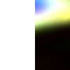
Frankly she looks like she has some kind of green and oozing plague at the mo - not exactly a good look. So to soften it up I did the following:

> Soft Light >

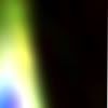
> Exclusion >
> Multiply >

To make it a bit more interesting I added a couple of black and white gradients:

> Linear Burn 75% opacity >

> Soft Light >

I then used a texture by
ewanism:

> Color Burn 65% opacity >
Finally I feel the colour is too dark, but as I'm going for a soft look I don't want every part of the icon to be the same saturation. Instead I want different parts to be brighter and stand out more than others. So I created several plain white layers and erased the parts of the layer where I would like the colour to be stronger. I then set all the layers to saturation and gave them different opacities, like this:
Saturation 20% opacity +
Saturation 25% opacity +
Saturation 30% opacity >
Finally I deleted the edge of the image to soften that too.
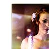
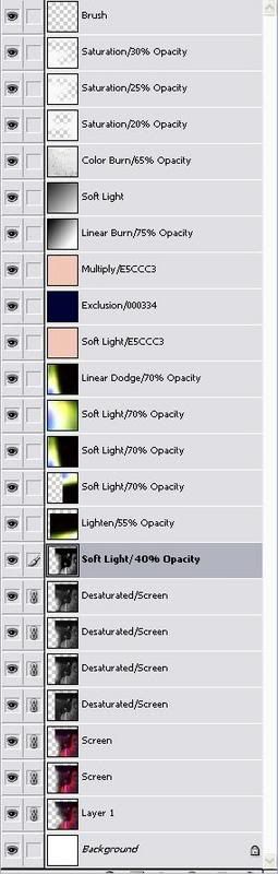
Now add your brushes etc. to get the final icon. Here are the layers again:
You probably shouldn't use all the layers I did - it'll vary depending on how dark your image is, the effects you want, etc. But I hope the above tutorial has given you some ideas to try out.
Links to all my other tutorials can be found in my rosources HERE